Wednesday, May 25, 2011

Experimenting with Neocolor II Water-soluble crayons


On Tuesday, my morning colored pencil class and I experimented with the Neocolor II crayons as an underpainting for our still life drawings. In advance for the lesson, I prepared the surface for us to use. I took a sheet of gatorboard and covered it with with two coats of Storm Blue Colourfix liquid primer then cut it into 8x10" pieces for each person. The surface worked out perfectly for our application of the Neocolor crayons, a little water and then colored pencil on top. Colored Pencil artist Ranjini Venkatachari uses this method so successfully, I wanted to give it a try. I read my class Ranjini's recent blog post on how she uses the Neocolor II crayons with colored pencil and then we tried it.

In attempt to keep the lesson simple, our still life subjects were different pitchers and each student chose one. First we applied the Neocolor II crayons lightly and evenly all over the drawing, not paying attention to detail and blocking in large areas. We only had small sets of Neocolors so we had to choose from what colors were available. Secondly we brushed on water and wet the crayon, dissolving it and giving the background a smooth underpainting. Next the surface had to dry and we found we could speed up the process by using a hair dryer and after it was dry we began adding in colored pencil and start drawing and defining colors, shapes and values. The surface is so textured that it will take many layers of pencil and crayon and I even added more crayon on top of the pencil giving it almost the look of a pastel. Pictured is my experimental drawing which I really had fun with.

Now I am anxious to buy a BIG set of the crayons and experiment more of this method. So I'm looking for a sale on-line!

Sunday, May 22, 2011

Crinkly Old Paint Tubes

I have been looking for new and creative ideas for different still life subjects and have been thinking about drawing some of my old paint tubes for months now. The older and the more crinkled, the better they look to me. I especially like the tube in the center with no label and paint residue smeared all over it. Last I finally sat down, sketched them out and started working on them. I began with two grays; Cool Grey 30% and Cool Grey 50%. I started by drawing all the shadows and crevices in these two grays only. The folded part of the red tube is currently just the 30% and 50% Cool Grey and I have just begun adding a bit of yellow which is Prismacolor Sand. It's the tube I am working on now

After I worked most of the folds and shadows in the 30% and 50% Greys in each tube, I continued by adding Cool Grey 90% to establish the very dark areas. At closer look, I realized the metal tubes weren't only in tones of cool grays but also had warm gray tones in them, thus I added warm grays. And its different because I often use only one or the other but this project lent itself to both cool and warm.

After establishing all the tones of gray, I then had lots of fun adding different reflected colors into the tubes. I see several golds and blues and some tones of red and brown. I found it easier to concentrate on completing one tube at a time. When they are all finished and I have laid in all the shadows, I will go back and complete the whole piece. This drawing is really fun and I am working on illustration board so I'm able to add many light layers of different pencils to the the subjects. I am also using Black in this piece which I normally don't use but it's definitely working in this piece to show strong darks and to depict the paint caps which are black.

Wednesday, May 18, 2011

Tuesday Colored Pencil Classes


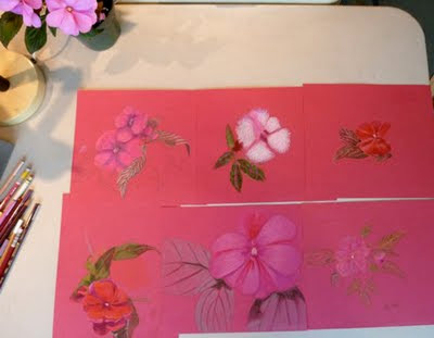
These are photos of some of my morning and evening students colored pencil work. I brought in several New Guinea Impatiens plants in red, pink and white and each person chose a plant and chose a portion of the plant to focus on and draw. The morning class worked on Raspberry Canson Mi Teintes paper and the evening class worked on Violet Canson Mi Teintes because I couldn't find any more of the Raspberry color at our local art store. I chose the bright warm tones to make the flowers pop and give the finished drawing a color harmony. The warm pink and purple tones showing through the leaves give the whole drawing an interesting effect.

I thought this lesson would be interesting and fun but most everyone found it very challenging. The flowers lack different hues and values and they found it difficult to make them look real and find enough brightly colored pencils to get the job done. The leaves, buds and stems are intricate and took some thought and drawing skill. I suggested they each choose three values of green to work the leaves and later add other colors if needed. By the time everyone left I think they were tired, I even heard some comments about needing a glass of wine from the night class! I'm not sure if you can tell from the photos but they all did a wonderful job and we marveled at how we used the same subject matter and paper but each person's drawing was unique and had its own style

Tuesday, May 17, 2011

Orchid Drawing is Complete

Since my last post of this drawing, I decided on a blue background which is mostly Prismacolor Blue Violet Lake and the surface is Prismacolor Gingeroot. I chose the cool blues and cool greens in the leaves to make the flowers pop. When the background was complete and I worked on the pot, I then returned to the flowers and punched them up with more color. I particularly worked on the three blossoms on the right which are my focal point. I didn't use any solvent on this piece which makes it look more like a drawing than a painting with the surface texture showing through.

Its been raining here for days so working on this piece made me feel better about our dreary weather because it is so colorful and cheerful.

I sprayed the drawing with Lascaux fixative and Krylon Kamar Varnish to finish and seal the colored pencil. And I chose to frame the piece in a light wood floater frame which gives it a contemporary look.


Wednesday, May 11, 2011

Orchids in Pinks and Purples

I'm continuing work on the orchids that I started a few weeks ago. I'm using my bright pinks and purples and two of my favorite dark pinks have been discontinued by Prismacolor. The are Lightfast Madder Lake and Thio Violet so I am down to my last few pencils of those colors. I am working the warm pinks against the cool greens in the background, complementaries. The greens make the pinks pop forward. The grouping of blossoms to the center right will be my focal point. The first post about this piece is here where I explain about the surface I'm working on. Thus far, I have only worked with Prismacolor and Coloursoft pencils without solvent. I'm not sure if I will use solvent with the pencils on this piece.

Wednesday, May 4, 2011

Yesterday's Class Project


For my colored pencil classes yesterday, I gave the students white Chinese take out boxes, fortune cookies and chopsticks to choose from and set up their own still life to draw. My intention was to have everyone draw the white boxes and create colorful grays. We used Canson Mi Teintes paper in Felt Gray to draw on and started with whites and grays on the box, students chose either cool or warm grays. Next we added other colors in different areas where they saw color in the shadowed areas. For example, we used colors such as Cream, Grayed Lavendar, Light Flesh, Sage and Celadon green and several of the blues. Afterward some added a fortune cookie, with or without the wrapper and some colorful chopsticks and shadow. The Felt Gray paper makes a nice background.

In the top photo are drawings from the morning class and in the bottom photo are drawings from the evening class. It is interesting to see how different each person's style is and the different choices of color, especially the subtle color in the white boxes which you may not be able to see from the photos.

Monday, May 2, 2011

CPSA 19th Annual Exhibition

I am very excited to learn today that my piece "Sea Foam" has been accepted into CPSA Annual Exhibition which will be in Dallas, Texas this year. I really enjoyed working on this piece last summer because I love the beach and all its treasures. My intention is to draw the viewers into the scene and through the rocks, sand and foam of the surf. I'm thrilled it will be a part of the exhibition and hope to be able to make it to Dallas.