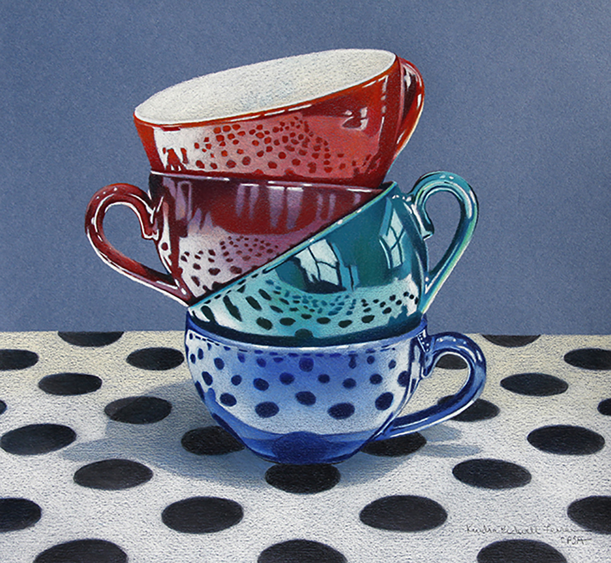
Wednesday, May 15, 2013

A Work in Progress on Vellum


 I just realized that I haven't posted any work in over a month. I'm not quite sure what happened but I went away then came back and proceeded to get a cold and respiratory virus that hung on for about two weeks. When breaks like that happen, I find that I lose momentum and vigor for my artwork, particularly what piece I'm working on. I get out of the "zone" and it can take awhile to get it back. In the meantime I start doing things like cleaning the condo, cleaning the studio, cooking; all sorts of daily activities until I can get back into the the right frame of mind. Anyway, thankfully, I'm back and finishing up this piece.

As I mentioned in the last post about this piece, I am working on two pieces of DuraLar vellum and when I put them together, the top sheet is a bit more translucent so the drawing on the second sheet (behind) isn't as sharp as I would like it. In the top photo you can see how I've taped the two sheets together at the top and I keep laying the top sheet down to check for alignment, colors and values. On the bottom sheet of vellum, I had drawn the bottom of the carousel in black and the shadows in Prismacolor Black Grape. However, when I put the two sheets together, the shadows looked dull and gray so I erased the black and purple shadows. The vellum is easily erased with a kneaded eraser and then I cleaned up with a white eraser.


I am finding that if I use very bright colors on the bottom sheet of vellum, it translates much better when I put the two sheets together. I decided to use Prismacolor Peacock Green for the bottom of the carousel and Ultramarine Blue for the shadows.


Here are the two sheets of vellum as the drawing appears now. My next step is to bring parts of the background images forward by drawing them on the top sheet of vellum and letting other parts of the merry go round fade into the background. Hoping to finish today!

Monday, April 8, 2013

Drawing on Multiple Layers of Vellum


I've been intrigued by the thought of experimenting with colored pencil on multiple sheets of drawing vellum (also called drafting film in some cases) in which one layer would show through another to give my composition a 3D type quality. I purchased several 18x24" sheets of Duralar matte vellum and chose my photos of carousel horses for my composition. My intention was to use three sheets of the film; one for the foreground, midground and background of my drawing. I started this piece in January, using Prismacolor pencils and working first on my three foreground horses which will be the focal point. Next I moved on to the second sheet of vellum and began working on the next grouping of carousel horses as they recede for the midground (top photo) and the objective is to have these horses fade a bit into the background. I had planned the third sheet of vellum would be used for the shadows and part of the carousel center.

However, as I began to work on the multiple layers, I quickly found the vellum isn't quite translucent enough to achieve I color I need to show through on multiple layers. The vellum is smooth and takes the pencil beautifully, colors are rich and intense on the surface. What I like about the translucency of the vellum is that I am able to work with the colored pencil on both sides. The smooth surface only allows minimal layers of pencil and if I've saturated the front, I turn the sheet over and continue on the opposite side to achieve additional color and value. It is also easy to erase mistakes with a drafting eraser and I've also heard rubbing alcohol will remove smudges and fingerprints but haven't tried it just yet.

What I have learned so far ... I'm going to have to adjust my layering process. I may only use two sheets of vellum instead of three. I may add more of my composition to the top layer and let it fade into the next layer. It's trial and error as I work but learning and enjoying the process.

Thursday, March 28, 2013

New Grouping of Boxes


Started another grouping of my Ocean Life boxes on 5x5" Ampersand Claybord boxes. I have sold several of the last series of boxes and decided to create another series of boxes. Shown here are seven new cover drawings and three new inside drawings. All of the cover drawings are worked on white Stonehenge paper with image transfer and colored pencil. I adhere them to the Claybord surface of the box top with Grafix Double Tack Mounting Film. I like the bottom drawings to be sturdier so I use white Strathmore rag illustration board, again with image transfer and colored pencil and glue them onto the bottom. The box top drawings are sprayed with one coat of Krylon UV Resistant Clear, three coats of Krylon Kamar Varnish and then several layers of Golden Polymer Varnish with UVLS to make them smooth and glossy.

In the last series I left the natural wood box sides showing and varnished them for protection. In this series I've decided to experiment with painting the wooden sides or collaging some of the box sides with rice paper. I'll explain that in my next post about the boxes.

Sunday, March 24, 2013

Beach Stones and Water are Finally Finished


I finally finished this piece and I'm almost reluctant to say that it has taken me two months to complete. I started the piece in January just before my father went into the hospital with the flu and fluid in his lungs. He stayed for a week and then went into a nursing home where he has been since but will be coming home next week. I've been running back and forth first to the hospital and then to the nursing home almost daily. Now I am setting up the 24-hour care he will need when he comes home. He didn't want to have to go to the nursing home and now he doesn't want to pay for care thus, we've been arguing that this has to happen. What do you do when a parent becomes like a child and is totally dependent on you? It's overwhelming. I had been involved in his care previously but now it's become physically and emotionally draining. However, I have worked to get him back to walking, in better spirits and at a point where he can come home with care. Unfortunately, my art took the back seat for the last two months. I taught some classes and tried to get some work done but emotionally it was difficult. Besides this piece, I have also started a large piece on mylar and am going to be handmaking a book with small drawings. I'm excited about both projects and really need to start working on a regular basis, when I get away from my art I feel somewhat lost and very irritable!

Just to review, this drawing is 18x24" on Rtistx 300 Board. I used Prismacolor, Lyra Rembrandt and Faber Polychromos pencils. I wrote details on how I worked the rocks in this previous post. My next step was to continue upward and put in suggestions of more rocks and the sea foam encroaching the rocks. I decided to leave the top left predominantly white, I wanted to keep it somewhat abstract with just suggestions of rocks underneath the flowing water. This piece will be one of the entries I submit to the CPSA national exhibition but I have to title it first. Right now it's untitled and I'm in the though process.

Tuesday, March 5, 2013

Providence Art Club Colored Pencil Class


My class at the Providence Art Club has been working in colored pencil and watercolor pencil. The third photo of the Bird of Paradise images was the previous class project. We used the reference photo and the students worked in watercolor pencil on white Ampersand Pastelbord. The other three photos are the current class project working with the yellow tulip reference photo. The surface is Ampersand Gessobord covered with a layer of blue Art Spectrum Colourfix primer. The students are putting down a layer of colored pencil and then adding solvent with a brush to melt the waxy pencil and move it around. Subsequent layers of pencil are added after the solvent and blended in. I suggested to my students that they start on one area of the drawing and get the feel for applying the solvent with the pencil before they move onto the whole piece.

Friday, February 22, 2013

Art Boot Camp Watercolor Class


These are three photos from my recent watercolor class during the Art Boot Camp that Felicia and I teach at Beach Studios. The students are working from still life objects they put together according to their liking and what they wanted to paint. I had each of them decide on a composition in their viewfinder, then sketch it out in pencil on the Fabriano hot press watercolor paper I provided. The next step was to apply watercolor washes to build color after which they experimented with watercolor pencils and water. The resulting paintings were anywhere from very detailed to very loosely painted. I always enjoy seeing each student's expression and style evolve in their work.

Thursday, February 21, 2013

Working on the Beach Stones

I'm continuing my work on the beach stones drawing which is 18x24" on Rtistx board. I've finished the foreground stones, which took me a few weeks because I found I could only concentrate for a few hours at a time because of all the elements and detail. I've been using Polychromos, Prismacolor and Lyra Rembrandt pencils for the rocks. Let me tell you why and what my technique is. The Rtistx board is a sanded surface and I find the Polychromos work best for the first layer of color. After I apply the color, I burnish it with a bristle brush to even out the tone. Polychromos aren't as waxy as other brands so they tend to rub into the paper almost as a pastel stick would. Next I apply layers of Prismacolor and Lyra Rembrandt. The Lyras have an oil base so they don't crumble as much as the Prismacolors. However, I also have to choose my pencils according to the colors I need for the rocks. Because I'm working from the bottom upwards and leaning on my drawing, I will put a piece of clean paper under my arm so I won't smudge the drawing I've already done. I also spray with workable fixative between layers of colored pencil to keep the pencil from lifting or smudging on the board.

After I've applied the color, there are still some areas I want to look smooth but sometimes doesn't because of the sanded board surface. If the rocks look too textured, I hit the surface with a soft brush and some odorless mineral spirits which dissolves the pencil pigment so it moves like paint. I brush it lightly so I get the effect of watercolor paint. One of the brushes I like to use is a Mongolian Sable 1/4" flat from Dynasty Brush Company.

My next step is to continue working towards the top of the drawing where the waves and white foam are encroaching on the stones. The easy part about the top is that much of the board will be left white to show the lightness of the foam.


Friday, February 1, 2013

Creating Handmade Books

 I just finished a bookmaking workshop and I'm totally hooked. I can't wait to find some time, get some materials and make a few more handmade books. We learned how to make the traditional book with the sewn bookbinding, shown above. My book has 44 blank pages which are made from heavy weight drawing paper and I haven't decided whether I will use this book as a journal, sketchbook, or to collage my drawings and prints.


 I chose a decorative blue with gold leaf design for the cover and a yellow/green and gold design for the  front and back inside covers. I also added a ribbon to the spine for decoration.

This photo is a bit out of order but here is my book wrapped in newsprint, in the antique book press. Have to get myself one of these cool looking presses.

Tuesday, January 22, 2013

Beach Stones


I've started working on a new large colored pencil piece, it is going to be a vertical 18x24" and I'm working it on Rtistx 300 board. I chose that surface because I wanted to work on a white board in which I could use solvent and also varnish at the end. I like the Rtistx because it can stand up to both. For this piece I am using a mixture of Prismacolor and Polychromos pencils and my stiff bristle brushes to burnish the pencil pigment into the paper.

The picture at the top is of just the bottom of the beginning of my drawing. The photo beneath is the reference photo for the bottom area. I am using three reference photos of the scene for the entire 18x24 drawing, the middle reference photo will be of smaller, more distant rocks and the top of the photo will be mostly the waves and foam washing over the rocks. I couldn't find one photo of the scene that I liked so I am going to combine at least the three and work the water into the rocks using some of my imagination.

I began drawing the rocks with three Prismacolor pencils: Indigo Blue, Warm Grey 50% and Warm Grey 70% working in the darks with indigo and parts of the other rocks with the grays. I'm working this way to hopefully simplify the drawing before adding all of the other colors. It has already taken me many hours to get this far so I think this drawing is going to take me a while. Stay tuned for upcoming posts on this drawing.

Tuesday, January 15, 2013

Two Upcoming Classes at Beach Studios


Felicia and I are kicking off the year with two sessions of classes. Our Art Boot Camp focuses on 2-week sessions of drawing, watercolor, monotype prints and colored pencil. It's a good way to try out the different mediums and experiment with them. Students will be working from still life set ups and this boot camp includes materials so our students don't have to spend extra money on the supplies.

The second class is a two-morning colored pencil class in which we will be working on Ampersand Pastelbord using watercolor pencils and colored pencils. I have prepared the project and we will be working from a photo reference.

Any interest? Contact us, there are a few spaces left in both classes.

Friday, January 4, 2013

Printmaking Portfolio on Permanent Display at Woman & Infants Hospital


Woman & Infants Hospital in Providence, RI has purchased one of our Providence Art Club printmaking portfolios in which 22 artists created various types of one of a kind prints for this project. We are happy to announce that we sold all 13 portfolios to raise money for the education department of the Providence Art Club. One of our portfolios was purchased by Woman & Infants Hospital. Each artist's print was framed and hung just outside the main lobby in a hallway leading to conference rooms. The staff held an artists' reception for us just before Christmas, here are pictures of the prints on display and some of the attendees. My piece, an etching with chiné collé titled A Floating World is pictured above.

This is a link to the original post about our portfolio project.

Thursday, January 3, 2013

Fragile

The newest colored pencil piece, and first one completed for the new year, is titled Fragile, it is 10x14" and worked on rag illustration board. The idea came from a birthday party I attended back in November in which each attendee received a small nest with a saying attached. The words attached to my nest spoke to me: Be the rain. Wash away, cleanse, forgive. I thought what great advice, so true for our lives and a good way to begin a new year. I immediately started thinking of how I could put this little nest into a composition and tell a story.

I found some little blue bird eggs. No, not real ones - I found these at Pottery Barn! I brought my little nest and my camera out walking on the trails with my dog at Mt Hope Farm in Bristol, RI and decided to nestle it in amongst the fall leaves and grass. I took several photos in different areas with different colored leaves and then went home to look at the photos on my computer and choose one. I chose this particular one because of the bright red and orange leaves int he foreground and the older brown leaves scattered behind them. The contrast of the green grasses peeking through caught my attention also.

Everything in this piece is fragile, the nest, the fall leaves that are drying up in the cold weather and the grasses will soon turn brown. The eggs are fragile but also symbolize a new beginning. The words also remind us that our lives and our relationships are fragile. Happy New Year!

Friday, December 21, 2012

Dog Portrait of Bentley


Just finished this 9x12" dog portrait for a customer who called me a few weeks ago but we ended up meeting just last Friday. He asked if I could do a portrait of his recently deceased Yellow Lab named Bentley. The portrait is going to be a surprise for his wife for Christmas. I was really nervous about this commission for two reasons: first I had never met the dog. If possible I like to try to see the pet in person but of course this wasn't an option. Second, I only had a week to work on the portrait along with all of my other holiday preparations. I suppose I can say that I work good under pressure because I finished the portrait and met with the customer yesterday and he was very happy with the finished piece and the likeness of his dog. I breathed a sigh of relief.

The portrait is on 9x12" 3/4-cradled Ampersand Gessobord. The customer requested that I add the colored pencil to the sides in the event he and his wife didn't want to frame it. I applied gesso to all of the sides of the Gessobord, then coated the top and sides with light blue/green color of Art Spectrum Colourfix primer (which it appears they don't make anymore) mixed with Ultramarine Blue Art Spectrum Concentrated Ink to achieve the background color I'm looking for. I worked on the surface with colored pencil and solvent (odorless mineral spirits) so the pencil will adhere like paint and I can move it around and remove surface texture. 

After the holidays, the customer is returning the piece to be varnished. He is asking for a flat matt finish in a varnish with no sheen on the surface. The varnishes I use are somewhat shiny and  have a little bit of a sheen so my next step is to find another varnishing product to use. If anyone has any suggestions, let me know.

Thursday, December 6, 2012

Trying My Hand at Encaustics


These two 6x6" encaustic pieces are a surprise gift for my sister in law, Lori, who lives in Florida. If she happens to be reading this blog before they arrive, she's not going to be very surprised. Last spring during a visit to Florida, Lori and I went through galleries in her town of Mt. Dora. In one of the galleries, she noticed similar encaustic pieces and mentioned that she liked them. It seemed like a project I could handle, especially with several other artists in my studio who work in encaustics so I came home with a plan. Of course, the plan took months to actually come to life but here it is.

My process is to choose two of my photos that I felt Lori would like, resize them and print them out on my inkjet printer. I purchased two 2" cradled Ampersand Claybord panels and affixed the photos to the Claybord with gel medium. After it dried, Felicia Touhey helped me learn how to brush on layers of hot wax, smoothing the wax out with a heat gun, filling in grooves with a palette knife, and so on. I even got creative and tried green wax on the sides of one piece. It was fun, maybe I'll try this again.

Sunday, December 2, 2012

Colored Pencil Magazine & Current Exhibit


I was really excited to be asked to be a contributor in the December issue of Colored Pencil Magazine. The article features my colored pencil boxes and how I created them from Ampersand Claybord boxes and colored pencil drawings. To purchase a copy of the December issue, go to this link.


Here are pictures from my recent exhibit at Angelina's Coffee in Bristol, RI. Above is some of my artwork pictured in the cozy sitting room complete with a record player and albums. Now how often do you see that anymore?


Julio Amaro (pictured) and Larry Lawrence played for the Art Night reception last Thursday night. My friend, Sharon Holmes, who is a fabulous singer sat in with Julio to sing a few songs.


The two photos above show m two candy apple photos next to the door and part of the counter and holiday tree, everything was so festive. Notice the walls are painted aqua blue above the white chair rail and red below, so warm and inviting.