KJF DESIGN Fine Art
Journeys in Colored Pencil ... And Other Mediums
Monday, December 8, 2025
Catharine Lorillard Wolfe Exhibit Award
Monday, July 14, 2025
Watercolor Pencil Demo Notes: Part 2
At my Rhode Island Watercolor Society Demo I was asked how do watercolor pencils differ from colored pencils? Watercolor pencils are made up of pigment plus a water-soluble binder that dissolves in water and mimics the characteristics of paint. Traditional colored pencils are comprised of pigment and a wax based or oil based binder that doesn't dissolve in water.
The pencils layer differently; water-soluble pencils are more opaque especially when water is added. Traditional colored pencils have a smooth or waxy feel as they glide over paper. You can burnish waxy colored pencils (applying heavy pressure or burnishing with a blender pencil to create a smooth surface) but not watercolor pencils. Traditional wax based colored pencil pigment is more translucent when applied and layered.
At the demo, I worked on these two pieces using different brands of watercolor pencils.
These are my two reference photos for what I worked on.This first piece is from a photo I took this photo in Volterra, Italy. I really like the way the light is hitting the old stone building and producing a variety of color and shadow. Can I achieve this with watercolor pencil? I Hope so! For this painting, I am working on Arches Aquarelle 140 lb hot press watercolor paper in a 7x10" block and using my set of 12 Derwent Graphitint Pencils. I chose the Graphitint pencils for their muted tones and colors that would compliment the stone on the buildings.
The magnolia blossom is also on Arches Aquarelle hot press 140 lb, but a sheet I cut to size and taped to a board. I worked the magnolia using Caran d'Ache Supracolor and Derwent Inkense pencils. I started with the softer colors of the flower and then worked around the flower with some darker greens to make the light tones of the flower to stand out. You can see how I began using the watercolor pencil dry and then added water with a brush to move the paint around.
I had a question from the group asking if I use watercolor pencil to draw my image on the paper and explained that I like to draw with graphite pencil (which is also easy to erase). Drawing with dry watercolor pencil might work as long as water isn't added to blur or erase drawing lines.
Often watercolor painters like to mix their own greens by combining yellow or ochre with blue. I had a second question about whether it is possible to mix greens in this same way with watercolor pencil, so I gave it a try. It is possible but would seem to be more difficult as I didn't have good luck.
I brought the two pieces of artwork (below) and had questions on these. The first drawing of the cherries is on Ampersand Pastelbord created in watercolor pencil and colored pencil. I created a video of this piece for Ampersand, if you'd like to you can view it here. The second drawing of the coffee cup is on Ampersand Aquabord with watercolor and watercolor pencil. Both of these paintings are sealed with varnish so they don't have to be framed under glass.
Sunday, July 13, 2025
Watercolor Pencil Demo Notes: Part 1
I gave a talk and demo at Rhode Island Watercolor Society on July 12 and told my viewers I would put all the notes on my blog. So here they are:
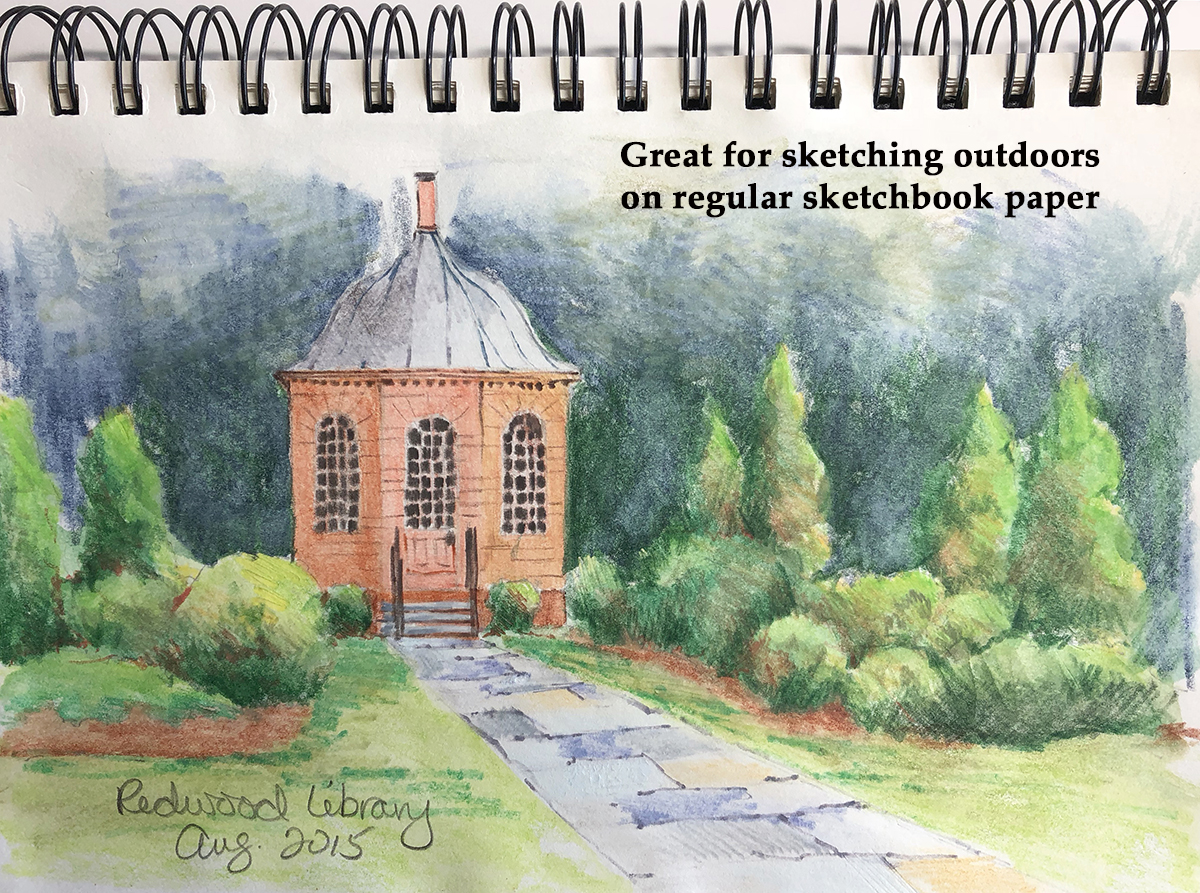
Watercolor pencil is useful for control, adding detail and sketching. It is a portable medium for working outdoors or traveling all you need are watercolor pencils, a brush and a small amount of water.
There are many brands of watercolor pencils on the market, the ones I like to use are:
1. Faber Castell Albrecht Durer - these pencils are sold individually or in sets up to 120 pencils. Most are lightfast and are made up of acid free pigments. These pencils apply smoothly and can be used wet or dry. I splurged for the 120 pencil set as it has a great range of colors and values from very light to dark. These are my favorite watercolor pencils. (I haven't put together a color chart for these yet)
2. Caran d'Ache Supracolor - these pencils come in sets up to 120 pencils. Not all colors are lightfast but they have a good range of color, value. They also apply smoothly with or without water applied.
3. Derwent Inktense - sold in sets up to 100 pencils. Inktense are vibrant with intense color because they are ink based and permanent, so you cannot lift color once it is dry. You can also use these pencils on ceramic wood and fabric. I am anxious to experiment with the Inktense pencils on fabric as colors will be permanent once dried.
4. Derwent Graphitint - these pencils are sold in sets of 12 or 24. They consist of water soluble graphic and colored pigment. Graphitint pencils create softer hues and are not permanent so the pigment can be removed with water or an eraser. (I have a set of 12 pencils)
Other pencils I like are the Stabilo White Aquarabelle ALL, this water soluble pencil works on a variety of surfaces and has great coverage for adding white details and highlights on top of color. These Stabilo pencils also come in other colors.
I often use a regular wax based colored pencil for adding details and fine lines as the wax pencil is not water soluble so it won't lift when water is applied around it.
Paper:
I always use good quality paper, 140 lbs paper weight is sufficient if you aren't putting a lot of large wet washes on the paper. Hot press finish works the best because of its smoother texture. Cold press or rough contain textured grooves in the paper that are hard to fill with the pencil point. My go-to choices are Winsor Newton or Arches but I have recently tried Legion Stonehenge Aqua and like working on it. I also like to use watercolor blocks which are portable and easy to work on because the paper is affixed to the block and doesn't need to be taped to a board. Otherwise I will purchase individual sheets, cut them to the size I need and tape to a board.
Other surfaces I sometimes use are:
(Clarefontaine) Pastelmat, the white tiger drawing I brought was on this velvety surface worked with the Faber Castel Albrecht Durer pencils used wet and dry. Available in several colors.
Ampersand Art Aquabord & Pastelbord
Application:
I purchase an inexpensive watercolor pad for testing my colors. I like to make color charts of each brand of watercolor pencils, showing how each color looks when it is applied dry and then water is added. Some pencil pigment colors do change significantly when water is added.
Above is my application testing sheet You don't mix colors on a palette as you do in traditonal watercolor, watercolor pencils are layered (light to dark) to create the color and value you want to achieve. I used inexpensive cold press paper for testing and realize later that I should do my testing on good paper for more accurate results. However you can see that cold press paper is not good for watercolor pencils because you can really see the texture even when blended.
I apply the colors dry first, then add water. You only want a small amount of water on your brush so activate the pencil and keep your brush clean when moving from one color to another.
Allow your layers of color to dry before adding another color to prevent your colors from mixing and becoming muddy.
Saturday, June 21, 2025
Watercolor Pencil Magic Demo
I will be giving a watercolor pencil talk and demo on Saturday, July 12 from 11:30 am to 1:00 pm at the Rhode Island Watercolor Society, Slater Park, 831 Armistice Blvd, Pawtucket, Rhode Island 02861. The demo is in conjunction with RIWS Memories Exhibit with an opening reception at 1 pm following the demo.
Come join me and learn about working with watercolor pencils! The demo is free and open to the public.
Friday, June 6, 2025
Painting in Northern Tuscany, Italy
My husand and I were lucky to enjoy a week in a small hilltop town in Northern Tuscany called Mulazzo. Mulazzo is perched on a hill in a region called Lungiana and surrounded by mountains with beautiful views of the Appenine Mountains. Lungiana is an historical setttlement that dates back to medieval times and is filled with beautiful mountaintop castles and fortresses. We stayed at a beautiful villa Spino Secco adjacent to the site of the original castle owned by the royal Malaspina family. The town hosted the Italian philospher, writer and poet Dante in the 1300s and named the tower on the top of the town after Dante.
The whole region is an artist's paradise and less known then the larger hilltop towns of other parts of Tuscany. We were able to explore quiet hilltop towns and castles with few other tourists nearby and most are European, we saw very few Americans.
I really enjoyed taking some time to sit and watercolor a few views. Here I am atop of part of what is left of the original castle on the Spina Secco property. From my perch I had an amazing view of the whole town.
Tuesday, April 1, 2025
Experiments in Abstract Watercolor
These next two pieces are also the jellyfish swimming around at the aquarium. The top is the first layers of color and the second piece is after more colors were added. I like seeing them together, both are really fun exercises.This watercolor is of seaweed flowing underwater. I played with four color schemes (clockwise): Monochromatic, Analogous, Double Complementary and Complementary. I think I would like to try this one again but without the dividing lines, letting them flow into each other. For this exercise our instructor brought in slices and leaves of green and purple cabbages. We looked at shapes, how lines intersect and form shapes and patterns. In my experimenting and painting, I am finding that I often use colors right from the tube or slightly mixed with other colors. Apparently I like a bright colorful palette.
Friday, March 21, 2025
Working in Ceramics
I am taking classes in ceramics at Lighthouse Art Center while spending the winter in Florida. I am working mostly with handbuilding and underglazes which utilizes surface design. I really enjoy exploring another medium, especially creating images on 3D surfaces instead of using flat papers. I feel this stimulates my creative growth.
The top pieces are created from slabs and the technique I used is image transfer where I paint the design on newsprint with slip and underglazes and print it onto the wet clay before it is fired.
This technique is again working with underglazes but using stencils cut from newsprint, dampened and applied to the wet clay. I layer my underglazes and stencils to produce the shapes. I did learn that I need to use like colors, the blue over the orange neutralized because (orange and blue are complementary colors) creating some grays instead of the nice light blue I was trying for.Sunday, November 3, 2024
Working with Acrylic Inks & Gouache
I decided to try experimenting on my own. To begin, I created a small drawing in pencil then went over it with black ball point pen.
For this painting I drew the Cardinal and branch in black ball point pen and again added some journaling about Cardinals. I then used Burnt Umber and Prussian Blue Liquitex Acrylic Ink for the background. Misted with water before painting the Cardinal and branch with gouache. If you would like to see a more detailed video of this process, I found Marianne Vander Dussen's video Gouache Sketchbook on YouTube. She explains this process more in depth.


