Showing posts with label watercolor. Show all posts

Friday, June 6, 2025

Painting in Northern Tuscany, Italy

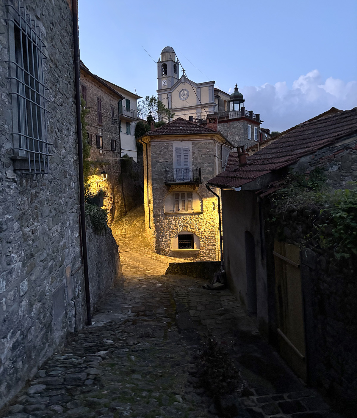
My husand and I were lucky to enjoy a week in a small hilltop town in Northern Tuscany called Mulazzo. Mulazzo is perched on a hill in a region called Lungiana and surrounded by mountains with beautiful views of the Appenine Mountains. Lungiana is an historical setttlement that dates back to medieval times and is filled with beautiful mountaintop castles and fortresses. We stayed at a beautiful villa Spino Secco adjacent to the site of the original castle owned by the royal Malaspina family. The town hosted the Italian philospher, writer and poet Dante in the 1300s and named the tower on the top of the town after Dante. 

The whole region is an artist's paradise and less known then the larger hilltop towns of other parts of  Tuscany. We were able to explore quiet hilltop towns and castles with few other tourists nearby and most are European, we saw very few Americans. 


I really enjoyed taking some time to sit and watercolor a few views. Here I am atop of part of what is left of the original castle on the Spina Secco property. From my perch I had an amazing view of the whole town. 


Here are the two colorful watercolor sketches I created, looking at them now I can't believe how many hours it took me to sketch out the buildings and all of the angles. I certainly enjoyed simplifying some of the scenery and brightening up the colors. Below are a few more photos of the town. We also really enjoyed wandering through the small streets and winding passageways inside the town. I was met with historic views and beauty at every turn. 


Tuesday, April 1, 2025

Experiments in Abstract Watercolor

I've been taking an abstract watercolor class which is challenging for me because I am a realist and not an abstract painter at all. But it has been fun experimenting and loosening up in my work. Seeing abstract work doesn't come easy to me, I found a good starting point is to take an image or scene and attempt to abstract it. These two pieces are from reference photos I took at an aquarium of jellyfish swimming in a tank. The sepia toned top piece is by far my favorite of anything I have done in this class. I like the shapes, dark and light values and the lines I have added. 

As a class we are focusing on: 
Composition • Value • Color • Line • Shape • Form
As well as techniques using watercolors, acrylic inks, watercolor pencils, watercolor papers, yupo papers, 

The lionfish is also a reference photo from an aquarium. I have experimented with just the patterns of the fish itself. Not sure what I am going to do with the bottom piece, the negative shapes of the lionfish. I am still contemplating changes. 

These next two pieces are also the jellyfish swimming around at the aquarium. The top is the first layers of color and the second piece is after more colors were added. I like seeing them together, both are really fun exercises.

This watercolor is of seaweed flowing underwater. I played with four color schemes (clockwise): Monochromatic, Analogous, Double Complementary and Complementary. I think I would like to try this one again but without the dividing lines, letting them flow into each other. 


For this exercise our instructor brought in slices and leaves of green and purple cabbages. We looked at shapes, how lines intersect and form shapes and patterns. In my experimenting and painting, I am finding that I often use colors right from the tube or slightly mixed with other colors. Apparently I like a bright colorful palette.
 
Last one for this post is working on Legion brand Yupo with acrylic inks and watercolor added afterward. I am still trying to figure out this Yupo surface which is very slick. It accepts inks and watercolors very differently than regular paper as it doesn't absorb and takes a long time to dry.

Saturday, July 13, 2024

Mounting a Watercolor on a Panel


I taught a colored pencil workshop this week and was explaining to my students how I often like to mount a drawing or watercolor on a panel rather than framing it with a mat and under glass. It is a bit complicated so I thought I would put it on my blog for future reference. I have been using DaVinci ProPanels as a surface in which to mount my artwork. This acid-free archival panel is coated with a textured gesso. I haven't tried the smooth textured panel but I'm sure it would work too. I have also used Ampersand Art Claybord or Gessobord in the past. To adhere (or glue) my artwork to the panel I use Grafix Double Tack Mounting Film which is also archival and non yellowing. I sell my artwork so I want to be sure that I use the best quality materials that will last many years.


Today I am using a 16x16" DaVinci Pro Panel and a watercolor painting of a blue crab on Arches 140 lb watercolor paper. I have cut my watercolor painting to about 16.5 x 16.5" so I have a little bit of extra paper around the edges. I found out the hard way not to cut my artwork exactly the same size as my panel because it can move while being pasted down and the mounting film is not repositionable. Then I cut the piece of mounting film the same size as the artwork.


Next I pull off one side of the backing paper and carefully adhere the sticky side of the mounting film to the back side of my artwork. 


I lay my artwork face down on a flat clean surface and burnish the mounting film with my bone folder. I start in the middle and move the bone folder outward to the edges to remove any air bubbles and make sure the mounting film is securely glued to the back of my drawing. Now I have the mounting film on my drawing and have to adhere the drawing to the panel.

I lay my DaVinci panel on a flat surface and make sure the surface of the panel is clean and free from any debris. I peel off the other side of the backing paper on my artwork and, starting with one side edge, line up the panel and edge of artwork while paying attention to the top and bottom edges then lay down the mounting film as carefully as possible. It is not repositionable once stuck to the artwork so be very careful. (When I first began this process, I practiced using a small panel first.)


Now I turn the artwork right side up, take a piece of waxed paper or one of the waxy sheets I peeled off the mounting film and put it on top of my drawing. Again, burnish with the bone folder from the center outward to make sure it is firmly glued and to alleviate any air bubbles. 


Seeing that I cut my drawing a little larger than my panel, I have to trim the sides to fit. Turn the piece back over. I use a sharp X-Acto knife and carefully trim the excess paper close to the edge of the panel. After cutting, if the edges are jagged, lightly sand with a piece of fine grit sandpaper. 


 Here is what my piece looks like when mounted on the panel. It is completely flat and professional looking. Erase any marks or sand any edges that aren't even. The next step is to apply a varnish or fixative to the drawing and I will show that in the next blog post. 

Monday, September 28, 2020

I am a Contributing Author of this New Book!


I was very excited when asked by GMC Publications to be included in the newly published Painting & Drawing Techniques and Tutorials for the Complete Beginner book. Some of my tutorials and lessons from my previous colored pencil book have been included with the works of five additional artist authors Paul Clark, Adrian Burrows, Noman Long and Richard Rochester

This book includes some really good information with beautiful illustrations and easy to follow steps about how to draw in charcoal and pencil, and how to paint in watercolor, acrylic and oil painting. It is a great resource for artists who wish to learn about these different mediums from supplies to lessons and it's all included in one book. 

This book is available through Amazon.com at this link.


Wednesday, April 18, 2018

Watercolor Workshop

I haven't worked in watercolor for a while but here in Florida a watercolor workshop at the Society of Four Arts caught my eye. It was being taught at the Society of Four Arts by master watercolorist Sue Archer. The description intrigued me as it was for advanced artists and focused on color theory, composition and design. Feeling like I could use a "tune-up" or refresher in these areas, I signed up for the workshop and was not disappointed. The workshop consisted of five intense days of lectures, demos and working on our own exercises and watercolor compositions. I found myself coming early and leaving late because I was so inspired to work and mingle with the other participants. 


We worked using a limited palette of transparent or granulating colors only. The colors I used were: Hansa Yellow, New Gamboge, Quinacridone Red, Raw Sienna, Burnt Sienna, Manganese Violet, Cobalt Blue, Indanthrone Blue and Sap Green.

Here are some of my studies done in class. The top image are three simple (or not so simple) value patterns using three values only to merge shapes together. We then picked the value study we felt was most successful and added color in the fourth block.

Just below, we chose two white objects and set them up in order to see light and cast shadow. My first piece was worked in values of gray only. I went back in afterward and added some areas of reflected light in various grays. The lower piece is the same principle only using wet-on-wet technique with Raw Sienna, Cobalt Blue and Manganese Violet to create colorful shadows. Afterwards we created rich darks in a wet on wet background. 


The bottom six small paintings are wet on wet watercolor skies using transparent and granulating washes. I later took the next step and added a horizon and more detail to the washes. 


Friday, October 27, 2017

Autumn Leaves with Watercolor Pencil

These are a few of my student drawings from our class today. Colorful autumn leaves and berries were the subject. We worked on hot press watercolor paper and started with layers of watercolor washes with watercolor colored pencils. The next layers were building up more layers and detail watercolor pencils and adding colored pencils (when dry) for details. 

We used a variety of watercolor pencils: Derwent Watercolor, Derwent Inktense, Caran d'Ache Supracolor Soft and Prismacolor watercolor pencils. 


Monday, March 28, 2016

How to Start a Fine Art Collection

Pictured are three of my sea turtle paintings on sale at Epilogues, art and antiques in Bristol, Rhode Island.


I recently started thinking about how art appreciators and art buyers can start their own fine art collection after reading a post on Invaluable.com. During my many years of gallery sitting, I have often found that many people are often intimidated just to walk into a gallery to view artworks. Some people even think they shouldn't come in just to look if they aren't going to buy anything. We all love to view art and we all have our own preferences about types of subjects and styles of artwork we admire. So why is art intimidating? It isn’t! There is no right or wrong, you are free to enjoy any type of art you want to and to be unintimidated to go to any gallery or museum without hesitation just to view and learn more about art.

A nice way to start becoming familiar with art and artists is to start on the computer. Invaluable has a great website with many categories to help viewers become more informed by reading their articles about Must See Art Exhibits, 10 Contemporary Artists to Watch, Old Masters Perfecting the Art of the Frame and many other exceptional categories. You may decide that you’d like to start your own collection of art for your living space or for investment. Reading, researching and observing can assist in learning about art and becoming more familiar with styles of art and different artists in order to purchase and collect pieces. You may decide that you like the old masters’ work or the art of more contemporary artists. 

Under the For Collectors on the website, a person can find information about collecting many other categories such as antiques, fine jewelry, decorative art, furniture, Persian rugs, wines and even sports memorabilia. There are even tips for decorating and showing your art in your home. Would you prefer to buy art on line? Would you like to learn how to bid on items in an art auction right in your own home? There are also auction tips and where to find auction houses near your city. 

The Invaluable blog In Good Taste will aid in learning how to start a your own art collection and you can sign up to get weekly updates via email. I have found some great articles on the website. Some of the categories I enjoyed reading are How to Start a Fine Art Collection, 8 Must-See Art Exhibits This Spring, Specialists Speak: 2016 Trends & Predictions in CollectingHow To Flawlessly Flaunt Asian Art in Your Home, Up-and-Coming Wines To Collect (or Drink) This Winter and 7 Modern Marvels of Mid-Century Design.

Enjoy the many resources of this website and enjoy reading and collecting!

Wednesday, July 23, 2014

Gyotaku: Fish Printing


Last week I took a class in fish printing, the Japanese term is Gyotaku. Living near the water and having a husband and friends who fish, I have wanted to learn how to do this for a long time. It's really quite simple, all you need are some smelly dead fish from the local fish or grocery store, acrylic paints and rice paper or white practice paper.

We started by rinsing and drying the fish with paper towels and then lying it on newspaper to brush on the paints. Our instructor gave us palettes and our choice of acrylic paints to mix or use pure. We used soft brushes and sponges to paint our fish from head to tail, spreading out the fins and painting them also. I found that if the fish was still wet or applying too much paint would make it run or smear  when I printed the fish onto the paper. Our instructor suggested that we use paint colors that were similar to the fish's natural colors but I chose to think out of the box and my favorite turned out to be the red fish.

After the paint is applied, the paper is put down onto the fish and gently with our hands, we pressed the paper starting at the center and pressing out to the head and tail. We also carefully pressed around all edges in order to print the fins. This has to be done carefully so the paper doesn't slide and quickly so the paint doesn't dry. If I took too long, the paint would stick and tear the paper, especially the rice paper because it is soft and fibrious.

This was just a basic fish printing class but there are other techniques and ways to prepare. Some artists will lay the fish on a soft concave surface and pin the fins open or stuff material under the gills to keep the body from caving in.

Afterwards I painted the eye on each fish with acrylic paint and where I needed more color, I touched up with watercolor paint.

Tuesday, January 28, 2014

Fly Away - Book Sculpture


Here is my second book sculpture creation. I took an old mathematical table book that belonged to my dad when he attended engineering school. I folded each page in half and creased the folded edge with a bone folder to ensure a crisp edge. When the pages are folded, they create a semi-circle pattern. Next I glued marbleized paper to the inside front and back cover to make the background more appealing.

After that was finished, I tore multiple pages out of another old book and hand colored them with watercolors, letting the two or three colors on each piece to flow and mingle together. My first attempts at watercolor were too muted, so I chose to use the brightest colors. The next step was to find and cut out butterfly, dragonfly and bug patterns in workable sizes and interesting shapes. I have to admit I spent two days cutting bugs and butterflies out of my watercolored pages. I found that too many legs or antennas could easily tear and larger bold shapes worked better. In all honesty, I have many unused bugs waiting for my next project.

I attached the butterflies to colored jewelry wire by making holes in the bodies with a small awl and weaving the wire through. Next I attached the wired butterflies to the book so they could "float" or "fly" above the book. Others I just glued to the pages of the book.

I am really enjoying this creative hiatus from my colored pencil drawings. I believe that each and every medium and art project influences another. To work in another form of art and especially in sculpture is a learning and growing experience.

Friday, February 22, 2013

Art Boot Camp Watercolor Class


These are three photos from my recent watercolor class during the Art Boot Camp that Felicia and I teach at Beach Studios. The students are working from still life objects they put together according to their liking and what they wanted to paint. I had each of them decide on a composition in their viewfinder, then sketch it out in pencil on the Fabriano hot press watercolor paper I provided. The next step was to apply watercolor washes to build color after which they experimented with watercolor pencils and water. The resulting paintings were anywhere from very detailed to very loosely painted. I always enjoy seeing each student's expression and style evolve in their work.