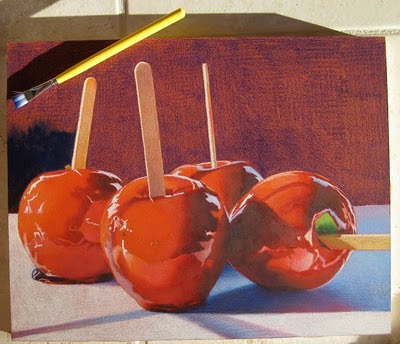
This is how I create my rich dark backgrounds for some of my still life pieces. Just a reminder that I am working on Ampersand Gessobord with a coat of Terra Cotta Colourfix applied on the surface. In the top photo, I've started with a layer of Prismacolor Indanthrone Blue (LF208) but you can also use Indigo Blue. I like the Indanthrone Blue rather than the Indigo because it is not as intense as indigo and more "blue" if that makes any sense. I also don't layer it on very evenly because I'm going to add solvent to melt and move the pencil around so it doesn't matter how neatly it is applied. Next I begin with a small amount of odorless mineral spirits on my brush, sometimes I dab it on a paper towel so it doesn't run or puddle when I apply it to the surface, it just has to be wet enough to melt the pencil so it will almost turn into a paint like substance. I work small areas at one time with a flat brush which is shown in the top left. Its a Loew-Cornell inexpensive wash brush with soft nylon bristles to brush strokes won't show. I purchase this brush at a craft store.
In this photo, the sun is glinting when I took the picture so you can see the strokes in the sunlight but not when it dries.
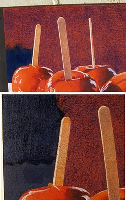
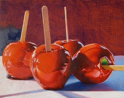
These 2 photos you may have to enlarge to see. I decided to put a lighter blue on top and chose Prismacolor Copenhagen Blue. I apply it on the Indanthrone Blue while it is still a little wet but not too wet or the Copenhagen Blue will mush and not apply. Then I brush it smooth with very little mineral spirits on my brush, almost a dry brush. The top photo shows the Copenhagen Blue smoothed out and the bottom photo shows the area above where I began to work the next section of color. You can see how I apply the Copenhagen Blue in strokes which don't have to be exactly even.
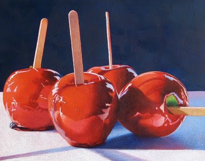
This is the finished background ... however ... I think the backgound is a beautiful color but is too vibrant and is coming forward to compete with the apples and not sitting back as it should be.
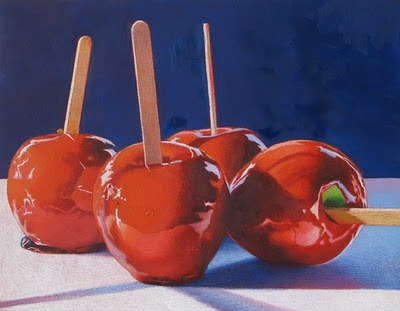
So in order to compensate, I add a layer of Cool Gray 90% to the entire background. I do this by slightly dampening the background working small areas at a time, laying down a layer of the Cool Gray 90% and then gently brushing it smooth. I find that I have to hold it to the light and inspect the finish because some areas are applied heavier than others and can cause inconsistencies. You can always alternate between pencil and brush to make the color more consistent. Sometimes I also use my fingers to move the wet pencil around and remove brush strokes. Like finger painting! In this last photo, the sun was shining when I took the picture so some of the brush strokes are showing. The background of my original is also more gray than it appears in the picture. This whole process for the (11x14") background takes about an hour. I hope this helps if anyone wants to give this process a try!
 This is how I create my rich dark backgrounds for some of my still life pieces. Just a reminder that I am working on Ampersand Gessobord with a coat of Terra Cotta Colourfix applied on the surface. In the top photo, I've started with a layer of Prismacolor Indanthrone Blue (LF208) but you can also use Indigo Blue. I like the Indanthrone Blue rather than the Indigo because it is not as intense as indigo and more "blue" if that makes any sense. I also don't layer it on very evenly because I'm going to add solvent to melt and move the pencil around so it doesn't matter how neatly it is applied. Next I begin with a small amount of odorless mineral spirits on my brush, sometimes I dab it on a paper towel so it doesn't run or puddle when I apply it to the surface, it just has to be wet enough to melt the pencil so it will almost turn into a paint like substance. I work small areas at one time with a flat brush which is shown in the top left. Its a Loew-Cornell inexpensive wash brush with soft nylon bristles to brush strokes won't show. I purchase this brush at a craft store.
 In this photo, the sun is glinting when I took the picture so you can see the strokes in the sunlight but not when it dries.
 These 2 photos you may have to enlarge to see. I decided to put a lighter blue on top and chose Prismacolor Copenhagen Blue. I apply it on the Indanthrone Blue while it is still a little wet but not too wet or the Copenhagen Blue will mush and not apply. Then I brush it smooth with very little mineral spirits on my brush, almost a dry brush. The top photo shows the Copenhagen Blue smoothed out and the bottom photo shows the area above where I began to work the next section of color. You can see how I apply the Copenhagen Blue in strokes which don't have to be exactly even.
 This is the finished background ... however ... I think the backgound is a beautiful color but is too vibrant and is coming forward to compete with the apples and not sitting back as it should be.
 So in order to compensate, I add a layer of Cool Gray 90% to the entire background. I do this by slightly dampening the background working small areas at a time, laying down a layer of the Cool Gray 90% and then gently brushing it smooth. I find that I have to hold it to the light and inspect the finish because some areas are applied heavier than others and can cause inconsistencies. You can always alternate between pencil and brush to make the color more consistent. Sometimes I also use my fingers to move the wet pencil around and remove brush strokes. Like finger painting! In this last photo, the sun was shining when I took the picture so some of the brush strokes are showing. The background of my original is also more gray than it appears in the picture. This whole process for the (11x14") background takes about an hour. I hope this helps if anyone wants to give this process a try!
3 comments:
That is really helpful Kendra .. thanks for sharing.
You must have nerves of steel to add backgrounds after the main subject is finished :o)
Do you mean it takes an hour for the entire process described in the blog post? (Or just the last step?) If for the entire process, that's incredible. I have to start doing my backgrounds your way! Can't wait to see this one at the show. .. .
Sue, I agree that I'm very brave ... or stupid ... to put the background on last! Debbi, it does take an hour or a little more but this piece is only 11x14" and the background only takes up about half of the area. And I've had some practice from other pieces.
Post a Comment