The current drawing I have been working on is a composition Angel Trumpet flowers and Chinese landern on Rtistx white board. Above is a portion of the drawing which wouldn't fit in my scanner, the size is approximately 11x15". Below I have put my reference photo so you can see the basic composition although I am planning to make some changes, mainly simplifying the background (no bricks) and changing all the dark greens in the bottom third of the drawing perhaps one or more flowers. The elements in the photo which enticed me to draw this scene are the sunlit flowers and the blue/orange complimentary colors of flowers and lantern. I started with the Angel Trumpets (my focal points) and then letting the drawing evolve around them.

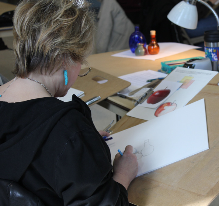
The image below is one of my printmaking experimentations. As I mentioned in the previous blog entry I have been taking a solar printmaking class one day a week for a year now. There are 6 students and the instructor in the printmaking room and we literally shut ourselves off from the world and print to our hearts' content. I enjoy it so much because the printing process is a completely different than working on my colored pencil drawings and sometimes I just want to try another form of art that is different and hands-on.
So after a year of classes I have ended up with many experimental etchings in all different colors and styles, particularly etchings of my Koi fish prints which I experimented on for the portfolio project. I took my various prints and cut them up into different shapes and sizes then gluing the prints onto notecards. This card below is an etching with textured rice paper chiné colléd onto my printing paper and then painted with watercolor on the fish when the print was dry. Thus I have a group of little handmade notecards in which I can to people who will hopefully enjoy them!

While putting together notecards, I got to thinking about art and how I can spend hour upon hour creating (when I have the free time), thus I am never bored. I recently had dinner with two of my close friends who both work in another industry other than art. My two friends were discussing being "empty nesters" with adolescent children going to college or having graduated from college hereby leaving my friends with less household duties and more free time. Both were contemplating what they were going to do with all their time. Of course my first (selfish) thought was ... hmmm, can I put them to work helping me? I did suggest they come to my studio and try their hand at some form of art.
After the conversation, I thought about how lucky I am that I will never be bored because there are several types of art mediums I would like to try and several more I would like to be proficient at. Even when I'm not creating, I'm teaching art classes or looking at art at galleries, exhibits and museums. And I can do all this for the rest of my life, so how lucky am I?
With that being said, I am off to Paris tomorrow and will be towing my somewhat reluctant husband to all the art museums I can see in a week.