This book includes some really good information with beautiful illustrations and easy to follow steps about how to draw in charcoal and pencil, and how to paint in watercolor, acrylic and oil painting. It is a great resource for artists who wish to learn about these different mediums from supplies to lessons and it's all included in one book.
Showing posts with label oil painting. Show all posts
Monday, September 28, 2020
I am a Contributing Author of this New Book!
Monday, August 14, 2017
Colorful Commission
This was a fun commission, done in oil paint for a client. She had a similar reference painting and wanted the woman's face changed to look more like herself plus she wanted her cat Massimo in the painting with her. The style of painting is relatively flat and very colorful so it was fun for me to create, I especially liked working on Massimo - probably because it's another form of a pet portrait.
Friday, November 11, 2016
Small Paintings for Exhibit
Here are three small fish paintings I will be exhibiting in the Providence Art Club Holiday Little Picture Show. The exhibit opens November 13, opening reception 2-4 pm. The exhibit runs through December.
Friday, September 16, 2016
Beach Studios Exhibits in Newport, RI
Here are photos from 12 Beach Studios Artists exhibiting at Spring Bull Gallery in Newport, RI for the month of September. We work in many different mediums, oil, acrylic, encaustic, pastel, colored pencil, monotype printmaking, origami and paper sculpture.
Anne Winthrop Cordin (left) and Susan Petree (right).
Cindy Jordan, origami and paper art.
Cindy Jordan, paper art.
Diane Gay
Helen Woodhouse (left) and Sandra O'Brien (right)
Kathy Morton (left) and Felicia Touhey (right)
My work, Turtle triptych, colored pencil boxes and handmade book.
Helen Hadley and Judy Chaves (right)
Anne Winthrop Cordin's painting demo for Gallery Night last week.
Monday, August 29, 2016
Fish Painting
I just completed this 36x36" oil painting on canvas which was a commissioned piece of artwork for a customer and art appreciator. He came into our artist studio, Beach Studios, to look at art and saw a similar painting in progress on my easel. I had stopped for the day and left the piece on my easel just like this, black and white with just a little blue in the same areas. The customer and his wife liked the piece and asked me to create another for their home. I was more than happy to oblige and enjoyed creating a second painting for them. The piece is unframed, I painted the wrapped canvas edges.
Monday, March 28, 2016
How to Start a Fine Art Collection
Pictured are three of my sea turtle paintings on sale at Epilogues, art and antiques in Bristol, Rhode Island.
I recently started thinking about how art appreciators and art buyers can start their own fine art collection after reading a post on Invaluable.com. During my many years of gallery sitting, I have often found that many people are often intimidated just to walk into a gallery to view artworks. Some people even think they shouldn't come in just to look if they aren't going to buy anything. We all love to view art and we all have our own preferences about types of subjects and styles of artwork we admire. So why is art intimidating? It isn’t! There is no right or wrong, you are free to enjoy any type of art you want to and to be unintimidated to go to any gallery or museum without hesitation just to view and learn more about art.
A nice way to start becoming familiar with art and artists is to start on the computer. Invaluable has a great website with many categories to help viewers become more informed by reading their articles about Must See Art Exhibits, 10 Contemporary Artists to Watch, Old Masters Perfecting the Art of the Frame and many other exceptional categories. You may decide that you’d like to start your own collection of art for your living space or for investment. Reading, researching and observing can assist in learning about art and becoming more familiar with styles of art and different artists in order to purchase and collect pieces. You may decide that you like the old masters’ work or the art of more contemporary artists.
Under the For Collectors on the website, a person can find information about collecting many other categories such as antiques, fine jewelry, decorative art, furniture, Persian rugs, wines and even sports memorabilia. There are even tips for decorating and showing your art in your home. Would you prefer to buy art on line? Would you like to learn how to bid on items in an art auction right in your own home? There are also auction tips and where to find auction houses near your city.
The Invaluable blog In Good Taste will aid in learning how to start a your own art collection and you can sign up to get weekly updates via email. I have found some great articles on the website. Some of the categories I enjoyed reading are How to Start a Fine Art Collection, 8 Must-See Art Exhibits This Spring, Specialists Speak: 2016 Trends & Predictions in Collecting, How To Flawlessly Flaunt Asian Art in Your Home, Up-and-Coming Wines To Collect (or Drink) This Winter and 7 Modern Marvels of Mid-Century Design.
Enjoy the many resources of this website and enjoy reading and collecting!
Thursday, December 18, 2014
Metropolitan Art Museum
Today I spent four hours viewing art in the Metropolitan Museum of Art in New York City, I walked until my feet hurt and my brain was over stimulated from all of the diverse piece of art. This is the main gallery of the armor and weapons gallery. I wasn't planning to view any of this exhibit but wandered through the gallery and was amazed at the intricacy of the coats of armor, padding, helmets, etc; even for the horses. And the design of every piece was so complex, they should be in a museum (as they are) instead of on a battlefield.
Here is a section of the Met's Christmas Tree. I walked though this central gallery several times and each time, I could not get close to the front of the tree. There were so many people standing, viewing and taking photos. There were so many incredible artworks, below are just a few that interested me today.
I was awed by this painting The Weeders by Jules Breton, I'm not sure my photo captures the light and the dusk, the figures are reflected in the orange glow from the setting sun while the crescent moon shines in the distance. I stood and stared for a long time, he captured the peasants pulling weeds with such emotion.
This figure study by Manierre Dawson intrigued me, each figure is a series of shapes as well as the background. It creates an intricate design which interests me.
Here is another realist painting by William Merritt Chase, serene beach scene with colorful umbrellas. The bright umbrellas fascinate me, pulled me right into the otherwise quiet painting.
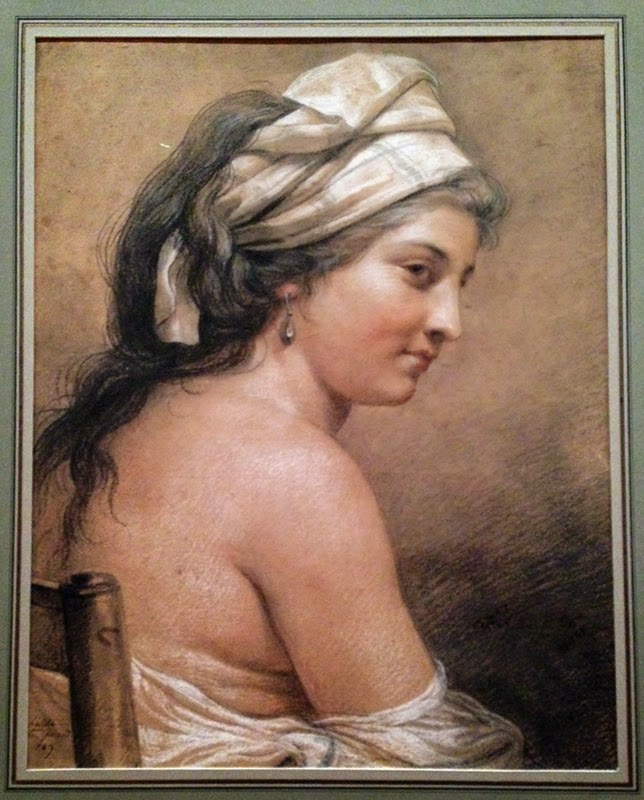
This beautiful drawing is by a woman artist, Adelaide Labille-Guiard, titled Study of a Seated Woman Seen from Behind, it is black, red and white chalk on toned paper. It is very inspiring as I have been thinking quite a bit about creating a tonal drawing on toned paper.
While I walked through the Met I looked at people as well as the art. I stood back at a distance and watched viewers behold the art and I was pleasantly surprised. There was a variety of ages; young to old and a variety of nationalities. Each person was quietly beholding the works of art, many were sitting on benches in the galleries and staring at pieces of art. As an artist I am really pleased to see art appreciated and valued in this way.
Sunday, November 16, 2014
Student Work and Inspiration
I am teaching a colored pencil drawing class at the Newport Art Museum, Newport, RI and I thought I would share our lesson on Friday. My students are beginners to working in colored pencil although most have taken other art classes and open to trying new techniques with colored pencil. For this class, I had them work on 5x7" Ampersand Gray Pastelbords using colored pencil and odorless Gamsol solvent. They each have a set of 48 Prismacolor pencils and we work within the colors contained in the box. I chose cherries as a subject for them and let each person choose the background. They each began by deciding on their composition and then sketching it out. Next adding a layer of colored pencil and working in the solvent with a brush, afterward adding more layers of colored pencil to the wet solvent and later more when the area had dried.
On Saturday I went up to Boston with a friend to visit the Richard Schmid, Nancy Guzik and Kathey Anderson oil exhibit at the St Botolph Club and the Boston Fine Arts Expo. Besides being back in my old Copley Square neighborhood from my college days, I really enjoyed and was inspired by all the wonderful art at both events and the American Art Collector magazine I picked up on the way out. Although, there are mostly oils at the Fine Arts Expo, there were some pastels and watercolors but a very few drawings and no colored pencil. Much of the work was from the 19th and early 20th centuries, although some contemporary artists mixed in. Still inspiring but got me thinking how can professional colored pencil works become included?
Friday, March 30, 2012
I Could Paint Red Shoes for a Year!


Sunday, March 25, 2012
Complementary Color Painting Workshop


Monday, June 6, 2011
Portrait Workshop with Michael Peery


Michael Peery is a fantastic painter from New London, Connecticut and teaches at both Rhode Island School of Design and Rhode Island College. His portrait and still life work is just fascinating and American Artist magazine published an article about his inspirations, style of painting and his works in the March 2010 issue. I have included the links.
To paint the portrait, we learned Michael's technique of mixing the basic or beginning flesh tones from flake white, transparent red oxide and payne's gray. A series of colorful grays or flesh tones are created (see Michael's value chart above using these three colors only). He prefers flake white to titanium for more subtle flesh tones, often the painter may achieve a pasty or chalky look mixing with titanium white. I have to add that one must be careful working with flake white because it has a lead base. From that basic palette we mixed other colors as we began laying in the values and hues of the figure.
The bottom photo is Michael's demonstration of how he begins the portrait painting and shows his palette with transparent red oxide, payne's gray and flake white value mixtures in the center and other colors in his palette surrounding them.
I'm going out on a limb and posting my painting in its beginning stages. Because after this, I started to really mess her up! I'm still learning oils and the portrait process is soooo slow for me. Our model was lit by two lights; the brightest light source on the left and a more subtle greenish light on the right which highlighted our model in green and allowed us to experiment with green in skin tones. I love color so I found that part fascinating. With two light sources, we learned about transition shadows on the flesh as it turns from one light source to the next. I had fun with the colorful shadows and highlights on the model's skin and hope to eventually finish this piece in my studio.
Subscribe to:
Posts (Atom)