Showing posts with label Colourfix. Show all posts
Monday, July 21, 2014
Colored Pencil Cherries
Here is the 12x12" colored pencil drawing that I have been working on. As I mentioned in a previous post, I am working on 12x12" cradled Ampersand Gessobord with a coating of Colourfix liquid primer to hold the layers of pencil. I began by putting down one layer of color in the cherries and then adding solvent (odorless mineral spirits) with a small brush to the pencil to dissolve it and make it start to flow like paint. Into the wet pencil, I added more layers of pencil and then almost a dry brush to dissolve those layers and make them flow. This is how I achieve such rich colors. When the cherries were finished I worked the stems and then the shadows and patterns of the dish below in the same way but careful around the edges of the cherries. I find it's better to use less solvent so it doesn't get runny or to dab the brush on a cloth or paper towel before applying it to the drawing. For the white surface under the plate I used white Prismacolor and white #8052 Stabilo Aquarellable pencil. I like the Stabillo pencil because the lead is soft but not flaky and I can get good white coverage.
To finish this piece, I will spray with Lascaux Fixativ to preserve it. Next I will spray three coats of Krylon Kamar Varnish letting each dry in between.
Wednesday, June 18, 2014
Underpainting for Cherries
| Cherry drawing with colored pencil and mineral spirits |
Now I am working one cherry at a time, adding odorless mineral spirits with a small, soft flat brush and then more colored pencil over the mineral spirits while it is still wet. When I achieve the density of colors I want, I will move onto the next cherry although when I have completed each one, I will go back and refine areas and colors.
Friday, December 21, 2012
Dog Portrait of Bentley
Just finished this 9x12" dog portrait for a customer who called me a few weeks ago but we ended up meeting just last Friday. He asked if I could do a portrait of his recently deceased Yellow Lab named Bentley. The portrait is going to be a surprise for his wife for Christmas. I was really nervous about this commission for two reasons: first I had never met the dog. If possible I like to try to see the pet in person but of course this wasn't an option. Second, I only had a week to work on the portrait along with all of my other holiday preparations. I suppose I can say that I work good under pressure because I finished the portrait and met with the customer yesterday and he was very happy with the finished piece and the likeness of his dog. I breathed a sigh of relief.
The portrait is on 9x12" 3/4-cradled Ampersand Gessobord. The customer requested that I add the colored pencil to the sides in the event he and his wife didn't want to frame it. I applied gesso to all of the sides of the Gessobord, then coated the top and sides with light blue/green color of Art Spectrum Colourfix primer (which it appears they don't make anymore) mixed with Ultramarine Blue Art Spectrum Concentrated Ink to achieve the background color I'm looking for. I worked on the surface with colored pencil and solvent (odorless mineral spirits) so the pencil will adhere like paint and I can move it around and remove surface texture.
After the holidays, the customer is returning the piece to be varnished. He is asking for a flat matt finish in a varnish with no sheen on the surface. The varnishes I use are somewhat shiny and have a little bit of a sheen so my next step is to find another varnishing product to use. If anyone has any suggestions, let me know.
Friday, November 9, 2012
Working with Dynasty Brush Company
In the above photo I'm using a Dynasty Brush Mongolian Sable flat brush to add odorless mineral spirits to my colored pencil so I can move it around like paint. This is a commission piece I am working on for a customer, it is 6x24" on 2" cradled Ampersand Gessobord coated with Terra Cotta tinted Colourfix Primer which gives it a nice texture to work on.
For another totally different method of working with colored pencil, I'm using Dynasty Brush Deerfoot IPC (ink, pastel, charcoal). This rounded brush has a flat angled end (like a deer foot) which is perfect for burnishing my colored pencil work and pushing the pencil into the grooves of the paper. I'm using UArt 800 grit sanded paper with Faber Castell Polychromos pencils. The Polychromos are less waxy than other brands and lend themselves to being applied to the sanded paper in a similar method to working with pastel.
I may have mentioned previously that Dynasty Brush Company has offered me an opportunity to experiment with several of their different types of brushes and has featured me, my artwork and recent accomplishments in this blog entry on their website, the link to my article is here. I'm really honored to be chosen to be able to try the various Dynasty brushes in my colored pencil work, and also a little bit with oils and watercolors. I am always trying new methods and materials when working with colored pencil in which to work quicker, as we all know that colored pencil can be timely and require much patience. I also look for ways in which to smooth my colored pencil work when using a very textured surface which I often do.
Tuesday, April 17, 2012
Dunes and Clouds, Colored Pencil and NeoColor
Working on a 6x18" Cradled Gessobord, I have created this atmospheric beach dune and sky drawing. On the left, my sky is underpainted with NeoColors to which I added water, dissolved the crayon for a background wash. The foreground I laid in with colored pencil and dissolved with some mineral spirits instead of using the NeoColors. On the right, is my finished piece. I added colored pencil to the clouds and softened some of the darker blues. I also added some mineral spirits to the clouds to smooth them out and lose the texture of the board showing through. Then I added color to the grasses in the foreground with colored pencils and NeoColor crayons.
Monday, April 16, 2012
Field & Sky Colored Pencil & NeoColor
I have decided to work on a few landscape pieces in a loose, flowing style with lots of colorful clouds and an airy feeling. The surface I decided to use is 2" cradled Ampersand Gessobord covered with Coloufix Primer in white which I tinted pink for a soft, warm base. The top image is the underpainting which I worked in NeoColors then added water and dissolved to make a nice surface to work on.
Next I added colored pencil and then more NeoColors on top of some of the colored pencil. I like the "pebbly" effect of the NeoColor crayon on top of the colored pencil, it looks almost like pastels without the chalk and the dust, plus I can varnish over top. This piece was really fun and I like the results!
Thursday, April 12, 2012
Evening Colored Pencil Class Drawings
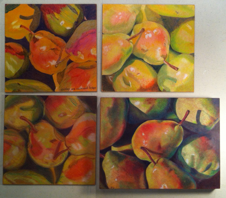
My evening class has been working on a drawing of pears on a surface of Ampersand Gessobord covered with Raw Sienna Colourfix primer. We worked from one of my photos and I had them begin by laying in color with Caran D'Arche NeoColors then adding water with a brush to push around the NeoColors around as an underpainting. When they were satisfied with the background, they began rendering the pears with colored pencils covering the NeoColor base. Here are four of the examples of my student's work which I think are all fabulous! Notice the two on the left are more abstract, the student who worked on the top left piece, chose to focus more with the NeoColors and the water to create more of an abstract look. She only added a little bit of colored pencil to the top, she is a quilter and enjoys bright colors. The bottom left piece has some great bold areas of color. The top right piece was rendered in lighter colors and the artist chose to let the pink and peach colors in the pears show, for a softer look. The artist who worked on the bottom right piece used Prismacolor Peacock Green for the darker valued and shadowed areas of the pears. A color I wouldn't have thought of myself but I really like the vibrancy it gives, the pears almost glow.
Friday, February 3, 2012
Sailboat on Gessoed Board & Ann Kullberg's New Book


I found this 11x14" cradled gessoed board at our local Michael's Craft store and liked it because the sides were gessoed as well as the surface. I decided I could try to "wrap" my colored pencil drawing on all four edges as oil painters often do when painting canvases. I applied a layer of Art Spectrum Colourfix Primer to the surface of the gessoed board including all four edges with colored pencil and mineral spirits to dissolve the pencil in areas so it will apply as paint. For the sky and cloud area I often used my finger to blend the colored pencil and mineral spirits to create a smooth surface. After I completed my drawing on the surface, I continued the picture on the sides. This was a bit of a challenge because I had to hold the board sideways or in my lap to work on each edge. I kept the edges simple, just a continuation of the water, sky and landscape. I think it looks really cool and I'm going to hang it in the gallery today, I'm wondering what kind of a response it will receive. I like to listen to the viewers' comments. I am also excited to be one of 70 artists selected for Ann Kullberg's new book "CP Treasures". You can view a preview of the book here. Click on "view partial image" and you can browse through the pages and see a small thumbnail of each of the illustrations. My piece "Splendor" is on page 53. The illustrations in the book are fabulous, drawn by some fabulous artists! I can't want to see the book when it's published.
Saturday, October 22, 2011
Neo Color & Colored Pencil Workshop


Yesterday I taught a one-day workshop on working with Neo Color II watercolor crayons as an underpainting and colored pencil on top. My five students had done little or no colored pencil in the past but are all artists working in different mediums. I've included the reference photo of the pears to show the colors and composition we would be working on. The surface we used was Ampersand Gessobord primed with Terra Cotta Colourfix. Pictured above are their drawings. This could actually be a 2-day workshop because there was not enough time to complete the work in one day. We began by lightly laying down one layer of the Neo Colors and next adding water with a brush and disolving the color to look like an underpainting wash. After this dried, students began working with the colored pencil and again adding some of the Neo Colors letting them blend with the pencil, not adding water this time. I love all of the results! A few of the students commented that their work didn't look like mine but I was happy that each person developed their own style and I could see influences of the other mediums they work in coming through. I was really excited with each of their drawings and hope they all take the time to complete them!
Sunday, August 28, 2011
Five Colorful Koi
Today I finished my koi drawing in the midst of Hurricane Irene which was, fortunately, downgraded to a tropical storm by the time it hit Rhode Island. We lost power early this morning and have been without it all day. The nice part about being a colored pencil artist is that I can still work without power (as long as it is daylight!) all I need are my set of pencils and battery operated pencil sharpener. Over the last few weeks, I fussed with the colors and patterns on this piece, toning down the bright colors in the water so they wouldn't overpower or detract from the koi fish. My favorite fish is the large white one on top although another artist who saw the work in progress liked the two at the bottom because they had more contrast. I was hoping to create some of the koi with more detail than others and all of them to have an abstract quality. I'm happy with it and ready to finish it and deliver it to the gallery this week.
I'll spend the rest of the day going through photos and notes, trying to decide on my next piece. I prefer to have the next piece in mind before I even finish the current one but preoccupations with the coming hurricane this week kept me from that. We were really worried about how hard we were going to be hit and watched the Weather Channel every day. However, it's difficult for any of the weather authorities to predict the path until it's almost here!
Monday, June 13, 2011
Neocolor II Playtime!
Two weeks ago in my class, we experimented with Neocolor II water soluble crayons and I liked them so much that I ordered a set of 84 crayons to try. They just arrived and I just couldn't wait to begin. I decided to create a small candy apple piece because I'm anxious to see what kind of candy apples I could do with these crayons. I am using an 8x8" 2" cradled gessobord coated with (my usual) Terra Cotta tinted Colourfix primer. In the top photo, I've lightly covered the surface with the Neocolors and begun adding water to just the background blue which becomes incredibly vibrant when water is added.
Now I've added water to all of the color and tried (somewhat unsuccessfully) to make the color flow and even it out. First of all, I have to remember that the crayon color becomes incredibly vibrant when water is added. Secondly, It can be difficult to brush out evenly, see the blue on the right? No matter how hard I tried, it would just keep lifting off the surface. The bright purple, pink and red apples look a little funny but my intention for them is to be a colorful underpainting.
Now I am refining the drawing. The textured surface and the thick layer of the crayon are keeping this drawing somewhat abstract and do not allow me to achieve a very smooth surface. But its okay because I'm enjoying this process and the experiments. After adding the pencil, which is flaking off like crazy, I'm adding another layer of crayon. I'm leaving this layer dry but I like what I'm achieving, its beginning to look like pastel.
Friday, June 10, 2011
The Intricate Insides of Peppers

Earlier this week I was reading through some artist blogs and found an oil painting of an inside of a pepper by Cindy Haase that I found so fascinating and decided to have my colored pencil classes try drawing this same subject. I purchased yellow, orange and green peppers in intricate shapes, cut them in half and let each person choose one (with the exception of one student who wanted to draw a whole pepper and another who chose to draw stones). The morning class drawings are in the top photo. We used UArt 800 grit sanded pastel paper which is a finely sanded surface and a light beige background. The evening class worked on the Aubergine Colourfix paper because the additional UArt paper I ordered for this class arrived in a coarser grit which we couldn't use for colored pencil. Both surfaces worked well with the peppers in terms of background and contrast. I'm thinking about working on a whole composition of pepper halves.
Wednesday, May 25, 2011
Experimenting with Neocolor II Water-soluble crayons

On Tuesday, my morning colored pencil class and I experimented with the Neocolor II crayons as an underpainting for our still life drawings. In advance for the lesson, I prepared the surface for us to use. I took a sheet of gatorboard and covered it with with two coats of Storm Blue Colourfix liquid primer then cut it into 8x10" pieces for each person. The surface worked out perfectly for our application of the Neocolor crayons, a little water and then colored pencil on top. Colored Pencil artist Ranjini Venkatachari uses this method so successfully, I wanted to give it a try. I read my class Ranjini's recent blog post on how she uses the Neocolor II crayons with colored pencil and then we tried it.
In attempt to keep the lesson simple, our still life subjects were different pitchers and each student chose one. First we applied the Neocolor II crayons lightly and evenly all over the drawing, not paying attention to detail and blocking in large areas. We only had small sets of Neocolors so we had to choose from what colors were available. Secondly we brushed on water and wet the crayon, dissolving it and giving the background a smooth underpainting. Next the surface had to dry and we found we could speed up the process by using a hair dryer and after it was dry we began adding in colored pencil and start drawing and defining colors, shapes and values. The surface is so textured that it will take many layers of pencil and crayon and I even added more crayon on top of the pencil giving it almost the look of a pastel. Pictured is my experimental drawing which I really had fun with.
Now I am anxious to buy a BIG set of the crayons and experiment more of this method. So I'm looking for a sale on-line!
Thursday, April 28, 2011
Brightly Colored Orchids
I put the golfers aside and started a new colored pencil drawing. This one is on 12x12" Ampersand cradled gessobord. The surface of the gessobord is coated with Burgundy Colourfix liquid primer mixed with red Art Spectrum Liquid Spectrum ink to brighten the burgundy colored base. I chose this color for the background because I feel it will compliment the bright purples of the orchid blossoms nicely and still work well with the greens of the leaves. My reference photo is at the top of the photo.So I began by drawing in the white areas of the flowers and little yellow centers. Most of the white areas are drawing with white pencil although I used some Powder Blue, Cream and Peach for the flowers behind others. The nice part about this textured surface is that it will take many layers and I can adjust any color or value issues that I need to.
Next I moved onto the leaves and began choosing and laying in some greens. I am using gray greens; Sage, Kelly, Celadon and Limepeel rather than the bright greens. I want the blossoms to pop forward and the green leaves to settle in the background. I'm going to have fun with this piece, especially the beautiful purples and bright pinks of the orchids themselves.
Monday, February 7, 2011
An Eventful Week
I was down for the count this past week with the flu, couldn't believe it because I don't think I've ever had the flu before and have never considered getting a flu shot. That might change now because I spent a miserable week of laying around in bed. The next thing that happened was a little more exciting ... for a moment or two. I was contacted by an art gallery in New York City asking if I would be interested in being represented by them and could they send me their contract to look over. This really excited me, a gallery in NYC looking to represent me? And I didn't even have to hit the pavement with my portfolio! However, when I read over the contract I realized they are looking for the artist to pay $2950 per year for representation. It seems that most of the art exposure is through their website or advertisements, and perhaps for one collective exhibit in the gallery itself. Plus they still take 30% commission on sales. I'm not in a position to spend this kind of money but I'm wondering if anyone else is familiar with this practice or have heard whether an arrangement like this is worthwhile? I would be interested in comments.
Meanwhile, I have started another candy apple piece for my Rock/Candy exhibit with Debbi Friedman. The surface is 3/4" cradled Ampersand Gessobord with Terra Cotta Colourfix Primer, the usual surface I like for my candy apple pieces. I add a little bit of water to the Colourfix before applying it so the surface is a little less textured. I've started by laying on the first layer of color on the apples, mingling the pinks and reds.
Friday, October 15, 2010
Plums
I was asked to do a 6x12" commission piece of plums for a kitchen wall so this is the composition we came up with. Its colored pencil on the Colourfix primed Gessoboard that I like working on. The customer wanted a gray background and I like the way the background came out. I might not have thought of it myself. Plums are challenging, trying to achieve the light blue tones on the dark colors of the skin without making them look fake.
Tuesday, July 6, 2010
Japanese Koi
I took photos of colorful koi when I was in Napa Valley a few years ago. One of the wineries had a beautiful koi pond that really inspired me. And Providence Art Club is having a members' exhibit in which the theme of the artwork is vertically or horizontally much longer than the width. So I chose the koi as my subject. I worked on the cradled gessoboard and this piece is 6x24". I did change the color of the original water, it was more yellow green and I prefer the aqua blues and greens to compliment the fish. I like it so much because its more abstract than most of my work. Sometimes I like to move away from always being so photorealistic. So this piece is hanging at the Providence Art Club until August 31st.
Thursday, February 5, 2009
The latest in desserts
Tuesday, January 13, 2009
The next wave
This is the next wave that I have started. Its cradled gessoboard again, this time 16x20". The Colourfix ground is Terra Cotta with White and Burgundy mixed in so that its not so orange-y. I'm working from the top downward because the pencil flakes off so easily, I don't want to wear it off with my arm on the paper. I took this photo at night and I'm noticing the colors are a little bit off, especially the sky. What attracted me was the large wave in the center and all the colors it contains: greens, purples, blues, grays. The ocean behind is a turquoise/gray. Each time I go to the beach, the colors of the sky and ocean are different. This time of year, everything can be gray but I'm finding such beautiful shades of gray and colors in the grays.
Sunday, November 9, 2008
Orchid Series
Subscribe to:
Posts (Atom)