Showing posts with label portrait. Show all posts
Sunday, December 29, 2019
Making People Happy with My Art!
I created this colored pencil drawing in black and grays for this happy couple. The surface is vellum surface bristol paper. The portrait is of Linden Place in Bristol, RI. This couple were married in the Linden Place ballroom and grounds in 2013 and asked for a black & white photo of Linden Place for Christmas. The husband's parents went one step further and asked me to draw the portrait instead of giving them a photo. I was happy to draw the portrait and even happier when I heard how much they loved it!
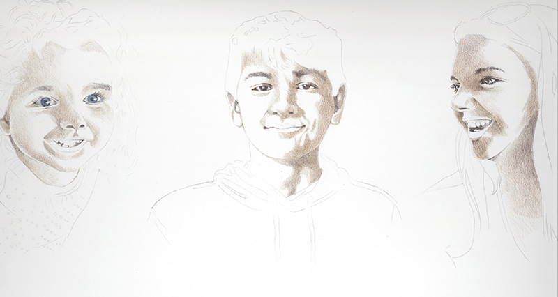
This is a second colored pencil portrait I was commissioned to work on for a Christmas gift of three grandchildren as a surprise for their grandparents. I worked on Cream Legion Stonehenge paper using both Prismacolor and Caran d'Ache Luminance pencils. I took a few pictures of my starting process, I began with brown shadowed undertones using Prismacolor Light Umber and Sienna Brown pencils. I then added Prismacolor Dark Umber, Periwinkle Blue and Luminance Violet Brown to shadowed parts then added Luminance Anthraquinoid Pink to rosy areas. I added pink and skin tones over the darker colors and later lifted a bit of dark areas with a kneaded eraser.
This took me a while and I have to admit I was very nervous about how the finished portrait would be received. Unfortunately I have never met these children and worked from various photos given to me. I hoped that I captured the likenesses enough to please the grandparents and I understand they are thrilled with the portrait so that made me very happy! and relieved!
Saturday, December 28, 2019
Colored Pencil Dog Portrait Commission
This is a recent 8x8" dog portrait I created in colored pencil for a client to give as a gift. The dog's owner lost this attractive guy earlier in the year and misses him terribly. I worked on Canson Ingres gray paper that I would later to mount to an 8x8" DaVinci Medium Textured Canvas Panel from Jerry's Artarama. You can see the progress in the photos above. I used Prismacolor, Caran d'Ache Luminance and Derwent Drawing brands of colored pencils to create the portrait. I also burnish the colored pencil layers with a stiff brush to smooth out the pencil and alleviate the texture of the paper showing through.
I recently purchased a set of 24 Derwent Drawing colored pencils and have been liking their soft buttery feel as well as the range of colors, many are earthy natural colors perfect for creating pet portraits. These pencils also claim to be extremely lightfast.I try to choose the most lightfast pencils for my works so they won't fade through the years.
After mounting and trimming the edges of the paper to the canvas panel, I spray varnish the piece and edges with Krylon UV Resistant Clear to seal the colored pencil and then 3 coats of Krylon Kamar Varnish allowing each layer to dry in between.
Monday, March 28, 2016
How to Start a Fine Art Collection
Pictured are three of my sea turtle paintings on sale at Epilogues, art and antiques in Bristol, Rhode Island.
I recently started thinking about how art appreciators and art buyers can start their own fine art collection after reading a post on Invaluable.com. During my many years of gallery sitting, I have often found that many people are often intimidated just to walk into a gallery to view artworks. Some people even think they shouldn't come in just to look if they aren't going to buy anything. We all love to view art and we all have our own preferences about types of subjects and styles of artwork we admire. So why is art intimidating? It isn’t! There is no right or wrong, you are free to enjoy any type of art you want to and to be unintimidated to go to any gallery or museum without hesitation just to view and learn more about art.
A nice way to start becoming familiar with art and artists is to start on the computer. Invaluable has a great website with many categories to help viewers become more informed by reading their articles about Must See Art Exhibits, 10 Contemporary Artists to Watch, Old Masters Perfecting the Art of the Frame and many other exceptional categories. You may decide that you’d like to start your own collection of art for your living space or for investment. Reading, researching and observing can assist in learning about art and becoming more familiar with styles of art and different artists in order to purchase and collect pieces. You may decide that you like the old masters’ work or the art of more contemporary artists.
Under the For Collectors on the website, a person can find information about collecting many other categories such as antiques, fine jewelry, decorative art, furniture, Persian rugs, wines and even sports memorabilia. There are even tips for decorating and showing your art in your home. Would you prefer to buy art on line? Would you like to learn how to bid on items in an art auction right in your own home? There are also auction tips and where to find auction houses near your city.
The Invaluable blog In Good Taste will aid in learning how to start a your own art collection and you can sign up to get weekly updates via email. I have found some great articles on the website. Some of the categories I enjoyed reading are How to Start a Fine Art Collection, 8 Must-See Art Exhibits This Spring, Specialists Speak: 2016 Trends & Predictions in Collecting, How To Flawlessly Flaunt Asian Art in Your Home, Up-and-Coming Wines To Collect (or Drink) This Winter and 7 Modern Marvels of Mid-Century Design.
Enjoy the many resources of this website and enjoy reading and collecting!
Wednesday, November 28, 2012
A Different Kind of Portrait
I had forgotten to share this photo of a portrait I had been commissioned to draw so I'm going to post it now. This portrait was done as a surprise for it's likeness, Angie, pictured here with the drawing. I had been asked by one of Angie's friends to draw a portrait of her from this self portrait photo that she took of herself and present it to her at my Providence Art Club exhibit. Pictured here, she is seeing the drawing for the first time. And since this was a surprise for Angie, I didn't post the image as I was working on it and then just got busy, absentmindedly forgot, so I'm doing it now.
The photo was black and white but had a sense of color to the gray tones. I was intrigued by her pose, the colors/values and the body art on Angie's forearm which reads Harmony, a tribute her young daughter. I used only a few colored pencils to achieve this the values: Slate Gray, Cool Grey 50%, Tuscan Red, Indigo Blue, Black Cherry, Black Grape and Black. While I wanted it to read as a black and white photo, I chose to give it warm tones of colorful darks. I worked on Strathmore rag illustration board which has a texture so I used bristle brush to burnish the colors into the board as I was working. The most difficult part was the top left which is a solid dark. I achieved this by layering color over color starting with Tuscan Red, adding a second layer of Indigo Blue and a third layer of Black Grape using a light even pressure then burnishing between each layer of pencil. This combination was too colorful and not dark enough so I added a layer of black on top letting the bottom layers of color show through. It took several layers and a lot of burnishing to achieve the rich dark I was looking for.
Our Art Boot Camp ended yesterday and I have to say it was a rewarding session for both students and instructors myself and Felicia Touhey. I have to share one comment that was made at the end of class when the students were laying out their work for everyone to view. One of the students said to Felicia and I with a big smile on her face: "You must be so proud of us and all that we achieved in this session!" Yes, we are absolutely proud of the students. To me that is the biggest reward an instructor could want, helping students to learn, to grow and feel a sense of accomplishment.
Wednesday, September 7, 2011
My Drawing of Bandit
I enjoyed working on the Ampersand Pastelbord (size 8x10"), the surface takes the layers of pencil so easily and quickly. As I mentioned in the last post, I really like the ability to layer light colors over dark. There are so many colors and values in the fur that I like having the ability to keep going back and adding to what I've already drawn. I am using all Prismacolor pencils for this piece and decided on a blue/gray background to compliment the warm tones of Bandit's fur.
Thursday, September 1, 2011
Portrait of My Dog and Hurricane Photos
For the longest time my family has been asking me to draw a portrait of our beloved Yorkshire Terrier, Bandit. Seeing that Bandit is the spoiled baby of the family I have oodles of photos of him but not a single photo has inspired me to draw him, I keep pondering. However, earlier this summer, I took a close up head shot of Bandit with his fur blowing in the wind and decided I would start a small 8x10" portrait and just have some fun with it. The surface I'm using is Ampersand Pastelbord.
I've included some photos I took immediately following "Tropical Storm" Irene which was thankfully downgraded from a hurricane 1 category. We lost power for 26 hours between Sunday and Monday but there are still many areas in our town and nearby towns that still don't have power and may not have it until after this weekend. The above photo is a tree that fell into a field at the end of our street. The funny part is that this big heavy tree is merely resting on the stone wall which is still completely intact.
This is the dock a little way down the street from us. As the hurricane passed, the danger became the dangerously high "moon" tide and what damage it would cause. Water is almost to the top of the dock and usually about 5 or 6 feet of supports show, the water has also covered the beach and come up into the grassy area. Incidentally, movie scenes were filmed on this dock back in May, its titled "Moonrise Kingdom" and actors include Bill Murray and Bruce Willis. I saw all the traffic and security and had no idea at the time that Bruce Willis was right down the street.
These two photos are of Sandy Point Beach on the Sakonnet River. We rarely see waves, Sandy Point is a very calm, sheltered beach so this was exciting to see. Again, due to the high tides, the sand on the beach is completely covered. I like the atmosphere, the deep grays and the strength of the waves in both of these photos. Future colored pencil piece? Maybe!
Monday, June 6, 2011
Portrait Workshop with Michael Peery


This weekend I took an oil painting portrait workshop with Michael Peery. I took this workshop for two reasons, I am hoping what I learned will help me with my colored pencil portraits, in terms of color and value and rendering the human figure. I also wanted to do something different and out of the box for me. I always believe that one medium will influence another.Michael Peery is a fantastic painter from New London, Connecticut and teaches at both Rhode Island School of Design and Rhode Island College. His portrait and still life work is just fascinating and American Artist magazine published an article about his inspirations, style of painting and his works in the March 2010 issue. I have included the links.
To paint the portrait, we learned Michael's technique of mixing the basic or beginning flesh tones from flake white, transparent red oxide and payne's gray. A series of colorful grays or flesh tones are created (see Michael's value chart above using these three colors only). He prefers flake white to titanium for more subtle flesh tones, often the painter may achieve a pasty or chalky look mixing with titanium white. I have to add that one must be careful working with flake white because it has a lead base. From that basic palette we mixed other colors as we began laying in the values and hues of the figure.
The bottom photo is Michael's demonstration of how he begins the portrait painting and shows his palette with transparent red oxide, payne's gray and flake white value mixtures in the center and other colors in his palette surrounding them.
I'm going out on a limb and posting my painting in its beginning stages. Because after this, I started to really mess her up! I'm still learning oils and the portrait process is soooo slow for me. Our model was lit by two lights; the brightest light source on the left and a more subtle greenish light on the right which highlighted our model in green and allowed us to experiment with green in skin tones. I love color so I found that part fascinating. With two light sources, we learned about transition shadows on the flesh as it turns from one light source to the next. I had fun with the colorful shadows and highlights on the model's skin and hope to eventually finish this piece in my studio.
Friday, January 28, 2011
Elaina's Portrait
I have so many colors in this portrait that I'm starting to lose my sanity! I wouldn't recommend working on a portrait of someone from a photo and not being able to see that person in life. This is my niece who lives in Arizona so I am relying on photos in which to work from. The photos flatten and dull her skin tone so I am trying to bring her skin tones to life. Today I asked one of the artists in the studio to help me. First thing she said was that I had done an incredible job with the hair. I must say that I really enjoyed rendering the hair but its the face I want to bring to life. The she said I added too much brown to her skin tone and she needed more warm pinks and oranges to make her look like a child. I agreed because I had added Prismacolor Chestnut and Black Raspberry which are nice warm purple-browns but they dulled her complexion. Thank goodness Stonehenge paper erases so easily. I lifted off the brown tones and gave all of her skin tone a wash of Prismacolor Pale Vermillion which warmed everything up. So upward and onward I go with the portrait hoping that one of these days I will have my skin colors down to a science like my candy apple colors!
Sunday, January 23, 2011
Working on Two at Once!
I started going to a new acupuncturist late last summer and when she found out I am an artist, she told me that she could heighten my creativity and creative ideas. Well, I think its working because I've got so many ideas rattling around in my head that I just wish I had more time to put them all down on paper or board. For the time being, I will settle on finishing these two pieces. I'm working on the surface the vase of tulips is sitting on. I started with a layer of Powder Blue, then a layer of LF285 LIght Oxide and added solvent to blend the two. While the solvent was wet I added a layer of Cool Grey 30% - working only small areas at a time. While the glass table surface was that color, it appeared too light in value for the rest of the drawing. When it dried, I added many light layers of colors, so many I can't even remember them all because I've been going back and forth with light layers. I think I can name some of them; Periwinkle Blue, Parma Violet, Violet Blue, Cool Grey 50% and 70%, Kelly Green, Dark Green, and Tuscan Red. I think it may be just about done but I've stood it in my studio and every time I walk by, I'll look at it and ponder what more needs to be done.
I'm back to Elaina and working on her skin tones. In lightest areas I've added Deco Peach and Deco Pink over the color already there. I also think that parts of her too purple-brown (such as the shadowed area on her bottom arm that will need to be fixed. I'm added Periwinkle, Blue Violet Lake and Coloursoft Grey Green (one of my favorite colored pencils!) to the shadows in her skin tones and Spanish Orange for the glow in her face, which I may decide to take out later. Portrait work, for me, is a learning experience and goes slowly but I'm a perfectionist and enjoy the journey!
I'm back to Elaina and working on her skin tones. In lightest areas I've added Deco Peach and Deco Pink over the color already there. I also think that parts of her too purple-brown (such as the shadowed area on her bottom arm that will need to be fixed. I'm added Periwinkle, Blue Violet Lake and Coloursoft Grey Green (one of my favorite colored pencils!) to the shadows in her skin tones and Spanish Orange for the glow in her face, which I may decide to take out later. Portrait work, for me, is a learning experience and goes slowly but I'm a perfectionist and enjoy the journey!Thursday, January 6, 2011
Portrait of Elaina

After working on the portrait of my niece, Samantha, I decided to try my luck with a portrait of another niece, Elaina. Elaina is 3 years old in this photo and she lives in Arizona so her skin is always a bit tan. Her olive complexion is unlike Samantha's creamy skin so I find myself using all different pencils. As you can probably tell, I was really intrigued with her hair and began at the top. I think I used every brown plus some warm yellows and purples. For her skin, I began by putting a layer of Prismacolor 939 Peach on her skin. Then Mineral Orange, Rosy Beige, Clay Rose, Blush Pink, Burnt Ocher, Henna, Luminance Manganese Violet, Chestnut, Periwinkle and I'm far from being finished. The biggest challenge I'm finding is to capture her olive skin tones without making her skin look like wood. I am cautiously layering skin tone colors!
Sunday, August 1, 2010
Samantha is going to New York City
I just found out that "Samantha" has been accepted into Catharine Lorillard Wolfe Art Club's 114th Annual Exhibition at the National Arts Club in October. I'm very excited because this is the largest colored pencil portrait I've attempted. This is my third acceptance to CLWAC so I'm requesting full membership to the organization.
Subscribe to:
Posts (Atom)


