Showing posts with label CPSA international exhibition. Show all posts

Tuesday, September 29, 2020

Balancing My Tea Cups

I haven't been writing on my blog too much lately and mainly because I have been working on my colored pencil drawings and a few other things. Since the Covid began and I found myself spending more time in the studio, I decided to work on a series of drawings using tea cups as my subjects. I am working these drawings where I am stacking tea cups and also another group of drawings where tea cups are reflecting polka dots, linking to a previous post here.

Many of these tea cups belonged to my (late) mother in law who had them displayed on a shelf in her dining room but later on dismantled the display and gave me the cups. I kept them wrapped and tucked away for many years with thoughts of drawing them in colored pencil. My favorite is the Dragon Tea Cup which is at the very top of the above drawing. Over the years I have collected several others including the colorful bull (just below) from Barcelona Spain and the butterfly cup sent to me by a favorite cousin. 

The first drawing A Fresh Start (19x11") was accepted into the Colored Pencil Society of America's 28th Annual International Exhibition (click on the link to see some incredible colored pencil artworks) and sold shortly after the exhibition came on-line. The second drawing (below) Precarious Balance (18x10") was shown at the Providence Art Club Fall Member Exhibit. 

Both drawings were worked on Strathmore Series 500 Illustration board using a mixture Prismacolor, Caran d'Ache Luminance and Faber Castell Polychromos colored pencils. The Polychromos are a harder pencil and good for rendering smooth glassy surfaces by filling in the paper's "tooth". Prismacolor and Luminance have such rich color, Luminance being more fade resistant so I tend to use them more. 

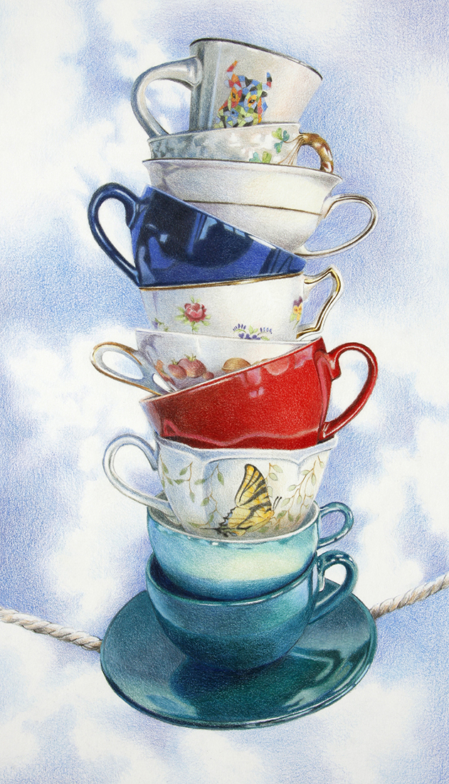
Here I go again with a third drawing. This time I attempted to stack nine tea cups and photograph the stack. I use my hot glue gun and fishing line to hold the stack of cups in place. I glued the spools of thread between cups in order to give each one the correct height. As you can see, this group tumbled and I had to superglue one tea cup back together. As I draw, I work from my photos and shortened stacks of two or three cups to get perspective, color and shading. 

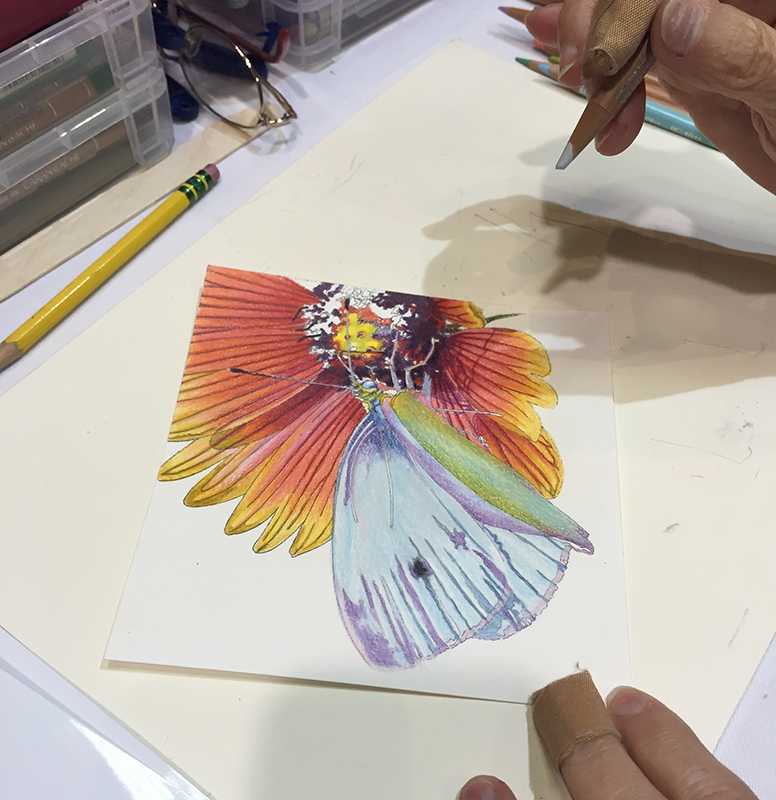
This is a quick photo of my start for this drawing, beginning with the top cups. I draw the design and shading on each but I will go back later to adjust and evaluate each cup before the drawing is finished. For this drawing I decided to try Arches Aquarelle Hot Press Watercolor Paper to see how it would compare to the Strathmore Illustration board. 


Tuesday, August 16, 2016

My Colored Pencil Workshop for CPSA

I was honored to be asked to be one of this year's workshop instructors at the Colored Pencil Society of America's international conference and exhibition in Tacoma, Washington. This one-day workshop is called Colored Pencil Goes 3D and I taught students how to design and finish a colored pencil box. In this workshop I taught the process of image transfer and then adding colored pencil on top, thus skipping the step of sketching out the design and also having somewhat of a grayscale image to help with the values. After completing two small drawings we learned how to adhere the drawings to the top and inside of the 5x5" Ampersand Claybord Box Kit.

Here are photos of just some of the very creative students working on their drawings. 


Here you can see this student is creating a seahorse drawing. The black and white image is shown along with the color reference photo and her small drawing is in front of her.


This student created a beautiful butterfly with colored pencils and I liked the way she left the transferred black and white image in the background without adding color.


This student decided to skip the image transfer process and drew directly on the Claybord surface with graphite, colored pencils and black marker. The Claybord is very smooth so it will only accept a limited amount of colored pencil but look how beautifully she is managing the floral design.

See more examples of creative artwork below! Everyone had their own variety of subjects and styles.


Sunday, August 18, 2013

CPSA Convention and Exhibition 2013

Here are photos from my recent trip to the CPSA annual exhibition and convention held in to Brea, California this year. It was a great trip and first I have to mention how much I enjoy meeting and catching up with the other artists whom I only see once a year at this event. I'm always interested to hear what everyone has been doing over the past year. I traveled across the country with Debbi Friedman and started the trip by staying with pal Elizabeth Patterson and her family in West Hollywood. 

 Elizabeth was kind enough to drive us around the area and let us be tourists. We stopped at Point Mugu and spend close to an hour photographing the various rocks and waves.

Here I am at the international exhibition with my piece "Fragile". I received my Signature Merit Award this year for have been accepted into the exhibit five times.

 This view is of Laguna Beach in which I absolutely loved. It does seem a bit touristy but beautiful nonetheless. I'd like to spend more time in this area.

 Here are pals Debbi Friedman and Elizabeth Patterson posing outside in the gardens at the Getty Center near Los Angeles. 

The architecture of the Getty Center is absolutely amazing as well as the collection of art and the grounds. I so enjoyed the visit and the trip as a whole. 

Saturday, July 20, 2013

Converse Sneakers


Last fall while our studio Art Boot Camp students were drawing from a variety of shoes, I began thinking about a composition of just the two pairs on contrasting Converse sneakers. I put the mens' black high tops with the womens' regular red sneakers. I'm working on UArt paper and the size is approximately 24x24". I started with a study of just the red sneakers (previous post) but was too intrigued with the larger piece so I abandoned the study for now and jumped right into the large drawing.

I love working on the UArt paper, it is one of my favorite surfaces for colored pencil. Because it is a rough sanded surface, it can take many layers of pencil and give me rich color in my drawings. I also like it because I can apply light colors over dark colors and they blend nicely. The lighter colors applied with a heavy pressure will also help burnish the piece to eliminate the texture showing through. I also burnish using a short flat bristle brush to rub out the texture in the paper.

My favorite part of the drawing is the shoelaces, I began with them using only whites and cool grays then added some light blues and purples. For pencils I used mostly Prismacolor and a few Coloursofts.

Take a look at the Colored Pencil Society of America's latest blog postings. Many of CPSA members, myself included, have donated a small piece for the silent auction. All of the pieces up for auction are posted in four different blog entries. There are some beauties! However, you must be present to bid and win and the auction takes place at the international exhibition in Brea, CA.

Tuesday, August 7, 2012

CPSA Convention and Exhibition

 I had a wonderful time last week spending time with good friends, Lynda Schumacher, Debbi Friedman, Elizabeth Patterson and Dianna Soisson and our happy and wonderful CPSA President Cindy Haase (on the left). It was nice to see so many friendly faces and reconnect with members I hadn't seen since last year. The exhibition was exceptionally fabulous this year with 120  amazing works of art in the Carnegie Visual and Performing Arts Center in Covington, Kentucky.

 Here is a portion of the CPSA silent auction table. Debbi Friedman's piece is on the left, my piece "Flying Away" (Bird of Paradise) is in the middle and Shawn Falchetti's drawing is on the far right.

While at the convention, I took a one-day workshop with John Ursillo. John works very successfully on canvas and taught us all about his techniques. He works on Fredrix Watercolor Canvas boards or Fredrix watercolor canvas paper which comes in a pad. He explained that you could actually work on regular oil paint canvas however, the weave of the canvas for oil painters is more coarse and not as tightly woven making it a little more difficult to achieve fine detail. The photo above shows my choice of a reference photo of the hummingbird and some of my materials. After I drew the outline of the hummingbird in regular pencil, I began drawing lightly with watercolor pencil and then blending it with water to create and build underpainting washes. John suggests spraying each layer of dissolved watercolor pencil with workable fixative before adding subsequent layers of washes. This is a helpful tip but I also found the workable fixative changes the surface of the canvas, makes it less absorbent for subsequent washes.

Next I added color and detail to the bird with regular colored pencil. I like the texture of the canvas, it is smooth enough for detail yet gives the appearance of a textured painting. The bird isn't finished but we were running out of time in the workshop so I began to work on the background and learn how to use solvent on the board. First I laid down a layer of Cool Grey 90% and then a layer of Indigo pencil on top of the grey. I tried John's technique for applying solvent to smooth out the background. I took the yellow brush (bottom left) dipped it in solvent and "pounced" all over the background to melt and blend the pencil. It was a bit of a challenge for me because I'm used to brushing solvent over pencil on other surfaces yet found it resulted in streaks if I used that method on this canvas. I found I just had to keep "pouncing" away to cover the area, it takes some patience and time. To work around the edges of the bird, John suggests sticking post-it notes on the edge as you work so the edge stays clean. My background wasn't completed by the end of the workshop, I hope to finish it in the studio and try working on canvas again. Also, to frame and present work on canvas, John sprays it with coats of Krylon UV Resistant Clear.

Saturday, March 31, 2012

Kaleidoscope of Koi

Here is my finished piece "Kaleidoscope of Koi". The size is 13x20" and it is all colored pencil on Stonehenge paper with the help of the Icarus Drawing Board for getting rich, intense color. I also burnished with a bristle brush in order to get the solid areas with no pencil lines of paper showing through the drawing. I did not figure out how many hours it took to complete this piece but I worked on it for 3 weeks straight, several hours per day. This is one of the pieces I submitted to the CPSA international exhibition for jurying.

Monday, July 18, 2011

CPSA Exhibition 2011 in Dallas, TX

I just returned from Dallas and the 2011 CPSA international exhibition and conference. It was a wonderful time and I consider myself fortunate to have been able to travel the long distance to Dallas, TX to be a part of it. The exhibition is just outstanding this year with such variety of subjects and techniques. I went to the gallery to view the exhibit three times while I was in Dallas and look at each piece again and again because it is a wonderful opportunity to view so much different colored pencil work by so many artists in one place. I also really enjoyed reconnecting with the different members and meeting new faces, CPSA has such a warm and welcoming governing board and all of the members. Above, I'm pictured with my piece "Sea Foam" which was juried into the exhibit (top). The beautiful piece to my right is by Dean Rogers of Michigan.

A few of us took a side excursion to go cowboy boot shopping. We hit the store like a tornado, strewing boots all over the place while we tried on all different styles. Here we are pictured with our selections: me, Dianna Soisson, Lynda Schumacher, Debbi Friedman and Elizabeth Patterson. The bottom photo is just a shot I took of one of the displays of boots. On this trip, I think I might have been known more for my shopping habbits, cowboy boots and gold shoes from Italy than my art!

I thought I would post these two photos of the silent auction pieces. I bid on several but they were all scooped up in the last seconds by more savvy bidders so I came home with none. Better luck next time! In the center of the top photo is "Wyoming Grey" the piece that took the highest bid. My candy apples are in the center of the bottom photo. Nicole Caulfield's "Dandelions" are to the right of mine.

I strongly suggest to any colored pencil artists who are able to attend one of the yearly exhibitons/conferences to do so. It's a very worthwhile experience and the one time of year so much of the cp art and so many of the artists are in one place. The 2012 exhbition will be held in Coventry, Kentucky which is outside of the greater Cincinnati, OH area. Cincinnati chapter is hosting.