Showing posts with label Prismacolor. Show all posts

Tuesday, July 26, 2022

Safari Drawing in Colored Pencil

I used a variety of reference photos from my safari trip to create this scene for customers who were looking for a custom wedding gift for their son and his wife. The newlyweds are very fond of cats so the lioness and her cubs were fitting as the main subjects. We decided on the other supporting animals and landscape for the middle and background. I used warm colors for this piece to depict the beautiful light of the Africa afternoon. My reference photos were taken from Kenya and Tanzania.

This drawing is 18x24" in colored pencils and drawn on cream Canson Mi-Teintes paper. I used a variety Prismacolor, Caran d'Ache Luminance and Faber Castell Polychromos pencils for this drawing. I choose different pencils because I want to use both lightfast pencils and certain colors to create my work. 

I sweated this one out because I hadn't worked on a piece so large in quite a long time and also because I had the concept in my head but could I put it on paper? My biggest struggle was what to do with the midground beween the animals to make it interesting yet still add some 'quiet' areas for the eye to rest between subjects. My second biggest struggle was depicting all those blades of grass in the foreground!! All in all I am happy with the result. 

Below is my beginning of the lioness and cubs. I may recreate them again just by themselves.


Tuesday, February 15, 2022

Spotted Hyena Drawing


I've been working on this drawing of a spotted hyena, my reference photo is from our African Safari trip. As hyenas are scavengers, this hyena was sitting in the dirt and watching a lion with a wildebeest carcass. Just waiting for a chance to pick up the scraps. My reference photo is at the bottom of this post, I was intrigued by this messy looking animal with matted fur and decided to clean him up a bit. I wanted to capture textures of the fur and the determined look in his eyes.

Using Adobe PhotoShop and Lightroom, I was able to lighten his eyes and nose to see the details and distinctions. I chose to leave out the background and focus on the portrait of the hyena. The paper I chose is Fabriano Tiziano drawing paper. I usually don't work on a paper that is this textured but for this drawing I think the background color and the texture lend itself to the fur and features.


I used Prismacolor Premier, Caran d'Ache Luminance and a few Derwent and Faber Castell polychromos colored pencils. In this photo I have also included my color swatches on a scrap of the Fabriano Tiziano paper. I like to try out different colors before choosing which ones I will use. 

Please excuse the inconsistencies in my photos, they were taken with my iPhone but in different lighting during my process!


Friday, November 19, 2021

Pet Portrait of a Little Yorkie

I’ve been working on this pet portrait of this little Yorkshire Terrier, Barrington. I am using primarily Prismacolor colored pencils and working on Canson Mi-Teintes paper, the color is called Hemp. I use the Mi-Teintes paper on the smoother side, not the textured side which works better when using pastels. 

I always start with the eyes because they’re the most important feature then work to the nose and mouth. Once I have the sparkle in the eyes and the facial features correct, I can start working the rest of the head and body.

Working on the body and all the little strands of fur. I start by adding my white highlights first so I don’t cover over them and then go to the darkest color and place it in the darkest areas of fur. Putting in those values helps me to define the lightest areas and darkest areas of his fur. From there I worked on the gray tones then added the tans and brown. I work one section at a time and then move onto the next section of the fur. For instance, one ear or one leg at a time. 


Barrington’s favorite spot is to sit in the laundry basket so that is how his owners wanted me to draw him. I’m working on the background, adding in the different bits of laundry but have to be careful that all the patterns and textures will detract from the dog. When I finish the background I will go back and make adjustments to the fur, especially around the edges. I may need to intensify some colors to bring him forward, and gray some background colors to make background elements sit back.

These are my color notes on the back of the paper. Colors always look different on a colored background than they do on a white background. It helps me to label the ones I plan to use on the fur, some of the browns and tans are so close in value and color that it’s hard to determine which is which just by picking up the pencil.


Friday, April 9, 2021

Colorful Candy Apple Drawing!

Here is my most recent drawing, I chose to draw colorful candy apples because I love bright colors especially reds! I worked on Strathmore 500 illustration board using Prismacolor and Caran d'Ache Luminance colored pencils. The drawing is 15x15" and I use my own photo reference. I make lots of candy apples and then photograph them for later use. I would prefer to draw from life but they begin to melt and change color and texture rather quickly. So ... we eat them instead! Feel free to ask questions or comment!


Here are just some of the colored pencils I used. Notice the candy apple surfaces don't look smooth. The texture of the paper is showing though the pencil.


In this photo, I used the small bristle brush to burnish color into the paper and create the smooth surface in the apples. I also used the white colored pencil to burnish the light reflected areas by applying white on top of color.


Monday, November 16, 2020

The Swirl


This is a new piece I just finished titled The Swirl. I had been sketching shells in a small sketchbook and thought I might put several together in one interesting type of still life. I chose and positioned the shells on a white board secured with putty. I drew each one individually. But first I started with an underpainting in Derivan Liquid Pencil diluted with water applied using a small watercolor brush. I worked on Strathmore 500 Series Illustration Board which is very sturdy and could hold the water and liquid graphite pencil without buckling. I worked tones/values in black and white and then layered colored pencil on top of the graphite when it had dried. 

This shell (top) has only two colors of blue applied over the graphite. The liquid graphite underpainting helps me establish tones of gray and characteristics within each shell before adding color. My brush and the tube of liquid pencil is pictured below.


Below is how I worked on the piece, adding all of the underpainting in liquid pencil before adding color. I did skip around a bit to draw different shells. My reason for working with these two mediums is to experiment with combining the mediums and also I have been curious about adding an underpainting to the colored pencil. To draw each shell I used a variety of colored pencils: Prismacolor, Caran d'Ache Luminance, Faber Castell Polychromos and Prismacolor Verithin. 


Sunday, November 15, 2020

Two Prize Winners & One Happy Artist!

I am really excited because two of my works of art have received recognition in art competitions in November! I've been staying home so much more this past year due to Covid as I know everyone else has been doing. No traveling and social distancing has given me much more time to focus on creating art in my studio. As I mentioned previously, I have been focusing on my collection of tea cups and setting them up in different ways in which to draw.

My colored pencil drawing A Fresh Start (left) was accepted into the Colored Pencil Society of America 28th Annual International Exhibition in the summer and in November it was also accepted into American Artist Professional League 92nd Grand National Exhibition. I was even more thrilled when I learned that it had also been awarded the Alma M. Preede Memorial Award for Graphics in the exhibit. 

There are some incredible works of art in the AAPL 92nd Exhibition in all different mediums. You can link and view the exhibit here. You can link to all of the award winners here.

This past week I learned that my colored pencil piece Hot Spots (right) was one of only 25 pieces accepted into the UArt 2020 on line Colored Pencil Competition. The contest is sponsored by UArt Sanded Paper Company and was open to any artist working with colored pencil on UArt sanded paper. You can view the 25 accepted entries here.

I send my congratulations to all other artists accepted into art competitions, working hard to create and exhibit!


Tuesday, September 29, 2020

Balancing My Tea Cups

I haven't been writing on my blog too much lately and mainly because I have been working on my colored pencil drawings and a few other things. Since the Covid began and I found myself spending more time in the studio, I decided to work on a series of drawings using tea cups as my subjects. I am working these drawings where I am stacking tea cups and also another group of drawings where tea cups are reflecting polka dots, linking to a previous post here.

Many of these tea cups belonged to my (late) mother in law who had them displayed on a shelf in her dining room but later on dismantled the display and gave me the cups. I kept them wrapped and tucked away for many years with thoughts of drawing them in colored pencil. My favorite is the Dragon Tea Cup which is at the very top of the above drawing. Over the years I have collected several others including the colorful bull (just below) from Barcelona Spain and the butterfly cup sent to me by a favorite cousin. 

The first drawing A Fresh Start (19x11") was accepted into the Colored Pencil Society of America's 28th Annual International Exhibition (click on the link to see some incredible colored pencil artworks) and sold shortly after the exhibition came on-line. The second drawing (below) Precarious Balance (18x10") was shown at the Providence Art Club Fall Member Exhibit. 

Both drawings were worked on Strathmore Series 500 Illustration board using a mixture Prismacolor, Caran d'Ache Luminance and Faber Castell Polychromos colored pencils. The Polychromos are a harder pencil and good for rendering smooth glassy surfaces by filling in the paper's "tooth". Prismacolor and Luminance have such rich color, Luminance being more fade resistant so I tend to use them more. 

Here I go again with a third drawing. This time I attempted to stack nine tea cups and photograph the stack. I use my hot glue gun and fishing line to hold the stack of cups in place. I glued the spools of thread between cups in order to give each one the correct height. As you can see, this group tumbled and I had to superglue one tea cup back together. As I draw, I work from my photos and shortened stacks of two or three cups to get perspective, color and shading. 

This is a quick photo of my start for this drawing, beginning with the top cups. I draw the design and shading on each but I will go back later to adjust and evaluate each cup before the drawing is finished. For this drawing I decided to try Arches Aquarelle Hot Press Watercolor Paper to see how it would compare to the Strathmore Illustration board. 


Monday, September 14, 2020

Colored Pencil Shell Study on Wood Panel


I drew this colored pencil piece on an 8x10" Blick Studio Wood Panel  with a 7/8" thickness. I like the smooth surface of the wood and it does not have to be sanded or primed to accept colored pencil. I selected three shells with different shapes and colors and decided how to arrange them on the surface. It took a little bit of figuring how I wanted them to look compositionally. 

First I drew the outlines with lead pencil and added some of the details to help me when adding color. I used Caran d'Ache Luminance and Prismacolor colored pencils to create this piece. The wood is soft so a softer pencil works really well on the surface. I was also able to build up layers easily. 

My drawing kind of evolved, I intertwined the shells and later put in a soft background suggesting sand and sky. 

The fixative/varnish is a three-part process. First I spray the drawing with Krylon UV Resistant Clear, two coats letting the first dry for 15 minutes. Secondly I spray the drawing with two coats of Krylon Kamar Varnish letting each dry for about 30 minutes in between. You may stop here and perhaps spray one more coat. I like a glossier finish so I add a third step. that is to apply Golden Polymer Varnish with UVLS. I mix one part varnish with two parts of water to thin the varnish so it can be easily brushed on with a soft bristle brush. I work in one direction when brushing on varnish and let it sit for about two hours until completely dry before adding another layer. The layers are thin and I keep adding additional layers until I like the shine. This drawing probably has about 8 layers of the polymer varnish. 


Monday, May 11, 2020

Reflected Dots - Colored Pencil


At my studio and wondering what to draw next. I really had fun with the tea cups and polka dots that I finished recently and posted here on my blog so decided to try another. I put a few reflective and shiny objects together for a small still life and positioned everything to reflect the dots over and over. I thought the green leaves and organic shapes were a good contrast to the other objects.

I am working on UArt 800 grit paper and my own reference photo (see bottom) as well as working from the objects themselves. I started by layering Faber Castell Polychromos colored pencils and blending them into the surface with a bristle brush. The Polychromos are an oil based pencil so less waxy and blend better as the surface layer. As I continue to add color, I will use Prismacolor Premier Soft Core colored pencils and Caran d'Ache Luminance pencils along with the Polychromos. Both Prismacolor and Luminance are waxy and build strong color as they are layered.

This sanded paper is so textured that it smudges easily, so I have to clean often with a kneaded eraser. I keep a piece of blank scrap paper under my drawing hand to keep my from smudging colors while I draw.


To work on the surface I put down a layer of Black Caran d'Ache Supracolor Soft  watercolor pencil and then blended it with water for a smooth surface with no paper texture showing through. 

I did the same for the background using Grey Supracolor Soft watercolor pencil and blending it with water. The Grey took a little more work to even out than the Black. 


Here is my finished drawing, I used several blue, gray and violet pencils to complete my background. I also added a few dark gray colored pencils to the black surface in order to lighten it up. I also added the whites to the dots. The piece is almost complete so I can punch up some of the colors, add light and dark values/tones to different areas. I also used Prismacolor Verithin pencils on top of a few of the areas where I wanted rich darks and no paper texture showing through. These are the darkest areas on the coffee pot, the black cup in the front and the two red vases.


This is my reference photo, I chose to eliminate the blue reflections in the coffee pot. I found them to be a bit distracting to the rest of the composition.


Friday, March 13, 2020

Hot Spots!

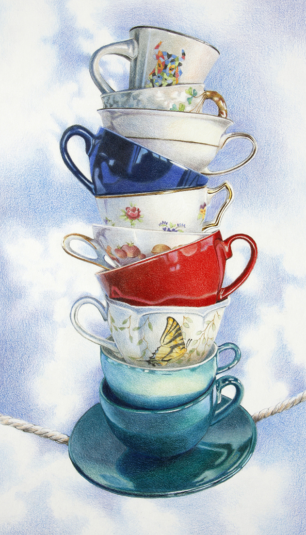
What I am doing while the Coronavirus spreading and scaring us all is working on new drawings. I started and finished this colored pencil drawing within two weeks, however the idea as been percolating in my thoughts for about two months. I have been working on some new drawings with stacked tea cups as my subject matter (I will post the others later) and wanted to create a drawing with dots reflected from the surface onto the cups. I wanted to achieve a design with brightly colored cups against a dark background.

My reference photo is the last photo, I couldn't find a dotted paper for the tea cups to sit upon so I created my own in Adobe Photoshop, printed them out and taped the sheets together to form the surface. The next step was to place the tea cups in order to achieve interesting reflections on the cups themselves. I moved them around and pulled down window shades so less light was reflected onto the shiny surfaces of the cups. I took many photos and later chose the one I liked best. 

I chose UArt 800 grit sanded pastel paper for the surface. This paper holds many layers of pencils and builds brilliant color quickly. It also smudges easily, you can see the marks on the paper below. I used Faber Castell Polychromos colored pencils for the first layer of color. Polychromos are an oil based pencil and keep a harder point than some of the waxier brands. They are perfect for this sanded surface and for burnishing the color into the paper with a bristle brush in order to create a solid surface of color. I continued with Polychromos for subsequent layers but also used Caran d'Ache Pablo and Prismacolor colored pencils if I needed other colors I didn't have in the Polychromos box.  Pablo pencils are also oil based and keep a harder point, Prismacolor are wax based and softer so they are better for top layers of color. 

I spray the drawing in between layers with workable fixative to keep the color in place. 


To create the solid background, I used a Staedtler Karat Aquarelle black watercolor pencil. I loosely and lightly apply the strokes to the surface without worrying about putting them on evenly. I keep the layer light because when I add water with a brush, it becomes a vibrant black (the surface behind the cups). Add just enough water to dissolve and move the pencil around, try to keep it as evenly toned as possible.


I have a solid black surface and after it dries I will add lighter colors that will give me a variation in colors and tones for my background because I don't want it to remain a solid black that will overpower my tea cups. I used three colors predominantly for the background: Polychromos Caput Mortuum, Pablo Greenish Black and Pablo Dark Gray. I spray with workable fixative.

I work on my light colors last because of all the pencil dust that moves around. I add my white dots and punch up all the light colors just before the drawing is finished.

I am excited about this piece! Maybe I should create a series!


Below is my reference photo I took from my still life set up:


Sunday, December 29, 2019

Making People Happy with My Art!


I created this colored pencil drawing in black and grays for this happy couple. The surface is vellum surface bristol paper. The portrait is of Linden Place in Bristol, RI. This couple were married in the Linden Place ballroom and grounds in 2013 and asked for a black & white photo of Linden Place for Christmas. The husband's parents went one step further and asked me to draw the portrait instead of giving them a photo. I was happy to draw the portrait and even happier when I heard how much they loved it!


This is a second colored pencil portrait I was commissioned to work on for a Christmas gift of three grandchildren as a surprise for their grandparents. I worked on Cream Legion Stonehenge paper using both Prismacolor and Caran d'Ache Luminance pencils. I took a few pictures of my starting process, I began with brown shadowed undertones using Prismacolor Light Umber and Sienna Brown pencils. I then added Prismacolor Dark Umber, Periwinkle Blue and Luminance Violet Brown to shadowed parts then added Luminance Anthraquinoid Pink to rosy areas. I added pink and skin tones over the darker colors and later lifted a bit of dark areas with a kneaded eraser.

This took me a while and I have to admit I was very nervous about how the finished portrait would be received. Unfortunately I have never met these children and worked from various photos given to me. I hoped that I captured the likenesses enough to please the grandparents and I understand they are thrilled with the portrait so that made me very happy! and relieved!

Saturday, December 28, 2019

Colored Pencil Dog Portrait Commission


This is a recent 8x8" dog portrait I created in colored pencil for a client to give as a gift. The dog's owner lost this attractive guy earlier in the year and misses him terribly. I worked on Canson Ingres gray paper that I would later to mount to an 8x8" DaVinci Medium Textured Canvas Panel from Jerry's Artarama. You can see the progress in the photos above. I used Prismacolor, Caran d'Ache Luminance and Derwent Drawing brands of colored pencils to create the portrait. I also burnish the colored pencil layers with a stiff brush to smooth out the pencil and alleviate the texture of the paper showing through.

I recently purchased a set of 24 Derwent Drawing colored pencils and have been liking their soft buttery feel as well as the range of colors, many are earthy natural colors perfect for creating pet portraits. These pencils also claim to be extremely lightfast.I try to choose the most lightfast pencils for my works so they won't fade through the years.

After mounting and trimming the edges of the paper to the canvas panel, I spray varnish the piece and edges with Krylon UV Resistant Clear to seal the colored pencil and then 3 coats of Krylon Kamar Varnish allowing each layer to dry in between.


Friday, November 29, 2019

Drawing Copper & Metals in Colored Pencil

My lesson this past week was to have my students draw objects in different metals; shiny silver, copper and iron. Most of my students in this session are new to colored pencil so it was not only a challenge for them but also for me.

I draw and understand which colors I choose and how I layer pencils but sometimes it can be difficult to verbalize to students. Everyone sees color and value/tone differently, new students don't always see every detail of the subject they are drawing and I often assist with the correct angle or perspective.

This was our fourth class in the series and this week one of my students said she is beginning to notice things she never noticed before. For instance, when she looked outside she noticed cast shadows from sunlight and moonlight. She also began to notice different colors and shades/tones of color. This excited me because I feel that I am succeeding in teaching not only to render subjects but to really study and see characteristics and relationships to surroundings.


 These photos are sketches I did for the class trying to simplify drawing metal. I chose the spoon as a quick study and (hopefully) easy way for my students to understand reflections and different values/tones in metal. I started with an outline and denoted shapes where the light was reflecting. My photo shows more white reflected areas than I was actually seeing.


Leaving the reflected highlights the white of the paper, I drew the different values using Prismacolor Warm Greys #30, #50, #70 and black. I shaded the spoon in gradual transitions from light to dark. I added some contour line on the edges of the spoon but careful not to outline whole shapes, just varying my pressure so lines are more prevalent in some areas and softer or fading away in others.

In my final drawing below, I burnished with a bristle brush to remove the texture of the paper and added a few more darks where needed.


Here are some examples of student work. I also let students choose the color of paper to work use for a background. I was so busy helping students achieve their goals that I only got three photos at the end of class. I was really pleased that each student chose a metal object that was challenging!