Showing posts with label Canson Mi Teintes Paper. Show all posts

Tuesday, July 26, 2022

Safari Drawing in Colored Pencil

I used a variety of reference photos from my safari trip to create this scene for customers who were looking for a custom wedding gift for their son and his wife. The newlyweds are very fond of cats so the lioness and her cubs were fitting as the main subjects. We decided on the other supporting animals and landscape for the middle and background. I used warm colors for this piece to depict the beautiful light of the Africa afternoon. My reference photos were taken from Kenya and Tanzania.

This drawing is 18x24" in colored pencils and drawn on cream Canson Mi-Teintes paper. I used a variety Prismacolor, Caran d'Ache Luminance and Faber Castell Polychromos pencils for this drawing. I choose different pencils because I want to use both lightfast pencils and certain colors to create my work. 

I sweated this one out because I hadn't worked on a piece so large in quite a long time and also because I had the concept in my head but could I put it on paper? My biggest struggle was what to do with the midground beween the animals to make it interesting yet still add some 'quiet' areas for the eye to rest between subjects. My second biggest struggle was depicting all those blades of grass in the foreground!! All in all I am happy with the result. 

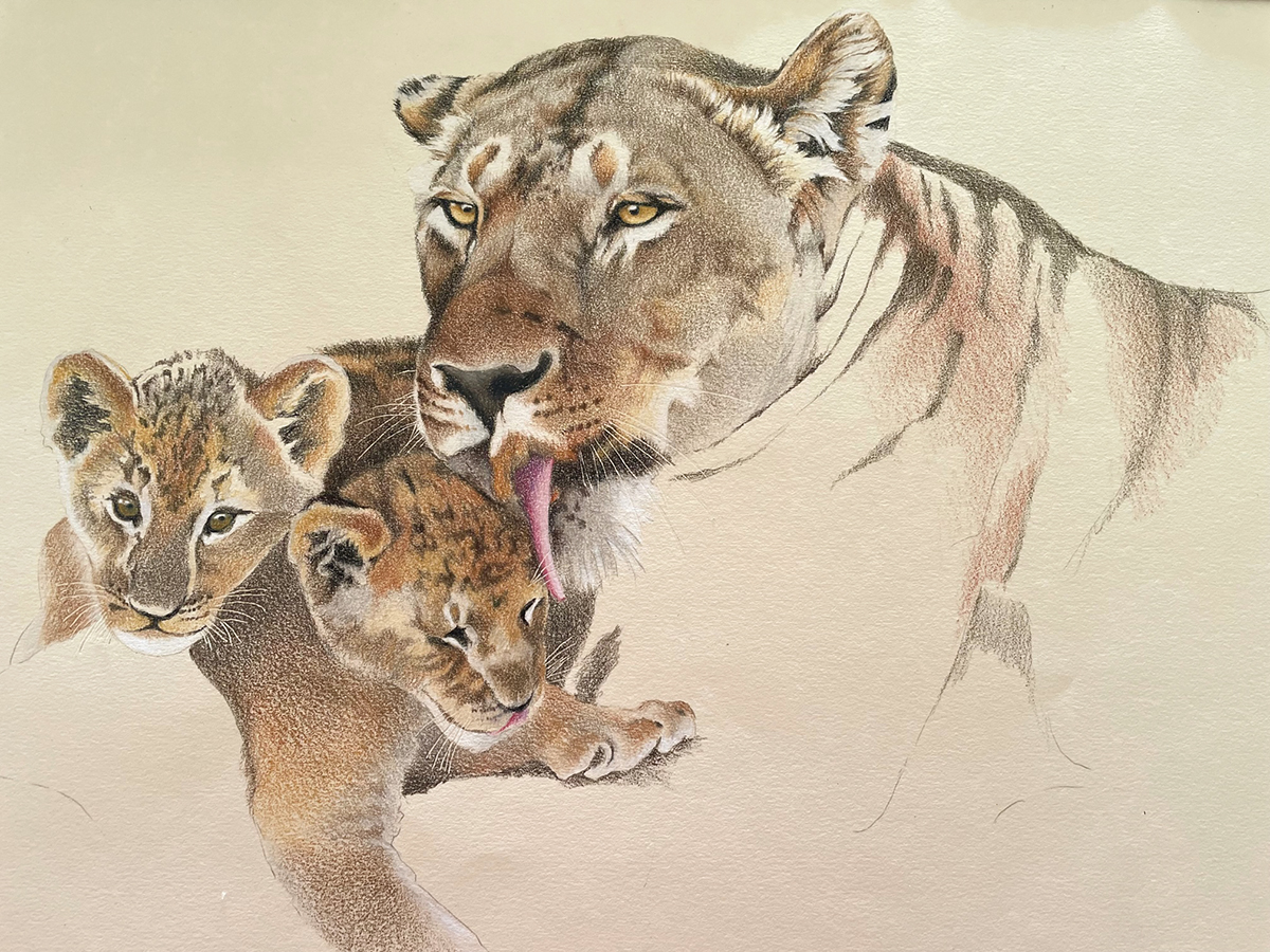
Below is my beginning of the lioness and cubs. I may recreate them again just by themselves.


Friday, November 19, 2021

Pet Portrait of a Little Yorkie

I’ve been working on this pet portrait of this little Yorkshire Terrier, Barrington. I am using primarily Prismacolor colored pencils and working on Canson Mi-Teintes paper, the color is called Hemp. I use the Mi-Teintes paper on the smoother side, not the textured side which works better when using pastels. 

I always start with the eyes because they’re the most important feature then work to the nose and mouth. Once I have the sparkle in the eyes and the facial features correct, I can start working the rest of the head and body.

Working on the body and all the little strands of fur. I start by adding my white highlights first so I don’t cover over them and then go to the darkest color and place it in the darkest areas of fur. Putting in those values helps me to define the lightest areas and darkest areas of his fur. From there I worked on the gray tones then added the tans and brown. I work one section at a time and then move onto the next section of the fur. For instance, one ear or one leg at a time. 


Barrington’s favorite spot is to sit in the laundry basket so that is how his owners wanted me to draw him. I’m working on the background, adding in the different bits of laundry but have to be careful that all the patterns and textures will detract from the dog. When I finish the background I will go back and make adjustments to the fur, especially around the edges. I may need to intensify some colors to bring him forward, and gray some background colors to make background elements sit back.

These are my color notes on the back of the paper. Colors always look different on a colored background than they do on a white background. It helps me to label the ones I plan to use on the fur, some of the browns and tans are so close in value and color that it’s hard to determine which is which just by picking up the pencil.


Friday, November 29, 2019

Drawing Copper & Metals in Colored Pencil

My lesson this past week was to have my students draw objects in different metals; shiny silver, copper and iron. Most of my students in this session are new to colored pencil so it was not only a challenge for them but also for me.

I draw and understand which colors I choose and how I layer pencils but sometimes it can be difficult to verbalize to students. Everyone sees color and value/tone differently, new students don't always see every detail of the subject they are drawing and I often assist with the correct angle or perspective.

This was our fourth class in the series and this week one of my students said she is beginning to notice things she never noticed before. For instance, when she looked outside she noticed cast shadows from sunlight and moonlight. She also began to notice different colors and shades/tones of color. This excited me because I feel that I am succeeding in teaching not only to render subjects but to really study and see characteristics and relationships to surroundings.


 These photos are sketches I did for the class trying to simplify drawing metal. I chose the spoon as a quick study and (hopefully) easy way for my students to understand reflections and different values/tones in metal. I started with an outline and denoted shapes where the light was reflecting. My photo shows more white reflected areas than I was actually seeing.


Leaving the reflected highlights the white of the paper, I drew the different values using Prismacolor Warm Greys #30, #50, #70 and black. I shaded the spoon in gradual transitions from light to dark. I added some contour line on the edges of the spoon but careful not to outline whole shapes, just varying my pressure so lines are more prevalent in some areas and softer or fading away in others.

In my final drawing below, I burnished with a bristle brush to remove the texture of the paper and added a few more darks where needed.


Here are some examples of student work. I also let students choose the color of paper to work use for a background. I was so busy helping students achieve their goals that I only got three photos at the end of class. I was really pleased that each student chose a metal object that was challenging!


Thursday, November 21, 2019

White Objects in Colored Pencil


My colored pencil class lesson yesterday was to have my Bristol Art Museum students draw white objects on gray toned Canson Mi-Tientes paper. Working on a toned paper helps the student create a full range of value and tone in her drawing. When we begin with a toned surface, we start somewhere in the middle of the value scale and will only need to push the values lighter and darker.

I have collected various white objects in different shapes, textures and degrees of difficulty and I encouraged my students to select an object or objects each would feel comfortable drawing. We began the class with a short talk about our lesson and I also like to present a short PowerPoint presentation with examples of my works and other artists' works pertaining to the lesson. 

As they began working, I asked students to take a few minutes to study their still life objects and determine the light and dark tones. White shapes will come forward and dark shapes will recede; as an object curves away from the light, it will become darker causing a gradual change from light to dark. I will help my students determine the lights, darks and shadows and how different textures will affect light and dark tones. 

Each student began with 3 colored pencils white, medium toned gray and dark gray. This helps to simplify applying color and tones. All students were using Prismacolor pencils in either Warm or Cool Grays. After completing the initial value drawing in grays, I asked my students if they were able to see hints of colors in their objects and encouraged each to add some color in order to create some interest and some colorful grays. 

I like to end class with a little sharing of works and discussion about the lesson and how each students interpreted their subjects in colored pencil. It also helps my students stand away from the drawing and see how each drawing looks at a distance; are values significant enough? Do shapes and composition work? I also like them to look at other students' and see how each person interpreted their subject(s). 

Our class time is 3 hours long and during that time I guide each student through drawing and making color and value choices. Many of the students in this class are new to colored pencil and some are new to the drawing medium. I was pleased with the results – each student starting to develop her own style of working and choice of subject matter. 


Thursday, August 29, 2019

Colored Pencil Portrait of Six Goats


I was asked by a customer to draw a 'goat' portrait of these six goats for their owner's upcoming birthday. The drawing is going to be a surprise! I was really excited about the idea so the customer and I jumped into her car and drove over to the see the goats. We went into the barn area and I was able to take multiple reference photos of the goats to use when creating the drawing. The goats were so curious! You can see the looks on their faces.

The drawing is approximately 8x16" and is drawn with Caran d'Ache Pablo and Prismacolor brands of colored pencil on Oyster colored Canson Mi Teintes paper.

Monday, June 19, 2017

Studies of Salt Water Taffy


I chose salt water taffy for my adult colored pencil students at Bristol Art Museum to draw studies of in our class. We had been working on changes in values and studying form and shape so this exercise was challenging. Several students struggled with the crinkles in the wrappers. Sometimes I take things for granted, what comes easy for me is not necessarily that way for my students. In this class most of the students are new to colored pencil and are brand new to trying their hand at art. Below are a few of their drawings, we worked on Canson Mi Teintes gray paper.


Sunday, January 10, 2016

One more Pet Portrait


This is my latest pet portrait of Logan. It's 8x8" on Bisque Canson Mi Teintes paper. The tone of the paper compliments the fur in the dog. I used both Prismacolor and Faber Castell Polychromos colored pencils to work on the portrait. Logan in progress and my reference photos are beneath the finished drawing. 

Sunday, June 28, 2015

Commission Work


I have been working on this colored pencil drawing of a bouquet of roses for a customer. She sent me photos of the roses and I chose the reference photo (top) which was the best to work from. I added three more roses to fill out the composition and make it more interesting. The middle photo is the drawing in progress. I worked this on Honeysuckle (?) Canson Mi Tientes paper, size of drawing is 7.5x10.5" The Mi Tientes paper is quite textured so I used the harder Faber Castell Polychromos pencils on top of Prismacolor Pencils to burnish or fill in space. 

The bottom is the finished piece, loosely drew the bottom area to blend and abstract the stems and leaves allowing the roses to be the focal points. 

Saturday, December 13, 2014

Student Work


I'm proud of my colored pencil students from my Newport Art Museum class who put work in the student exhibit at the museum's Coleman Center. The three pieces in which I've posted are also from three different lessons. Cindy's piece on the top is from our lesson that was drawing a variety of autumn leaves on colored paper. We used Canson Mi Tientes paper in which to work on.

The middle piece by Donna is from another lesson where we drew all white objects. The students had a set of 48 Prismacolor pencils in which to work and the 48 set contains only one or two grays so we mixed colors in order to achieve the values and color changes we needed.

The bottom piece is by Helen, our assignment was to work with colored pencil and odorless mineral spirits (solvent) on 5x7" Ampersand Pastelbord. I chose a simple still life of a few cherries on a colored surface so they could focus on the technique as well as the composition. Helen chose a fun frame for this piece also.

Sunday, November 9, 2014

Colored Pencil Classes

I'm teaching one Colored Pencil Drawing class right now at Newport Art Museum in Newport, RI. Below are two of the class drawing assignments. We are using the Prismacolor 48 pencil set which limits the color range and is forcing us to mix colors to achieve a local color or value we may not have a pencil for. Below are my examples as I draw along with the class.


Drew autumn leaves on a colored background, using Canson Mi Tientes paper. Here I am allowing some of the yellow tones to show through my leaves and using limited colors. I haven't done much layering, just juxtaposing colors by laying them side by side.


This class assignment was to draw white objects on a blue gray background, also Canson Mi Tientes paper. It was a bit more challenging because the easiest thing to do would be to reach for a set of gray valued pencils to render a white object. We were  forced to create colorful grays with the pencils we had in our Prismacolor 48 color set. This is my small drawing of a milk carton and the colors I used along the bottom. For the lightest values I used White, Cream, Gingeroot and Light Cerulean Blue. Medium values I used  are Yellow Ochre and True Blue. For the darker values I used Burnt Ochre and Peacock Blue and for the darkest areas of value I used Indigo Blue.

All of these colors except Light Cerulean Blue are warm colors which worked well together, I chose Light Cerulean Blue because I needed a light blue value, but used it very lightly so it wouldn't stand out against the warm colors. The blue shades and yellow/orange/brown shades are complementaries and I layered to create colorful grays for the different values.

Saturday, September 29, 2012

Pet Portrait of Frasier


This post is going to have everyone thinking of the holidays and it's much to early for that however here is a pet portrait I just finished of a cute little West Highland Terrier named Frasier. The drawing is 11x14" done in colored pencil on charcoal gray Canson Mi Tientes paper. It is exactly the pose my customer wanted, she also chose the winter or holiday themed scarf and wanted pine trees in the background. Fortunately she gave me several good photos to work from, although this pose wouldn't have been my first choice. Commission work can be tricky because the artist is drawing or painting the customer's ideas and impressions and not the artist's own. It can often take me a while to mentally get into the drawing I've been asked to do and to put it down on paper as the owner sees her dog. I find that it always helps to talk in length to a customer about his/her dog and also to meet the dog in person and understand a little about the dog's personality. I feel as if I did okay with this piece but I do see a few areas that could be improved upon. Of course I'm not going to point them out to my readers!

Wednesday, June 20, 2012

CPSA Silent Auction Piece

This is the colored pencil drawing titled "Flying Away" that I created for the CPSA silent auction which is held during the annual exhibition and convention August 1-4, 2012 in Covington, KY. I worked the drawing on felt gray Canson Mi Tientes paper, although it probably didn't matter what color I used because I covered every little bit with pencil. I used the Icarus Board to help me blend and layer the intense color. I love bright colors and so my blues and greens got quite a work out on this piece. When finished, I mounted it on 8x10" 3/4"-cradled clayboard with archival double tack film. I decided to leave the edges natural wood so I stained them and am varnishing the piece with Golden UVLS polymer varnish to preserve the bright colors.

Thursday, April 19, 2012

Brown Bag Drawings


My Tuesday morning class requested a lesson in drawing paper lunch bags. I gave them each a piece of  Amber colored Canson Mi Tientes paper which we used as the medium or base color. In attempt to simplify, we lit each bag with desk lamp so the lights and darks would be more pronounced. Everyone started working in the values with two colors, Prismacolor Cream for the lightest areas and Dark Brown for the darkest areas, letting the color of the paper act as the medium value. Some added different colors for the shadows. It was challenging and required a lot of thought, the middle photo shows everyone's work and just how much could be done in three hours. No one was anywhere near completion.

Friday, July 8, 2011

A Bowl of Oranges

My mother or my grandmother had this sweet little bowl that I found and decided I wanted to draw as a small still life. I filled it with tangerines and set it up against a white surface and background. I decided to work on orange Canson Mi Teintes paper so I could get the orange glow to show through the whole drawing and give a warm color harmony to the drawing. The finished size is 7 1/2" x 8 1/2" don't ask me how I ended up with the all the 1/2" I just started drawing and that's what happened.

I'm still working on the tulips, I keep working on different areas and setting it down for a while to look at and ponder.


Saturday, June 4, 2011

Three Shiny Apples

I have been asked to create a small colored pencil artwork for the CPSA silent auction fundraiser called "Small Works of Great Magnitude". The silent auction is held during the national convention week and exhibition which is in Dallas, TX July 12-16. The silent auction takes place during the Members' Night on Thursday, July 14 and is to benefit CPSA's exhibition costs. All of the works will be featured on the CPSA website by the end of June. This year there will be 36 wonderful works to bid on and I'm happy to say that I will be attending and can view them all.

For my submission, I chose to draw these candy apples. The size is 7x10" which will be matted to 11x14" which is the maximum size for the small works. I've worked on red Canson Mi Teintes paper and used Prismacolor pencils and Lyra Rembrandt pencils. Because the paper is so textured, the red shows through giving the whole piece an overall warmth. The colors I used for the background are Prismas Imperial Violet and Blue Violet Lake, which make the background look so interesting with the red behind it. I burnished the apples with a bristle brush so they would look shiny and and not textured like the rest of the piece. It was fun to draw and took me about 3 or 4 hours to complete.

Wednesday, May 18, 2011

Tuesday Colored Pencil Classes


These are photos of some of my morning and evening students colored pencil work. I brought in several New Guinea Impatiens plants in red, pink and white and each person chose a plant and chose a portion of the plant to focus on and draw. The morning class worked on Raspberry Canson Mi Teintes paper and the evening class worked on Violet Canson Mi Teintes because I couldn't find any more of the Raspberry color at our local art store. I chose the bright warm tones to make the flowers pop and give the finished drawing a color harmony. The warm pink and purple tones showing through the leaves give the whole drawing an interesting effect.

I thought this lesson would be interesting and fun but most everyone found it very challenging. The flowers lack different hues and values and they found it difficult to make them look real and find enough brightly colored pencils to get the job done. The leaves, buds and stems are intricate and took some thought and drawing skill. I suggested they each choose three values of green to work the leaves and later add other colors if needed. By the time everyone left I think they were tired, I even heard some comments about needing a glass of wine from the night class! I'm not sure if you can tell from the photos but they all did a wonderful job and we marveled at how we used the same subject matter and paper but each person's drawing was unique and had its own style