Showing posts with label commission work. Show all posts

Tuesday, July 26, 2022

Safari Drawing in Colored Pencil

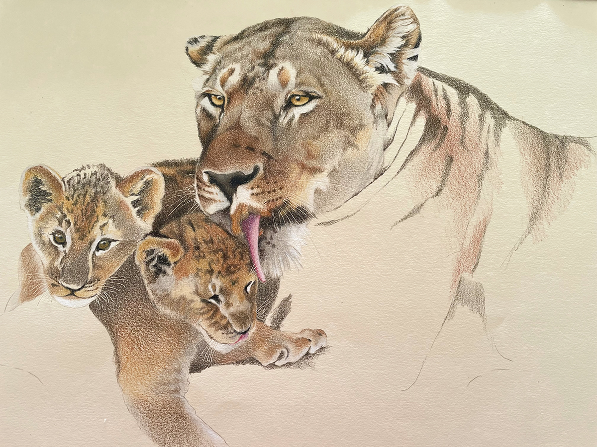
I used a variety of reference photos from my safari trip to create this scene for customers who were looking for a custom wedding gift for their son and his wife. The newlyweds are very fond of cats so the lioness and her cubs were fitting as the main subjects. We decided on the other supporting animals and landscape for the middle and background. I used warm colors for this piece to depict the beautiful light of the Africa afternoon. My reference photos were taken from Kenya and Tanzania.

This drawing is 18x24" in colored pencils and drawn on cream Canson Mi-Teintes paper. I used a variety Prismacolor, Caran d'Ache Luminance and Faber Castell Polychromos pencils for this drawing. I choose different pencils because I want to use both lightfast pencils and certain colors to create my work. 

I sweated this one out because I hadn't worked on a piece so large in quite a long time and also because I had the concept in my head but could I put it on paper? My biggest struggle was what to do with the midground beween the animals to make it interesting yet still add some 'quiet' areas for the eye to rest between subjects. My second biggest struggle was depicting all those blades of grass in the foreground!! All in all I am happy with the result. 

Below is my beginning of the lioness and cubs. I may recreate them again just by themselves.


Friday, November 19, 2021

Pet Portrait of a Little Yorkie

I’ve been working on this pet portrait of this little Yorkshire Terrier, Barrington. I am using primarily Prismacolor colored pencils and working on Canson Mi-Teintes paper, the color is called Hemp. I use the Mi-Teintes paper on the smoother side, not the textured side which works better when using pastels. 

I always start with the eyes because they’re the most important feature then work to the nose and mouth. Once I have the sparkle in the eyes and the facial features correct, I can start working the rest of the head and body.

Working on the body and all the little strands of fur. I start by adding my white highlights first so I don’t cover over them and then go to the darkest color and place it in the darkest areas of fur. Putting in those values helps me to define the lightest areas and darkest areas of his fur. From there I worked on the gray tones then added the tans and brown. I work one section at a time and then move onto the next section of the fur. For instance, one ear or one leg at a time. 


Barrington’s favorite spot is to sit in the laundry basket so that is how his owners wanted me to draw him. I’m working on the background, adding in the different bits of laundry but have to be careful that all the patterns and textures will detract from the dog. When I finish the background I will go back and make adjustments to the fur, especially around the edges. I may need to intensify some colors to bring him forward, and gray some background colors to make background elements sit back.

These are my color notes on the back of the paper. Colors always look different on a colored background than they do on a white background. It helps me to label the ones I plan to use on the fur, some of the browns and tans are so close in value and color that it’s hard to determine which is which just by picking up the pencil.


Sunday, December 29, 2019

Making People Happy with My Art!


I created this colored pencil drawing in black and grays for this happy couple. The surface is vellum surface bristol paper. The portrait is of Linden Place in Bristol, RI. This couple were married in the Linden Place ballroom and grounds in 2013 and asked for a black & white photo of Linden Place for Christmas. The husband's parents went one step further and asked me to draw the portrait instead of giving them a photo. I was happy to draw the portrait and even happier when I heard how much they loved it!


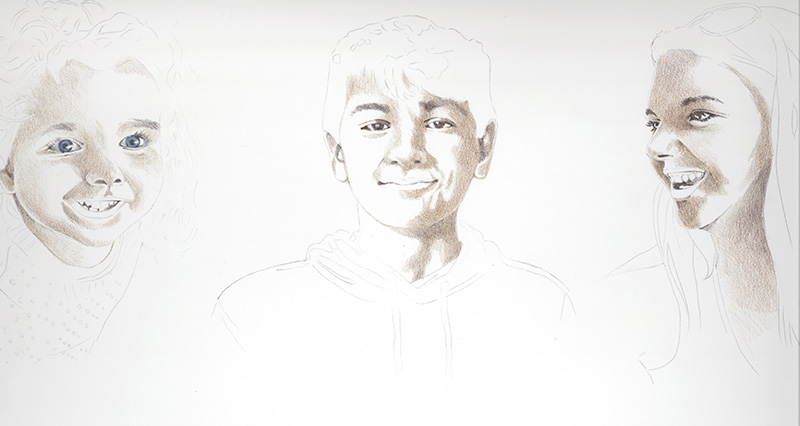
This is a second colored pencil portrait I was commissioned to work on for a Christmas gift of three grandchildren as a surprise for their grandparents. I worked on Cream Legion Stonehenge paper using both Prismacolor and Caran d'Ache Luminance pencils. I took a few pictures of my starting process, I began with brown shadowed undertones using Prismacolor Light Umber and Sienna Brown pencils. I then added Prismacolor Dark Umber, Periwinkle Blue and Luminance Violet Brown to shadowed parts then added Luminance Anthraquinoid Pink to rosy areas. I added pink and skin tones over the darker colors and later lifted a bit of dark areas with a kneaded eraser.

This took me a while and I have to admit I was very nervous about how the finished portrait would be received. Unfortunately I have never met these children and worked from various photos given to me. I hoped that I captured the likenesses enough to please the grandparents and I understand they are thrilled with the portrait so that made me very happy! and relieved!

Sunday, March 24, 2019

Boys in Surf


I have finished this commission drawing of the little boys running in the ocean surf. I added the boys to the drawing focusing first on each piece of clothing, it's folds and highlights to make it look realistic and form around the contours of their bodies. The details in the bathing suits took a little bit of time to add – I didn't want it to be overly busy and detract from the picture so I kept the marks simple. Next I added their hair in various shades of light browns and finally the skin tones and shadows in the skin tones.

For skin tones, I used Prismacolor pinks, warm yellows, Pumpkin Orange,  Burnt Ochre, Imperial Violet and Luminance Manganese Violet & Ultramarine Violet. I wanted to create highlights and shadows on glowing skin, making it look realistic in flesh tones.

After I finished the boys I went back and adjusted the tones in the water, making some of the waves in the water darker. I added colors such as Prismacolor Clay Rose, Nectar and Burnt Ochre and the Luminance violets to the sanded area in the foreground. I burnished the sand and the waves with a bristle brush to smooth out texture.

Wednesday, February 27, 2019

Boys in Surf - Beginning


I have been asked to create a colored pencil commission piece of the two little brothers jumping into the surf at the beach. The reference photo is below and the top photo is step 1. The drawing is approximately 11x14" and I am working on Legion brand Stonehenge paper in Pearl Gray. I chose a neutral for the paper, I thought white might be too bright underneath for the boys' skin tones. The Pearl Gray will be a nice tone for under the waves and beach and I can add the amount of white on the foam that I wish. The paper is beautifully soft and builds layers of the pencil nicely.

My first step is created with Prismacolor, Caran d'Ache Luminance and one of the new Derwent Lightfast pencils in Deep Blue. I received this pencil from the Colored Pencil Society of America convention in 2018, the color is perfect and I like that this pencil is lightfast. I may choose to add another brand of colored pencil also but these three are working fine for now.

The waves, the surf, reflections and beach are somewhat daunting so I decided to tackle them first before the figures. I have laid in colors and shapes first and will surely go back in and adjust contrast, tone and color. I will want the boys to be the main focus so I will have to be sure the water and surf doesn't overpower the figures.


Tuesday, October 3, 2017

Package Design for Staedtler Mars Ltd.


 I was really excited to be contacted by the company artist supply Staedtler Mars to create a colored pencil drawing for their new line of brilliant colored pencils. The company had recently seen a drawing I worked on of Converse sneakers and asked me to recreate a similar drawing using their brand of colored pencils. The new line of pencils are just being introduced and come in sets of 12, 24, 36 and 72.

I have attached my initial sketch and my finished drawing below. The pencils are easy to work with, the points stay nicely sharpened and the leads don't crumble. The set of pencils in each tin is easy to transport for travel or sketching on the road! Give them a try!


Monday, August 14, 2017

Colorful Commission

This was a fun commission, done in oil paint for a client. She had a similar reference painting and wanted the woman's face changed to look more like herself plus she wanted her cat Massimo in the painting with her. The style of painting is relatively flat and very colorful so it was fun for me to create, I especially liked working on Massimo - probably because it's another form of a pet portrait. 


Monday, August 29, 2016

Fish Painting


I just completed this 36x36" oil painting on canvas which was a commissioned piece of artwork for a customer and art appreciator. He came into our artist studio, Beach Studios, to look at art and saw a similar painting in progress on my easel. I had stopped for the day and left the piece on my easel just like this, black and white with just a little blue in the same areas. The customer and his wife liked the piece and asked me to create another for their home. I was more than happy to oblige and enjoyed creating a second painting for them. The piece is unframed, I painted the wrapped canvas edges. 

Sunday, January 10, 2016

One more Pet Portrait


This is my latest pet portrait of Logan. It's 8x8" on Bisque Canson Mi Teintes paper. The tone of the paper compliments the fur in the dog. I used both Prismacolor and Faber Castell Polychromos colored pencils to work on the portrait. Logan in progress and my reference photos are beneath the finished drawing. 

Wednesday, November 25, 2015

Pet Portrait Commissions


I am posting my three latest pet portrait commissions and the photos I worked from. I take commissions from customers and enjoy working on pet drawings. 

The first (above) is Chester, I was commissioned to draw his portrait in 8x8" colored pencil, varnished and mounted on an Ampersand 3/4" cradled Claybord. I am attaching the photo I worked from because it was not a good reference photo. Fortunately, the customer had other photos of Chester for me to use as reference to get the color of the fur, eyes and details.


Here is Rocco, he is drawn in colored pencil on white Stonehenge paper, 11x14". He was then matted and framed under glass for the customer. I've included the reference photo I used to work from. 


Here is Cyrus, also 8x8" on Stonehenge paper mounted to Ampersand 3/4" cradled Claybord. The first photo is his portrait, the second is a side view in order to see the Cradled Claybord and sealed/varnished drawing. The third is the reference photo that I worked from. 


Thursday, August 20, 2015

Mural Repair Work


I was asked to repair a mural that was painted in a clients' home, the signature at the bottom noted it was painted around 1952 or 1953 and hadn't been touched since then. The paint had begun to chip and flake off in several different areas and the owners were hoping it could be repaired. I've painted a few murals but am not versed in the best way to repair chipped paint so I conferred with a fellow artist, experienced in mural painting and received suggestions on how to proceed. First step was to carefully wash the entire mural surface and there was a layer of a grimy substance especially near the top which had most likely developed over the years.

Next I sanded off the areas that were flaking, which subsequently lead to more flaking paint as I sanded so I needed to be extra careful not to disturb more paint. For sanding, I used very fine sandpaper, 320 grit. Pictured below are the several problem areas.


Once the areas were sanded and clean, I sealed and preserved them with a layer of Liquitex Matte Varnish, to stop any more flaking and preserve the surface to be painted. Once the varnish was dry, my task was to mix the correct colors and touch up the chipped areas. I used several brands of acrylic paints and added Golden Molding Paste added to some of the raised areas to create texture.


This is the finished piece, repainted areas and a coat of Liquitex Matte Varnish applied to the entire mural to seal and protect it for future years.

Sunday, June 28, 2015

Commission Work


I have been working on this colored pencil drawing of a bouquet of roses for a customer. She sent me photos of the roses and I chose the reference photo (top) which was the best to work from. I added three more roses to fill out the composition and make it more interesting. The middle photo is the drawing in progress. I worked this on Honeysuckle (?) Canson Mi Tientes paper, size of drawing is 7.5x10.5" The Mi Tientes paper is quite textured so I used the harder Faber Castell Polychromos pencils on top of Prismacolor Pencils to burnish or fill in space. 

The bottom is the finished piece, loosely drew the bottom area to blend and abstract the stems and leaves allowing the roses to be the focal points. 

Wednesday, November 12, 2014

Two Pet Portraits and an Award


These are two 8x10" commissioned pet portraits that I just finished, Bella is on the top and Ruby is below. Both are worked on Ampersand Pastelbord, Bella is on Sand Pastelbord and Ruby is on white Pastelbord tinted with brown tones of watercolor. Both pieces are worked in colored pencil. I have added odorless mineral spirits to the colored pencil to smooth out the texture in the background to compliment the fur textures of the dogs.


I am very excited because my colored pencil piece Seafoam has won the Frank C. Wright Medal of Honor Plus award in the American Artist Professional League's 86th Grand National Exhibition. I was honored to have been accepted to this wonderful exhibition shown at the Salmagundi Club in NYC, now I am doubly honored to have won this award. Seafoam is 16x18" colored pencil on rag illustration board.

Monday, July 21, 2014

Colored Pencil Cherries


Here is the 12x12" colored pencil drawing that I have been working on. As I mentioned in a previous post, I am working on 12x12" cradled Ampersand Gessobord with a coating of Colourfix liquid primer to hold the layers of pencil. I began by putting down one layer of color in the cherries and then adding solvent (odorless mineral spirits) with a small brush to the pencil to dissolve it and make it start to flow like paint. Into the wet pencil, I added more layers of pencil and then almost a dry brush to dissolve those layers and make them flow. This is how I achieve such rich colors. When the cherries were finished I worked the stems and then the shadows and patterns of the dish below in the same way but careful around the edges of the cherries. I find it's better to use less solvent so it doesn't get runny or to dab the brush on a cloth or paper towel before applying it to the drawing. For the white surface under the plate I used white Prismacolor and white #8052 Stabilo Aquarellable pencil. I like the Stabillo pencil because the lead is soft but not flaky and I can get good white coverage.

To finish this piece, I will spray with Lascaux Fixativ to preserve it. Next I will spray three coats of Krylon Kamar Varnish letting each dry in between.

Wednesday, June 18, 2014

Underpainting for Cherries

Cherry drawing with colored pencil and mineral spirits
I am working on this 12x12" commissioned drawing for a client who wanted a square format piece of artwork of cherries on a plate. I'm working on cradled Ampersand Gessobord coated with light blue Colourfix primer so the gessoed surface will hold the pencil. I started by transferring a line drawing of my own reference photo onto the surface and next put a light layer of pencil on the cherries and the darkest shadowed areas. I began working the darkest areas with Prismacolor Indanthrone Blue and Tuscan Red in a light layer. Next I added alight layer Crimson Lake, Scarlet Lake, Pale Vermillion and Blush Pink for the lighter areas of the cherries.

Now I am working one cherry at a time, adding odorless mineral spirits with a small, soft flat brush and then more colored pencil over the mineral spirits while it is still wet. When I achieve the density of colors I want, I will move onto the next cherry although when I have completed each one, I will go back and refine areas and colors.

Friday, December 21, 2012

Dog Portrait of Bentley


Just finished this 9x12" dog portrait for a customer who called me a few weeks ago but we ended up meeting just last Friday. He asked if I could do a portrait of his recently deceased Yellow Lab named Bentley. The portrait is going to be a surprise for his wife for Christmas. I was really nervous about this commission for two reasons: first I had never met the dog. If possible I like to try to see the pet in person but of course this wasn't an option. Second, I only had a week to work on the portrait along with all of my other holiday preparations. I suppose I can say that I work good under pressure because I finished the portrait and met with the customer yesterday and he was very happy with the finished piece and the likeness of his dog. I breathed a sigh of relief.

The portrait is on 9x12" 3/4-cradled Ampersand Gessobord. The customer requested that I add the colored pencil to the sides in the event he and his wife didn't want to frame it. I applied gesso to all of the sides of the Gessobord, then coated the top and sides with light blue/green color of Art Spectrum Colourfix primer (which it appears they don't make anymore) mixed with Ultramarine Blue Art Spectrum Concentrated Ink to achieve the background color I'm looking for. I worked on the surface with colored pencil and solvent (odorless mineral spirits) so the pencil will adhere like paint and I can move it around and remove surface texture. 

After the holidays, the customer is returning the piece to be varnished. He is asking for a flat matt finish in a varnish with no sheen on the surface. The varnishes I use are somewhat shiny and  have a little bit of a sheen so my next step is to find another varnishing product to use. If anyone has any suggestions, let me know.