Showing posts with label Faber Castell Polychromos. Show all posts

Tuesday, July 26, 2022

Safari Drawing in Colored Pencil

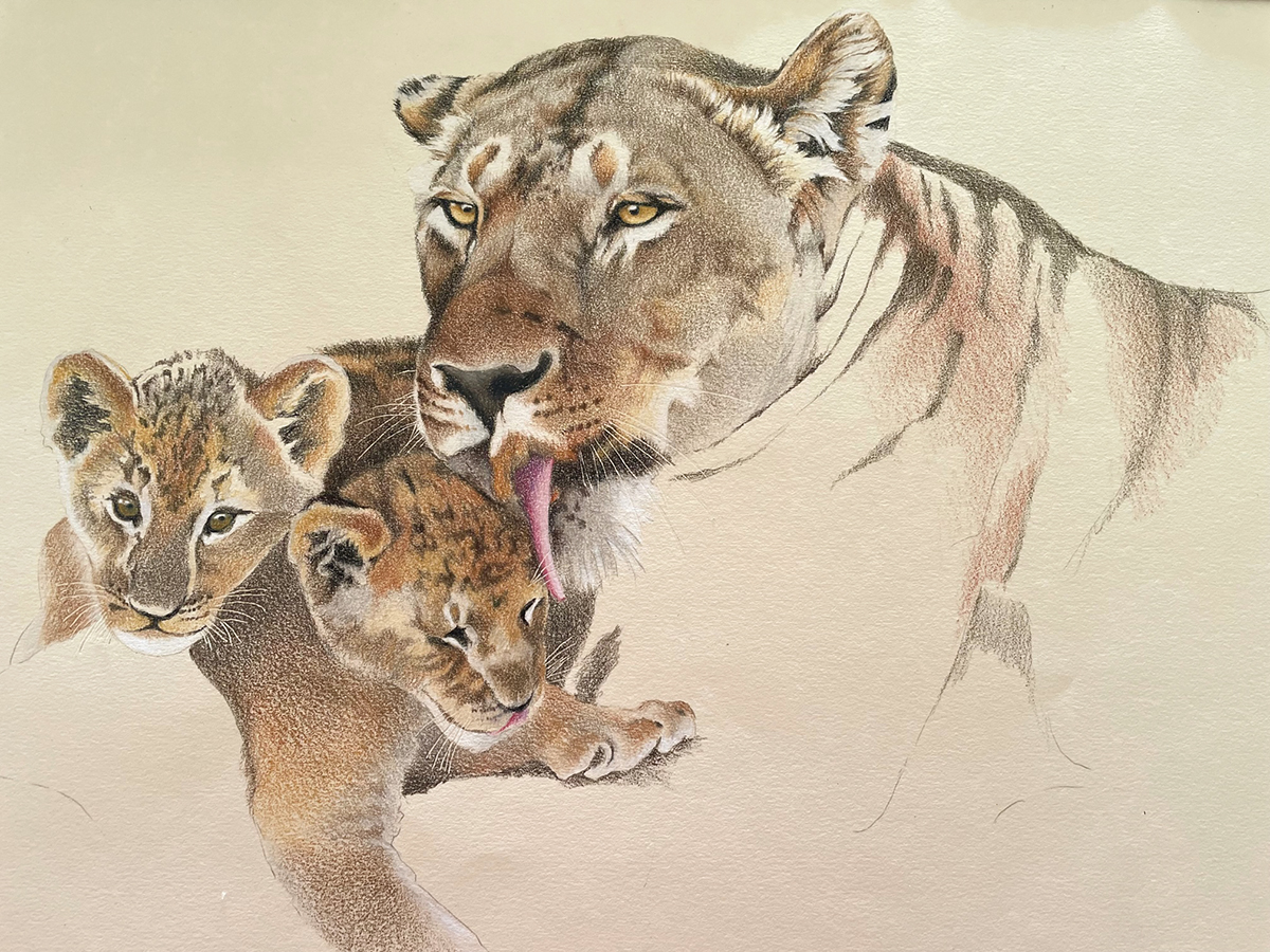
I used a variety of reference photos from my safari trip to create this scene for customers who were looking for a custom wedding gift for their son and his wife. The newlyweds are very fond of cats so the lioness and her cubs were fitting as the main subjects. We decided on the other supporting animals and landscape for the middle and background. I used warm colors for this piece to depict the beautiful light of the Africa afternoon. My reference photos were taken from Kenya and Tanzania.

This drawing is 18x24" in colored pencils and drawn on cream Canson Mi-Teintes paper. I used a variety Prismacolor, Caran d'Ache Luminance and Faber Castell Polychromos pencils for this drawing. I choose different pencils because I want to use both lightfast pencils and certain colors to create my work. 

I sweated this one out because I hadn't worked on a piece so large in quite a long time and also because I had the concept in my head but could I put it on paper? My biggest struggle was what to do with the midground beween the animals to make it interesting yet still add some 'quiet' areas for the eye to rest between subjects. My second biggest struggle was depicting all those blades of grass in the foreground!! All in all I am happy with the result. 

Below is my beginning of the lioness and cubs. I may recreate them again just by themselves.


Tuesday, February 15, 2022

Spotted Hyena Drawing


I've been working on this drawing of a spotted hyena, my reference photo is from our African Safari trip. As hyenas are scavengers, this hyena was sitting in the dirt and watching a lion with a wildebeest carcass. Just waiting for a chance to pick up the scraps. My reference photo is at the bottom of this post, I was intrigued by this messy looking animal with matted fur and decided to clean him up a bit. I wanted to capture textures of the fur and the determined look in his eyes.

Using Adobe PhotoShop and Lightroom, I was able to lighten his eyes and nose to see the details and distinctions. I chose to leave out the background and focus on the portrait of the hyena. The paper I chose is Fabriano Tiziano drawing paper. I usually don't work on a paper that is this textured but for this drawing I think the background color and the texture lend itself to the fur and features.


I used Prismacolor Premier, Caran d'Ache Luminance and a few Derwent and Faber Castell polychromos colored pencils. In this photo I have also included my color swatches on a scrap of the Fabriano Tiziano paper. I like to try out different colors before choosing which ones I will use. 

Please excuse the inconsistencies in my photos, they were taken with my iPhone but in different lighting during my process!


Saturday, January 8, 2022

Lioness Drawing from My Safari Trip

In October my husband and I were fortunate to go on an African safari  and travel to to five wildlife preserves in Kenya and Tanzania. It was an amazing trip and I came home with an incredible amount of wildlife photos. Covid made it a little more difficult to travel however we were tested frequently and wore masks indoors. And we were mostly riding in open air safari jeeps in the company of more animals than people. 

We had just landed in the Maasai Mara Wildlife Reserve and were traveling by jeep to our camp when we came across four sleeping lionesses near the side of the road. We pulled up quite close and sat watching them for close to an hour (they are so used to safari jeeps it is possible to get that close). They rolled around a bit, yawned, got up and spun around (just like a house cat), laid back down and went back to sleep. I was taking photos and just happened to catch this lioness with her eyes open looking at me. 

Here are three stages of the drawing that I created from my photo. I worked with Faber Castell Polychromos on Clairefontaine Pastelmat paper, Maize colored (pictured below). The Pastelmat has a textured but velvety surface to softly layer the pencil. The Polychromos are a harder oil based pencil that adhere to this surface and blend very easily. I was able to apply multiple layers of color to different areas.

The Pastelmat comes in several colors and I am anxious to order and try a variety of them. 


Monday, November 16, 2020

The Swirl


This is a new piece I just finished titled The Swirl. I had been sketching shells in a small sketchbook and thought I might put several together in one interesting type of still life. I chose and positioned the shells on a white board secured with putty. I drew each one individually. But first I started with an underpainting in Derivan Liquid Pencil diluted with water applied using a small watercolor brush. I worked on Strathmore 500 Series Illustration Board which is very sturdy and could hold the water and liquid graphite pencil without buckling. I worked tones/values in black and white and then layered colored pencil on top of the graphite when it had dried. 

This shell (top) has only two colors of blue applied over the graphite. The liquid graphite underpainting helps me establish tones of gray and characteristics within each shell before adding color. My brush and the tube of liquid pencil is pictured below.


Below is how I worked on the piece, adding all of the underpainting in liquid pencil before adding color. I did skip around a bit to draw different shells. My reason for working with these two mediums is to experiment with combining the mediums and also I have been curious about adding an underpainting to the colored pencil. To draw each shell I used a variety of colored pencils: Prismacolor, Caran d'Ache Luminance, Faber Castell Polychromos and Prismacolor Verithin. 


Tuesday, September 29, 2020

Balancing My Tea Cups

I haven't been writing on my blog too much lately and mainly because I have been working on my colored pencil drawings and a few other things. Since the Covid began and I found myself spending more time in the studio, I decided to work on a series of drawings using tea cups as my subjects. I am working these drawings where I am stacking tea cups and also another group of drawings where tea cups are reflecting polka dots, linking to a previous post here.

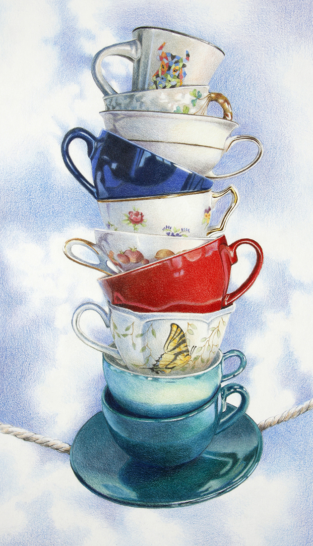
Many of these tea cups belonged to my (late) mother in law who had them displayed on a shelf in her dining room but later on dismantled the display and gave me the cups. I kept them wrapped and tucked away for many years with thoughts of drawing them in colored pencil. My favorite is the Dragon Tea Cup which is at the very top of the above drawing. Over the years I have collected several others including the colorful bull (just below) from Barcelona Spain and the butterfly cup sent to me by a favorite cousin. 

The first drawing A Fresh Start (19x11") was accepted into the Colored Pencil Society of America's 28th Annual International Exhibition (click on the link to see some incredible colored pencil artworks) and sold shortly after the exhibition came on-line. The second drawing (below) Precarious Balance (18x10") was shown at the Providence Art Club Fall Member Exhibit. 

Both drawings were worked on Strathmore Series 500 Illustration board using a mixture Prismacolor, Caran d'Ache Luminance and Faber Castell Polychromos colored pencils. The Polychromos are a harder pencil and good for rendering smooth glassy surfaces by filling in the paper's "tooth". Prismacolor and Luminance have such rich color, Luminance being more fade resistant so I tend to use them more. 

Here I go again with a third drawing. This time I attempted to stack nine tea cups and photograph the stack. I use my hot glue gun and fishing line to hold the stack of cups in place. I glued the spools of thread between cups in order to give each one the correct height. As you can see, this group tumbled and I had to superglue one tea cup back together. As I draw, I work from my photos and shortened stacks of two or three cups to get perspective, color and shading. 

This is a quick photo of my start for this drawing, beginning with the top cups. I draw the design and shading on each but I will go back later to adjust and evaluate each cup before the drawing is finished. For this drawing I decided to try Arches Aquarelle Hot Press Watercolor Paper to see how it would compare to the Strathmore Illustration board. 


Monday, May 11, 2020

Reflected Dots - Colored Pencil


At my studio and wondering what to draw next. I really had fun with the tea cups and polka dots that I finished recently and posted here on my blog so decided to try another. I put a few reflective and shiny objects together for a small still life and positioned everything to reflect the dots over and over. I thought the green leaves and organic shapes were a good contrast to the other objects.

I am working on UArt 800 grit paper and my own reference photo (see bottom) as well as working from the objects themselves. I started by layering Faber Castell Polychromos colored pencils and blending them into the surface with a bristle brush. The Polychromos are an oil based pencil so less waxy and blend better as the surface layer. As I continue to add color, I will use Prismacolor Premier Soft Core colored pencils and Caran d'Ache Luminance pencils along with the Polychromos. Both Prismacolor and Luminance are waxy and build strong color as they are layered.

This sanded paper is so textured that it smudges easily, so I have to clean often with a kneaded eraser. I keep a piece of blank scrap paper under my drawing hand to keep my from smudging colors while I draw.


To work on the surface I put down a layer of Black Caran d'Ache Supracolor Soft  watercolor pencil and then blended it with water for a smooth surface with no paper texture showing through. 

I did the same for the background using Grey Supracolor Soft watercolor pencil and blending it with water. The Grey took a little more work to even out than the Black. 


Here is my finished drawing, I used several blue, gray and violet pencils to complete my background. I also added a few dark gray colored pencils to the black surface in order to lighten it up. I also added the whites to the dots. The piece is almost complete so I can punch up some of the colors, add light and dark values/tones to different areas. I also used Prismacolor Verithin pencils on top of a few of the areas where I wanted rich darks and no paper texture showing through. These are the darkest areas on the coffee pot, the black cup in the front and the two red vases.


This is my reference photo, I chose to eliminate the blue reflections in the coffee pot. I found them to be a bit distracting to the rest of the composition.


Friday, March 13, 2020

Hot Spots!

What I am doing while the Coronavirus spreading and scaring us all is working on new drawings. I started and finished this colored pencil drawing within two weeks, however the idea as been percolating in my thoughts for about two months. I have been working on some new drawings with stacked tea cups as my subject matter (I will post the others later) and wanted to create a drawing with dots reflected from the surface onto the cups. I wanted to achieve a design with brightly colored cups against a dark background.

My reference photo is the last photo, I couldn't find a dotted paper for the tea cups to sit upon so I created my own in Adobe Photoshop, printed them out and taped the sheets together to form the surface. The next step was to place the tea cups in order to achieve interesting reflections on the cups themselves. I moved them around and pulled down window shades so less light was reflected onto the shiny surfaces of the cups. I took many photos and later chose the one I liked best. 

I chose UArt 800 grit sanded pastel paper for the surface. This paper holds many layers of pencils and builds brilliant color quickly. It also smudges easily, you can see the marks on the paper below. I used Faber Castell Polychromos colored pencils for the first layer of color. Polychromos are an oil based pencil and keep a harder point than some of the waxier brands. They are perfect for this sanded surface and for burnishing the color into the paper with a bristle brush in order to create a solid surface of color. I continued with Polychromos for subsequent layers but also used Caran d'Ache Pablo and Prismacolor colored pencils if I needed other colors I didn't have in the Polychromos box.  Pablo pencils are also oil based and keep a harder point, Prismacolor are wax based and softer so they are better for top layers of color. 

I spray the drawing in between layers with workable fixative to keep the color in place. 


To create the solid background, I used a Staedtler Karat Aquarelle black watercolor pencil. I loosely and lightly apply the strokes to the surface without worrying about putting them on evenly. I keep the layer light because when I add water with a brush, it becomes a vibrant black (the surface behind the cups). Add just enough water to dissolve and move the pencil around, try to keep it as evenly toned as possible.


I have a solid black surface and after it dries I will add lighter colors that will give me a variation in colors and tones for my background because I don't want it to remain a solid black that will overpower my tea cups. I used three colors predominantly for the background: Polychromos Caput Mortuum, Pablo Greenish Black and Pablo Dark Gray. I spray with workable fixative.

I work on my light colors last because of all the pencil dust that moves around. I add my white dots and punch up all the light colors just before the drawing is finished.

I am excited about this piece! Maybe I should create a series!


Below is my reference photo I took from my still life set up:


Sunday, July 21, 2019

Collecting Shells - Handmade Book in a Handmade Box


I just finished this handmade accordion book that folds up into a handmade box. I drew the seashell and sea life illustrations with black and white Faber Castell Polychromos colored pencils and Caran d'Ache Supracolor watercolor pencils on Strathmore Toned Tan drawing paper. I wanted to create this artwork using only tones of black, white and grays.

I built the box using book board and made the book cloth with this lovely fabric I found at a local fabric shop. The accordion book folds up into the box but can be displayed on it's side with the pages fanning out.

I enjoy creating small sketches and drawings and looking for new ways to present them instead of just in a sketchbook. I decided that I can create the drawings into handmade books and display them. This piece is going to be exhibited at the Bristol Art Museum, Bristol, RI. I am the guest curator of an upcoming drawing exhibit that opens Friday, July 26. More about that in my next post!


Tuesday, January 29, 2019

Harmony, Colored Pencil


 I began  working on this piece back in the summer and posted the top image previously on my blog. While I was working on writing the colored pencil book, I was also learning or brushing up on the structures of artworks such as composition, design and color theory. I was intrigued to try working on some colored pencil drawing in harmonious colors. Harmonious or analogous colors are next to each other on the color wheel. I had taken this photo of cabbages growing several summers ago and was curious to give it a try using only harmonious colors – green – blue  violet. I began by layering colors to create a blue/violet underpainting. I added various greens over the blues and violets but not covering up all of the blues and violets or allowing them to show through layers of green.

I am thrilled to say this finished piece received a Merit Award in the Providence Art Club Winter Members' Exhibit going on through February 15, 2019. Approximately 175 pieces were submitted and only thirteen awards were given out so I consider myself very fortunate!

Scroll down to see the piece in various stages and also one photo of my color notes on the borders.  I layered Faber Castell Polychromos under and over Prismacolor and Caran d'Ache Luminance colored pencils. The Polychromos are a harder pencil and mix nicely with the softer Prismacolor and Luminance pencils. Polychromos will help to fill color so less of the paper will show through. I burnished with a bristle brush and also a Prismacolor colorless blender pencil. This drawing is on Strathmore Drawing paper.


I used a mixture of different brands of colored pencils: Prismacolor, Faber Castell Polychromos and Caran d'Ache Luminance and made color notes to choose colors and help me remember which colors I had used.