Showing posts with label Ampersand Gessobord. Show all posts

Monday, July 21, 2014

Colored Pencil Cherries


Here is the 12x12" colored pencil drawing that I have been working on. As I mentioned in a previous post, I am working on 12x12" cradled Ampersand Gessobord with a coating of Colourfix liquid primer to hold the layers of pencil. I began by putting down one layer of color in the cherries and then adding solvent (odorless mineral spirits) with a small brush to the pencil to dissolve it and make it start to flow like paint. Into the wet pencil, I added more layers of pencil and then almost a dry brush to dissolve those layers and make them flow. This is how I achieve such rich colors. When the cherries were finished I worked the stems and then the shadows and patterns of the dish below in the same way but careful around the edges of the cherries. I find it's better to use less solvent so it doesn't get runny or to dab the brush on a cloth or paper towel before applying it to the drawing. For the white surface under the plate I used white Prismacolor and white #8052 Stabilo Aquarellable pencil. I like the Stabillo pencil because the lead is soft but not flaky and I can get good white coverage.

To finish this piece, I will spray with Lascaux Fixativ to preserve it. Next I will spray three coats of Krylon Kamar Varnish letting each dry in between.

Wednesday, June 18, 2014

Underpainting for Cherries

Cherry drawing with colored pencil and mineral spirits
I am working on this 12x12" commissioned drawing for a client who wanted a square format piece of artwork of cherries on a plate. I'm working on cradled Ampersand Gessobord coated with light blue Colourfix primer so the gessoed surface will hold the pencil. I started by transferring a line drawing of my own reference photo onto the surface and next put a light layer of pencil on the cherries and the darkest shadowed areas. I began working the darkest areas with Prismacolor Indanthrone Blue and Tuscan Red in a light layer. Next I added alight layer Crimson Lake, Scarlet Lake, Pale Vermillion and Blush Pink for the lighter areas of the cherries.

Now I am working one cherry at a time, adding odorless mineral spirits with a small, soft flat brush and then more colored pencil over the mineral spirits while it is still wet. When I achieve the density of colors I want, I will move onto the next cherry although when I have completed each one, I will go back and refine areas and colors.

Monday, July 8, 2013

Red Sneakers


My drawing is a study for a much larger piece that I'm working on, but this one is 6x8" on 2" cradled Ampersand Gessobord in which I have applied a layer of Art Spectrum Colourfix Primer in a blue that I don't think they make anymore because I don't see it on their page. However, there are many other wonderful colors and I like the texture for my colored pencil. I bought a pair of bright red Converse sneakers at an outlet store and haven't worn them yet because I want to keep them pristine for my drawings. In the study and in my larger piece, I am loving working on the laces; the subtle grays tinged with color and the way they move and fall off the page. I am applying the colored pencil and then softening it with odorless mineral spirits to make it move around like paint and entirely cover the surface.

Wednesday, July 3, 2013

Coffee and Tea


I did an colored pencil demo for Hope Gallery during the Bristol/Warren Art Night last week. I brought samples of my smaller works and did a demo of colored pencil and solvent on 6x8" cradled Ampersand Gessobord. My subject is the pair of red sneakers which are in front of me and I am also working from a photo of them. The lighting and the shadows in the photo are just the way I want them to be and that way I can keep the lighting consistent if I work in different locations. Approximately 80 visitors came to the gallery while I was there, many were friends or fellow artists and I really appreciated the wonderful turnout. I must also thank Krzysztof Matthews for taking this photo of me and give him the photo credit.


Here are three 6x6" image transfer and colored pencil drawings I have done on Utrecht wood panels. The question I am asked most is if I prepare the wood and the answer is no, I work directly on the wood. First I transfer my black and white image on the wood as I described in this post, and then I work right over it with colored pencil. I added backgrounds to the coffee cups and left the natural wood background behind the tea cup and pot showing. These three pieces are hanging at Angelina's coffee shop in Bristol, RI during the month of July along with several other works by myself and other CPSA members from New England; Debbi Friedman, Naomi Aho, Kathie Miranda, Kathy Clericuzio and Liz Patterson.

Tuesday, March 5, 2013

Providence Art Club Colored Pencil Class


My class at the Providence Art Club has been working in colored pencil and watercolor pencil. The third photo of the Bird of Paradise images was the previous class project. We used the reference photo and the students worked in watercolor pencil on white Ampersand Pastelbord. The other three photos are the current class project working with the yellow tulip reference photo. The surface is Ampersand Gessobord covered with a layer of blue Art Spectrum Colourfix primer. The students are putting down a layer of colored pencil and then adding solvent with a brush to melt the waxy pencil and move it around. Subsequent layers of pencil are added after the solvent and blended in. I suggested to my students that they start on one area of the drawing and get the feel for applying the solvent with the pencil before they move onto the whole piece.

Friday, December 21, 2012

Dog Portrait of Bentley


Just finished this 9x12" dog portrait for a customer who called me a few weeks ago but we ended up meeting just last Friday. He asked if I could do a portrait of his recently deceased Yellow Lab named Bentley. The portrait is going to be a surprise for his wife for Christmas. I was really nervous about this commission for two reasons: first I had never met the dog. If possible I like to try to see the pet in person but of course this wasn't an option. Second, I only had a week to work on the portrait along with all of my other holiday preparations. I suppose I can say that I work good under pressure because I finished the portrait and met with the customer yesterday and he was very happy with the finished piece and the likeness of his dog. I breathed a sigh of relief.

The portrait is on 9x12" 3/4-cradled Ampersand Gessobord. The customer requested that I add the colored pencil to the sides in the event he and his wife didn't want to frame it. I applied gesso to all of the sides of the Gessobord, then coated the top and sides with light blue/green color of Art Spectrum Colourfix primer (which it appears they don't make anymore) mixed with Ultramarine Blue Art Spectrum Concentrated Ink to achieve the background color I'm looking for. I worked on the surface with colored pencil and solvent (odorless mineral spirits) so the pencil will adhere like paint and I can move it around and remove surface texture. 

After the holidays, the customer is returning the piece to be varnished. He is asking for a flat matt finish in a varnish with no sheen on the surface. The varnishes I use are somewhat shiny and  have a little bit of a sheen so my next step is to find another varnishing product to use. If anyone has any suggestions, let me know.

Monday, November 26, 2012

Three Boats, Three Apples

Here are three small pieces I've done for a local small picture show at Spring Bull Gallery, Newport which opens Saturday. They are all 5x5" and will be framed in 12x12" frames with a wide mat. I chose a boat theme for tbe Newport scene.

 Illusion 5x5" colored pencil on gray Fabriano Tiziano paper. This reference photo is from Nantucket, MA

 Primary Colors 5x5" on UArt 800 sanded paper. I took this reference photo in Malta.

 Reflecting the Sky 5x5" on UArt 800 sanded paper. I believe I photographed this boat is in Wickford, RI.

My newest candy apple pieces (I don't think I put these on my blog yet) On the Chopping Block 12x12", Three Apples 6x8" and Melting 8x8". All on 2" cradled Ampersand Gessobord. These three pieces are hanging in Angelina's Coffee, Bristol, RI.

Friday, November 9, 2012

Working with Dynasty Brush Company


In the above photo I'm using a Dynasty Brush Mongolian Sable flat brush to add odorless mineral spirits to my colored pencil so I can move it around like paint. This is a commission piece I am working on for a customer, it is 6x24" on 2" cradled Ampersand Gessobord coated with Terra Cotta tinted Colourfix Primer which gives it a nice texture to work on.


For another totally different method of working with colored pencil, I'm using Dynasty Brush Deerfoot IPC (ink, pastel, charcoal). This rounded brush has a flat angled end (like a deer foot) which is perfect for burnishing my colored pencil work and pushing the pencil into the grooves of the paper. I'm using UArt 800 grit sanded paper with Faber Castell Polychromos pencils. The Polychromos are less waxy than other brands and lend themselves to being applied to the sanded paper in a similar method to working with pastel.

I may have mentioned previously that Dynasty Brush Company has offered me an opportunity to experiment with several of their different types of brushes and has featured me, my artwork and recent accomplishments in this blog entry on their website, the link to my article is here. I'm really honored to be chosen to be able to try the various Dynasty brushes in my colored pencil work, and also a little bit with oils and watercolors. I am always trying new methods and materials when working with colored pencil in which to work quicker, as we all know that colored pencil can be timely and require much patience. I also look for ways in which to smooth my colored pencil work when using a very textured surface which I often do.

Tuesday, April 17, 2012

Dunes and Clouds, Colored Pencil and NeoColor

Working on a 6x18" Cradled Gessobord, I have created this atmospheric beach dune and sky drawing. On the left, my sky is underpainted with NeoColors to which I added water, dissolved the crayon for a background wash. The foreground I laid in with colored pencil and dissolved with some mineral spirits instead of using the NeoColors. On the right, is my finished piece. I added colored pencil to the clouds and softened some of the darker blues. I also added some mineral spirits to the clouds to smooth them out and lose the texture of the board showing through. Then I added color to the grasses in the foreground with colored pencils and NeoColor crayons.

Monday, April 16, 2012

Field & Sky Colored Pencil & NeoColor

I have decided to work on a few landscape pieces in a loose, flowing style with lots of colorful clouds and an airy feeling. The surface I decided to use is 2" cradled Ampersand Gessobord covered with Coloufix Primer in white which I tinted pink for a soft, warm base. The top image is the underpainting which I worked in NeoColors then added water and dissolved to make a nice surface to work on.
Next I added colored pencil and then more NeoColors on top of some of the colored pencil. I like the "pebbly" effect of the NeoColor crayon on top of the colored pencil, it looks almost like pastels without the chalk and the dust, plus I can varnish over top. This piece was really fun and I like the results!

Thursday, April 12, 2012

Evening Colored Pencil Class Drawings

My evening class has been working on a drawing of pears on a surface of Ampersand Gessobord covered with Raw Sienna Colourfix primer. We worked from one of my photos and I had them begin by laying in color with Caran D'Arche NeoColors then adding water with a brush to push around the NeoColors around as an underpainting. When they were satisfied with the background, they began rendering the pears with colored pencils covering the NeoColor base. Here are four of the examples of my student's work which I think are all fabulous! Notice the two on the left are more abstract, the student who worked on the top left piece, chose to focus more with the NeoColors and the water to create more of an abstract look. She only added a little bit of colored pencil to the top, she is a quilter and enjoys bright colors. The bottom left piece has some great bold areas of color. The top right piece was rendered in lighter colors and the artist chose to let the pink and peach colors in the pears show, for a softer look. The artist who worked on the bottom right piece used Prismacolor Peacock Green for the darker valued and shadowed areas of the pears. A color I wouldn't have thought of myself but I really like the vibrancy it gives, the pears almost glow.

Saturday, February 4, 2012

Learning from Mistakes

My finished piece measures 7x8" and looks lovely in the frame with a smooth, glossy coat of varnish over the artwork it doesn't even look like colored pencil.
My piece in progress, working on Ampersand Gessobord with Terra Cotta Colourfix primer applied, I began working the piece with a thin underpainting of Caran d'Arche Neocolors and water with colored pencil on top. Read below about all my mistakes and how to apply the varnish correctly.

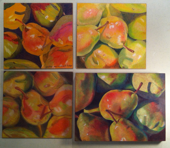
I think I should have titled this post "What Not To Do" because it's what just I've learned. As I've written about in past blog entries, I have been experimenting with different ways of presenting my colored pencil work so that it is varnished and not under glass. I have been admiring Ester Roi's work and her process of glassless framing explained on her blog. Ester uses Golden Polymer varnish with UVLS - Gloss to finish and present her work and I decided to try her method. I read Ester's blog entry a little too quickly and then read the label on the jar of Golden Polymer a little too quickly also, I mixed up the proportions. You mix 2 or 3 parts of the Golden Polymer with 1 part water and I did just the opposite, puzzled by the water-thin varnish and why it was taking 10+ coats to get a nice varnish. My second problem was puddling in areas and my third problem was lots of air bubbles.

In the photo above of my pears which began as an 8x8" piece, I laid the artwork sideways in order to show the problem spot right at the top and center. As I applied the varnish incorrectly, it puddled and left an uneven area which I attempted brush smooth after it had partially dried. However, I hadn't properly sealed the drawing so the pencil smeared when I tried to re-brush the area. Later when it was dry, I attempted to sand the area with a fine sandpaper which only left scratches that I couldn't get rid of (I think you can see them). Frustrated, I called Golden and explained to the representative everything I had done wrong. He sounded mortified and flustered and referred me to the Golden website and the technical information for the product and how to use it correctly.

I learned quite a bit from my flustered Golden rep! First of all, the artwork should be completely sealed with several coats of a non-removable clear, oil based varnish before the Golden Polymer varnish is applied. Part of the reasoning for this is because the Golden varnish is water based and can be completely removed if need be. He also suggested colored pencil use gloss varnish as opposed to matte varnish because matte varnish is porous and provides less UV protection. The rep recommended thinning the varnish with 25% water but I am still experimenting with the percentages as I find if the varnish is too thick, it can be streaky. All in all, I cut off an inch of the pear drawing containing the damaged part and I ended up with a nice, glossy finish on the piece (above).

I'm still having a little trouble getting rid of tiny air bubbles, if anyone has any suggestions please comment. I find varnishing small work is easier to learn on than large work. I recently took one of my older colored pencil drawings on paper, mounted it to Ampersand Clayboard and varnished it in this manner. However, I wasn't careful enough and found a brush hair and some air bubbles on the surface after it had dried. So I took this experimental piece to the sink and was able to wash off the entire layer of Golden Polymer Varnish, let it dry and begin again. Because I had the good coating of oil-based varnish on the drawing, the drawing itself wasn't harmed. I will post it at a later date.

The conclusion: take time to varnish correctly, read all directions, don't rush and be careful!

Saturday, October 22, 2011

Neo Color & Colored Pencil Workshop


Yesterday I taught a one-day workshop on working with Neo Color II watercolor crayons as an underpainting and colored pencil on top. My five students had done little or no colored pencil in the past but are all artists working in different mediums. I've included the reference photo of the pears to show the colors and composition we would be working on. The surface we used was Ampersand Gessobord primed with Terra Cotta Colourfix. Pictured above are their drawings. This could actually be a 2-day workshop because there was not enough time to complete the work in one day.

We began by lightly laying down one layer of the Neo Colors and next adding water with a brush and disolving the color to look like an underpainting wash. After this dried, students began working with the colored pencil and again adding some of the Neo Colors letting them blend with the pencil, not adding water this time. I love all of the results! A few of the students commented that their work didn't look like mine but I was happy that each person developed their own style and I could see influences of the other mediums they work in coming through. I was really excited with each of their drawings and hope they all take the time to complete them!

Sunday, August 28, 2011

Five Colorful Koi

Today I finished my koi drawing in the midst of Hurricane Irene which was, fortunately, downgraded to a tropical storm by the time it hit Rhode Island. We lost power early this morning and have been without it all day. The nice part about being a colored pencil artist is that I can still work without power (as long as it is daylight!) all I need are my set of pencils and battery operated pencil sharpener.

Over the last few weeks, I fussed with the colors and patterns on this piece, toning down the bright colors in the water so they wouldn't overpower or detract from the koi fish. My favorite fish is the large white one on top although another artist who saw the work in progress liked the two at the bottom because they had more contrast. I was hoping to create some of the koi with more detail than others and all of them to have an abstract quality. I'm happy with it and ready to finish it and deliver it to the gallery this week.

I'll spend the rest of the day going through photos and notes, trying to decide on my next piece. I prefer to have the next piece in mind before I even finish the current one but preoccupations with the coming hurricane this week kept me from that. We were really worried about how hard we were going to be hit and watched the Weather Channel every day. However, it's difficult for any of the weather authorities to predict the path until it's almost here!

Monday, August 15, 2011

Koi in Colored Pencil

The current piece I'm working on is a second long vertical drawing of koi. Bristol Art Gallery sold the first rather quickly and requested another. I'm putting together the composition from koi photos I took during a trip to Napa Valley, CA a few years ago. The koi at one particular winery were so colorful and plentiful, I took about 50 photos to work from. The surface I'm working on is Ampersand 2" cradled Gessobord with Raw Siena colored Art Spectrum Colourfix Pastel Primer (surface color shows around the koi). I've worked the koi fish almost to completion and next I'm going to add the water surrounding them and then I'll re-evaluate the composition and maybe add more colors or dimension to the fish and work them into their surroundings.

Monday, June 13, 2011

Neocolor II Playtime!

Two weeks ago in my class, we experimented with Neocolor II water soluble crayons and I liked them so much that I ordered a set of 84 crayons to try. They just arrived and I just couldn't wait to begin. I decided to create a small candy apple piece because I'm anxious to see what kind of candy apples I could do with these crayons. I am using an 8x8" 2" cradled gessobord coated with (my usual) Terra Cotta tinted Colourfix primer. In the top photo, I've lightly covered the surface with the Neocolors and begun adding water to just the background blue which becomes incredibly vibrant when water is added.
Now I've added water to all of the color and tried (somewhat unsuccessfully) to make the color flow and even it out. First of all, I have to remember that the crayon color becomes incredibly vibrant when water is added. Secondly, It can be difficult to brush out evenly, see the blue on the right? No matter how hard I tried, it would just keep lifting off the surface. The bright purple, pink and red apples look a little funny but my intention for them is to be a colorful underpainting.
Now I am refining the drawing. The textured surface and the thick layer of the crayon are keeping this drawing somewhat abstract and do not allow me to achieve a very smooth surface. But its okay because I'm enjoying this process and the experiments. After adding the pencil, which is flaking off like crazy, I'm adding another layer of crayon. I'm leaving this layer dry but I like what I'm achieving, its beginning to look like pastel.

Tuesday, May 17, 2011

Orchid Drawing is Complete

Since my last post of this drawing, I decided on a blue background which is mostly Prismacolor Blue Violet Lake and the surface is Prismacolor Gingeroot. I chose the cool blues and cool greens in the leaves to make the flowers pop. When the background was complete and I worked on the pot, I then returned to the flowers and punched them up with more color. I particularly worked on the three blossoms on the right which are my focal point. I didn't use any solvent on this piece which makes it look more like a drawing than a painting with the surface texture showing through.

Its been raining here for days so working on this piece made me feel better about our dreary weather because it is so colorful and cheerful.

I sprayed the drawing with Lascaux fixative and Krylon Kamar Varnish to finish and seal the colored pencil. And I chose to frame the piece in a light wood floater frame which gives it a contemporary look.


Thursday, April 28, 2011

Brightly Colored Orchids

I put the golfers aside and started a new colored pencil drawing. This one is on 12x12" Ampersand cradled gessobord. The surface of the gessobord is coated with Burgundy Colourfix liquid primer mixed with red Art Spectrum Liquid Spectrum ink to brighten the burgundy colored base. I chose this color for the background because I feel it will compliment the bright purples of the orchid blossoms nicely and still work well with the greens of the leaves. My reference photo is at the top of the photo.

So I began by drawing in the white areas of the flowers and little yellow centers. Most of the white areas are drawing with white pencil although I used some Powder Blue, Cream and Peach for the flowers behind others. The nice part about this textured surface is that it will take many layers and I can adjust any color or value issues that I need to.

Next I moved onto the leaves and began choosing and laying in some greens. I am using gray greens; Sage, Kelly, Celadon and Limepeel rather than the bright greens. I want the blossoms to pop forward and the green leaves to settle in the background. I'm going to have fun with this piece, especially the beautiful purples and bright pinks of the orchids themselves.

Tuesday, March 1, 2011

My Frame Choices and Wellesley Exhibit

Debbi Friedman and I spent a rainy afternoon yesterday hanging our work in the Wellesley, MA library. We've been planning this exhibit for over a year and suddenly its here. Pictured here is the main lobby gallery where Debbi hung her rock series and I've hung my candy apple pieces which are at the far end of the photo. The exhibit really looks great (if I may say so myself) and while we were hanging, so many folks were stopping to look at the work. We received the same response from just about everyone "That's colored pencil????!!!!" Viewers were amazed at what could be done with colored pencil. Our opening reception is on Saturday, March 5 from 2 to 4 p.m. and we are hoping for a good turn out. Everyone is invited!
Here are our featured pieces, Debbi's rocks titled "The Red Angle" (right) and my candy apples "Reflections #2" (bottom left). My two candy apple pieces shown here are both on 3/4" cradled Gessobord and my frame choice is a light wood floater frame. I haven't been framing my cradled Gessobord pieces but I feel the work looks more professional and contemporary in the floater frames which compliment and don't overpower the drawings.
Shown here is my other style of framing (although the photo is not very good). As I mentioned previously, the galleries are asking for colored pencil work that is not under glass so I find that I must get innovative. The board I've worked on for this piece is Rtistx and I've chosen to frame it as one might frame an oil painting. Between the artwork and the frame is a 3/4" linen liner to put some space between the art and the frame and the frame I've chosen is a simple design in warm silver.
Here is another wall of the library gallery with my rocks, shells and glass pieces. All in all, I'm relieved the show is hung and look forward to our opening on Saturday.

Monday, February 7, 2011

An Eventful Week

I was down for the count this past week with the flu, couldn't believe it because I don't think I've ever had the flu before and have never considered getting a flu shot. That might change now because I spent a miserable week of laying around in bed.

The next thing that happened was a little more exciting ... for a moment or two. I was contacted by an art gallery in New York City asking if I would be interested in being represented by them and could they send me their contract to look over. This really excited me, a gallery in NYC looking to represent me? And I didn't even have to hit the pavement with my portfolio! However, when I read over the contract I realized they are looking for the artist to pay $2950 per year for representation. It seems that most of the art exposure is through their website or advertisements, and perhaps for one collective exhibit in the gallery itself. Plus they still take 30% commission on sales. I'm not in a position to spend this kind of money but I'm wondering if anyone else is familiar with this practice or have heard whether an arrangement like this is worthwhile? I would be interested in comments.

Meanwhile, I have started another candy apple piece for my Rock/Candy exhibit with Debbi Friedman. The surface is 3/4" cradled Ampersand Gessobord with Terra Cotta Colourfix Primer, the usual surface I like for my candy apple pieces. I add a little bit of water to the Colourfix before applying it so the surface is a little less textured. I've started by laying on the first layer of color on the apples, mingling the pinks and reds.