Thursday, April 28, 2011

Brightly Colored Orchids

I put the golfers aside and started a new colored pencil drawing. This one is on 12x12" Ampersand cradled gessobord. The surface of the gessobord is coated with Burgundy Colourfix liquid primer mixed with red Art Spectrum Liquid Spectrum ink to brighten the burgundy colored base. I chose this color for the background because I feel it will compliment the bright purples of the orchid blossoms nicely and still work well with the greens of the leaves. My reference photo is at the top of the photo.

So I began by drawing in the white areas of the flowers and little yellow centers. Most of the white areas are drawing with white pencil although I used some Powder Blue, Cream and Peach for the flowers behind others. The nice part about this textured surface is that it will take many layers and I can adjust any color or value issues that I need to.

Next I moved onto the leaves and began choosing and laying in some greens. I am using gray greens; Sage, Kelly, Celadon and Limepeel rather than the bright greens. I want the blossoms to pop forward and the green leaves to settle in the background. I'm going to have fun with this piece, especially the beautiful purples and bright pinks of the orchids themselves.

Wednesday, April 20, 2011

Portrait of Three Golfers

Working on my art has been a bit slow because of issues with my dad. I'm losing my mind while he's losing his mind! His health is holding steady, now the problem is with his memory, confusion and some dementia which I find an incredible challenge. He fights me on every decision that needs to be made regarding his health and I just get so tired. The doctor has just put him on a new medication for memory issues and I'm hoping it will work.

Enough complaining! In the last few weeks I've been working on this portrait for my husband. The portrait of the three golfers are my husband (left) and his two best friends. I won't put their names in the blog because the portrait is a surprise. Although I doubt my husband or his friends will even read my blog! When it's finished we are going to have giclees made so he can present each friend with a print. These three lucky golfers have played golf courses in Ireland, Scotland and Wales. This year They are going to a world tournament in Deal, England (although the name of the tournament escapes me).

I wanted to portray them as happy and casual with the lovely landscape of this golf course in Scotland behind them. My husband had some special requests such as take a few pounds off him, remove wrinkles and make them all look younger. Yeah right, easier said than done! The piece measures 17x23" but their faces are only 1 1/2" wide. I began the drawing with the faces, because if I couldn't get their likenesses, then it wasn't worth doing the portait. And I learned that it's very difficult to get the likeness of a person when the face is so small because you have be able to draw it in a few strokes. Would you believe, the person I had the most trouble with was my own husband? His skin tone is darker and I found the browns made him look too wooden. I used purples, flesh, peach and some light browns. The surface I chose is white illustration board and I started with the Prismacolor and Coloursoft pencils then added Polychromos and Prismacolor Verithins to burnish and fill in the grain of the paper so white specks wouldn't show through. I also used a small bristle brush to burnish areas I wanted smooth. Two areas I still think I need to work on are their teeth, they may be too white and the grass which is much brighter green than I had intended. I don't think the grass area will take any more layers of pencil so I think I'll try blending either watercolor or pastel on top. Any suggestions? Please comment!

Saturday, April 9, 2011

Eye Candy 2 Opens Today


My solo exhibit at Bristol Art Gallery, Bristol, Rhode Island, opens today and continues through June 3rd. The opening tonight is from 5 to 8 p.m. Here is the largest wall with my work, however the fish with the big teeth in front isn't mine! This is a wonderful gallery with many other intriguing artists in all mediums. Everyone is invited, for anyone in the area, please feel free to stop by at the opening or through June 3rd.

Friday, April 8, 2011

Fixing Mistakes in Colored Pencil


Here is the tulip piece I was working on last summer. I searched my blog and the last entry I could find contained this bottom photo with the brown background. I finished the piece, entered it into a national exhibit (which it was rejected from) and then it just in my studio for several months. Meanwhile, I kept looking at it and saying to myself, "something is wrong". One of the artists in my studio came by and told me the brown background was killing the piece! I was trying to choose a background that sit back quietly and let all the action happen in the foreground and I failed.

So ... I scraped the entire background off with transparent tape (middle photo). Believe me, this took hours because I had to work small sections at a time. And its something I wouldn't want to do again. Although, it looks kind of cool. I had applied so many layers of pencil on the paper that I couldn't pull the color entirely off. I almost left the drawing this way but decided to experiment more and apply another background.

The top photo shows the finished piece. After scraping off the background, I applied several layers and colors of pastel in grays, blues and greens. I rubbed each layer/color into the surface so that it wouldn't overpower the delicate tulips and glass bottles. I took the brown reflections out of the glass and added the grays reflected from the background. Thus, the entire background is pastel worked very gently around the subjects and worked into some of the tulips to make some of them fade into the background.

This drawing has been a learning experience and somewhat of an experiment. I kind of like what's going on in the piece where I removed the background but wouldn't really want to take the hours to apply all that pencil and then remove it. What did I learn? To really think before choosing a background that works with the subject and that you can remove large areas and reapply color!

Monday, April 4, 2011

Splendor

Splendor is the title I chose for my "bowl of cherries" colored pencil piece. I've been working on and off for a month, especially on intricate patterns in the glass dish. As I mentioned previously, I used several brands of pencils; Prismacolor, Derwent Coloursoft, Luminance, Lyra Rembrandt and Prismacolor Verithin. The surface is Rtistx board which is a sanded surface so I began with the Prismacolor and Coloursoft pencils which are softer, especially the reds which are very soft pigment. On top of the softer pencils I filled in the textured surface and burnished with the Lyra Rembrandt pencils and Luminance. I especially liked the Luminance white for burnishing the white patterns in the dish. It was just hard enough and opaque enough to cover the surface perfectly. I used some of the Verithin pencils, especially the Tuscan Red to burnish the dark shadowed area behind the cherries.

I needed to render the cherries in a slightly different way to make them pop off the surface and not compete with the intricate dish pattern so I added solvent to the pencil. By adding solvent I dissolved layers of pencil so that it is applied in a thick layer. When it was dry, I added a top layer of lighter red Prismacolor and Coloursoft pencils to really make those cherries pop.

The finished size is 14x17", varnished and framed without glass in a warm silver frame and linen liner. This piece is going to Bristol Art Gallery for my solo exhibit Eye Candy 2 opening this Saturday, April 9.

Monday, March 28, 2011

Catharine Lorillard Wolfe Award

I recently shipped these two accepted pieces "Pebbles and Reeds" and "Polka Dot Bowl" off to the Catharine Lorillard Wolfe Art Club's annual members exhibit at the Salmagundi Club in NYC. Then I received an email a few days ago saying that I had won first prize in the Graphics and Mixed Media category in the exhibit. I am very excited but not sure which piece won! I am trying to decide which one it might be and thinking it might be "Pebbles and Reeds" which has already won an award at the Providence Art Club a few years ago. I guess I will wait to find out when the certificate comes in the mail.

Sunday, March 27, 2011

New Hampshire Workshop

I drove up to New Hampshire on Friday afternoon and stayed with an artist friend I haven't seen in many years, Mary Jane Cross, who paints in oils. We had long conversations about art and she cooked me a delicious dinner and breakfast the next morning. Saturday morning I woke up to 11º weather. Who would have thought it would be so cold at the end of March? Fortunately, at least the days are longer. I then drove to Keene where I taught a one-day colored pencil workshop for the Monadnock Area Artist Association. Fifteen students attended the workshop and it was a nice day. The range of expertise was from beginner to advanced, and several work in other mediums (pastel, watercolor, decorative painting) so colored pencil was somewhat new for them. I enjoyed it, I think they did also, and I'm honored that MAAA asked me to teach a workshop.

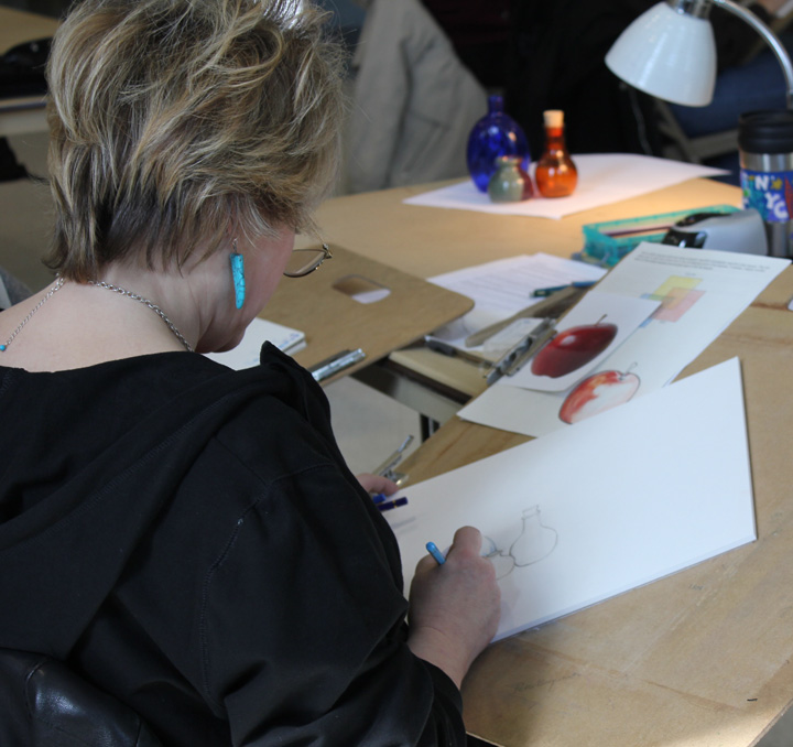
After talking about materials and having students do some practice exercises, I set out a variety of still life subjects for the students choose from for their drawings. The surface I chose to bring the students to work on was Rtistx board 300 for colored pencil. Here are some photos.

These two ladies chose a small grouping of shells to draw. Also shown is the apple drawing I had them practice on before starting.

Here Ellen is drawing the bottles in the upper left.
Liz chose a cluster of tomatoes (not pictured here) and started with a beautiful rendering of the stems and leaves.
Here are a few of the pieces and the practice exercises when we were setting them up for a final critique.

Sunday, March 20, 2011

A Little Progress on the Bowl of Cherries and My Life

I've started working on the cherries which are going to be my focal point so I really want them to stand out. I decided in order to do so, I will use the solvent with the colored pencil so I can achieve rich, intense color. The two cherries I began with are a bit too intense at the moment so I will attempt to tone them down and blend the edges into the background with dry colored pencil.

Progress on this piece is slow. Life with my father is challenging and I'm getting worn out, in fact I'm home with a cold today while my husband spends the rest of the day with my dad. My husband has been wonderful about filling in for me when I am exhausted. However, things are looking up because I have found someone to spend nights with my dad so I can at least go home to my own bed. This week, my project is to start setting up assistance for my dad during the days. Just in time because I'm teaching a colored pencil workshop for Monadnock Area Artist Association in New Hampshire next Saturday and have to start preparing this week.

I want to say thank you to everyone who has emailed, called or visited and offered their support! I am grateful to have so many kind friends in my life!

Wednesday, March 16, 2011

Life is Like a Bowl of Cherries ... Or Not

I've been plunged into a situation that was totally unexpected only two months ago. My father was hospitalized for congestive heart failure about 3 weeks ago and while he's back at home now, he needs full time care. I've been living with him for the last two weeks and finding that he not only has heart problems but also memory problems and possibly dementia. I am taking care of his every need, including daily care, coordinating visiting nurses and physical therapy as well as doctor appointments, not to mention the finances and legal things that the artist in me knows little about. This is the second most challenging task I've ever had to do in my life (the first was surviving cancer) and I've had more than one meltdown. As if that wasn't enough, my dad's lady friend died last week so we've dealt with his grief as well as attending the funeral and consoling the family. I am hoping to set up care for my dad within the next week so I can return to teaching my classes and doing my artwork soon. But first I can't wait to just return HOME and sleep in my own BED without having to worry about sleeping with one ear listening to when he wakes up and wanders.

For now I am working on this one colored pencil drawing whenever I have a few hours alone. I should call this piece "My Sanity" because working with my colored pencils is keeping me sane. Right now it looks more like "ghostly" cherries because I am working on the background first. My surface is Rtistx board and I am using a variety of brands of pencils; Prismacolor, Prismacolor Verithin, Derwent Coloursoft, Luminance and Lyra Rembrandt Polycolor pencils. I am not using solvent on the background so I am working first with the Prismacolor Premier Pencils and Derwent Coloursoft and then burnishing with the Lyras and Verithins in order to create a solid surface with none of the textured Rtistx board showing through. I've chosen to render the colorful glass dish and reflection first and when I'm satisfied, I will begin on the cherries. The cherries really have to "pop" off the intricate background so I am waiting until last to tackle them. I will list colors in my next entry.

Monday, March 7, 2011

Chapter Project for CPSA & Boston Globe

Pictured here is the 3x3" drawing that I did for our district chapter 112 project for the hospitality suite at the CPSA national exhibition and convention. We were asked to choose something to represent one of our New England states and living so close to Newport in Rhode Island I chose a sailboat. The project coordinators are going to put all of the drawings together in a type of "crazy quilt" collage and I'm eager to see the finished project. Just look at all the pencils I used on this little drawing, I think I may have even left some out. They take up more space on the table than the actual drawing.

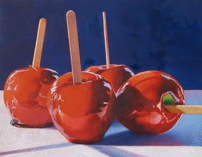
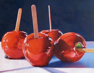
Today Debbi's and my Rock/Candy exhibit is written up in the G section of the Boston Globe on the "to do list". My candy apples are pictured in the actual newspaper but not in the on-line version which you can view here.

Saturday, March 5, 2011

Wellesley Library Exhibit & Seasons Pass Program TV Segment

Here is Debbi Friedman and my invitation to our exhibit at the Wellesley Free Library, Wellesley, MA. Our opening reception is today from 2-4 p.m. but the exhibit is going to be up for the entire month of March.

I'm going to attempt to imbed the link or upload the video onto my blog. Being more of a fine artist and less of a techie, I'm not sure this is going to work but we'll see. This is the news segment from NBC Channel 10 in Rhode Island containing the Rhode Island Blood Center's Seasons Pass Program press conference. Reporter Barbara Morse Silva narrates the segment which about the need for blood donors and how local artists have helped promote the program for the past 9 years with their art.

Thursday, March 3, 2011

RI Blood Center Season's Pass Program

Over a year ago I was interviewed by the RI Blood Center to be a contributing artist for their Seasons' Pass Program. It wasn't until last fall when I learned that I had been selected to be the artist for 2012. What this means is that I will design and donate a piece of artwork of which the Blood Center will make prints and give to their 4-times- per-year blood donors. Today at their press conference, I was introduced as the next artist for the Seasons' Pass Program. Since this program was begun in 2002, 4 times-per-year-blood donors have increased by two thirds currently totaling more than 10,000. I am honored to be chosen as the next artist but this also has meaning to me because coincidentally in 2002 I was having surgery for cancer and needed a blood transfusion. In turn, this blood transfusion saved my life so I am happy to able to give back. The question on everyone's mind today was what is going to be my choice for subject matter. I'm not even sure of that myself right now because I want to give some thought to my subject, something that has meaning to me and a subject or scene donors will be happy to receive.
Here I'm being interviewed by Barbara Morse Silva of NBC Channel 10 news. The segment ran on the evening news today.
Talking to the CFO and COO of the Blood Center.

Tuesday, March 1, 2011

My Frame Choices and Wellesley Exhibit

Debbi Friedman and I spent a rainy afternoon yesterday hanging our work in the Wellesley, MA library. We've been planning this exhibit for over a year and suddenly its here. Pictured here is the main lobby gallery where Debbi hung her rock series and I've hung my candy apple pieces which are at the far end of the photo. The exhibit really looks great (if I may say so myself) and while we were hanging, so many folks were stopping to look at the work. We received the same response from just about everyone "That's colored pencil????!!!!" Viewers were amazed at what could be done with colored pencil. Our opening reception is on Saturday, March 5 from 2 to 4 p.m. and we are hoping for a good turn out. Everyone is invited!
Here are our featured pieces, Debbi's rocks titled "The Red Angle" (right) and my candy apples "Reflections #2" (bottom left). My two candy apple pieces shown here are both on 3/4" cradled Gessobord and my frame choice is a light wood floater frame. I haven't been framing my cradled Gessobord pieces but I feel the work looks more professional and contemporary in the floater frames which compliment and don't overpower the drawings.
Shown here is my other style of framing (although the photo is not very good). As I mentioned previously, the galleries are asking for colored pencil work that is not under glass so I find that I must get innovative. The board I've worked on for this piece is Rtistx and I've chosen to frame it as one might frame an oil painting. Between the artwork and the frame is a 3/4" linen liner to put some space between the art and the frame and the frame I've chosen is a simple design in warm silver.
Here is another wall of the library gallery with my rocks, shells and glass pieces. All in all, I'm relieved the show is hung and look forward to our opening on Saturday.

Thursday, February 17, 2011

Dark Background with Colored Pencil and Solvent

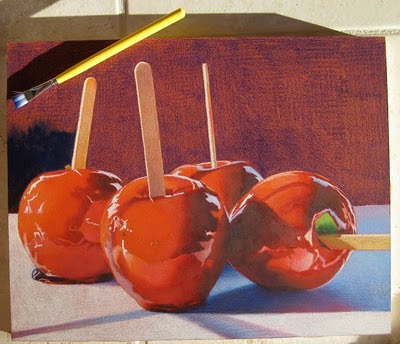
This is how I create my rich dark backgrounds for some of my still life pieces. Just a reminder that I am working on Ampersand Gessobord with a coat of Terra Cotta Colourfix applied on the surface. In the top photo, I've started with a layer of Prismacolor Indanthrone Blue (LF208) but you can also use Indigo Blue. I like the Indanthrone Blue rather than the Indigo because it is not as intense as indigo and more "blue" if that makes any sense. I also don't layer it on very evenly because I'm going to add solvent to melt and move the pencil around so it doesn't matter how neatly it is applied. Next I begin with a small amount of odorless mineral spirits on my brush, sometimes I dab it on a paper towel so it doesn't run or puddle when I apply it to the surface, it just has to be wet enough to melt the pencil so it will almost turn into a paint like substance. I work small areas at one time with a flat brush which is shown in the top left. Its a Loew-Cornell inexpensive wash brush with soft nylon bristles to brush strokes won't show. I purchase this brush at a craft store.
In this photo, the sun is glinting when I took the picture so you can see the strokes in the sunlight but not when it dries.
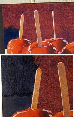
These 2 photos you may have to enlarge to see. I decided to put a lighter blue on top and chose Prismacolor Copenhagen Blue. I apply it on the Indanthrone Blue while it is still a little wet but not too wet or the Copenhagen Blue will mush and not apply. Then I brush it smooth with very little mineral spirits on my brush, almost a dry brush. The top photo shows the Copenhagen Blue smoothed out and the bottom photo shows the area above where I began to work the next section of color. You can see how I apply the Copenhagen Blue in strokes which don't have to be exactly even.
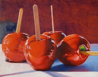
This is the finished background ... however ... I think the backgound is a beautiful color but is too vibrant and is coming forward to compete with the apples and not sitting back as it should be.
So in order to compensate, I add a layer of Cool Gray 90% to the entire background. I do this by slightly dampening the background working small areas at a time, laying down a layer of the Cool Gray 90% and then gently brushing it smooth. I find that I have to hold it to the light and inspect the finish because some areas are applied heavier than others and can cause inconsistencies. You can always alternate between pencil and brush to make the color more consistent. Sometimes I also use my fingers to move the wet pencil around and remove brush strokes. Like finger painting! In this last photo, the sun was shining when I took the picture so some of the brush strokes are showing. The background of my original is also more gray than it appears in the picture. This whole process for the (11x14") background takes about an hour. I hope this helps if anyone wants to give this process a try!

Monday, February 14, 2011

American Art Collector - March Issue


I'm plugging along with more candy apple pieces so I won't post them until they are finished and framed because it's my usual process. So rather, I'm including the pages from the next issue of American Art Collector. Through the Bristol Art Gallery, I am included in the feature editorial of Florals and Botanicals on pages 100 and 104. Page 104 shows my colored pencil piece "Calla Lilies" which was inspired by a trip to Kew Gardens in London a few years ago. American Art Collector is a great magazine highlighting different artwork from all over the USA. I enjoy seeing subjects and mediums other artists choose and happy to see other colored pencil artists featured. Its nice to see colored pencil gaining recognition in galleries and art magazines.

I'm in Florida right now and entered three small colored pencil pieces that I worked on board and varnished into a community art exhibit here. I can't tell you how many favorable comments I received and how many people said, "that's colored pencil?!" I really enjoy introducing viewers to different processes and new ways of seeing art.