Thursday, February 17, 2011

Dark Background with Colored Pencil and Solvent

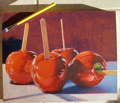
This is how I create my rich dark backgrounds for some of my still life pieces. Just a reminder that I am working on Ampersand Gessobord with a coat of Terra Cotta Colourfix applied on the surface. In the top photo, I've started with a layer of Prismacolor Indanthrone Blue (LF208) but you can also use Indigo Blue. I like the Indanthrone Blue rather than the Indigo because it is not as intense as indigo and more "blue" if that makes any sense. I also don't layer it on very evenly because I'm going to add solvent to melt and move the pencil around so it doesn't matter how neatly it is applied. Next I begin with a small amount of odorless mineral spirits on my brush, sometimes I dab it on a paper towel so it doesn't run or puddle when I apply it to the surface, it just has to be wet enough to melt the pencil so it will almost turn into a paint like substance. I work small areas at one time with a flat brush which is shown in the top left. Its a Loew-Cornell inexpensive wash brush with soft nylon bristles to brush strokes won't show. I purchase this brush at a craft store.
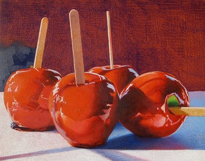
In this photo, the sun is glinting when I took the picture so you can see the strokes in the sunlight but not when it dries.
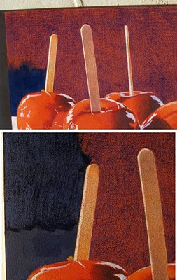
These 2 photos you may have to enlarge to see. I decided to put a lighter blue on top and chose Prismacolor Copenhagen Blue. I apply it on the Indanthrone Blue while it is still a little wet but not too wet or the Copenhagen Blue will mush and not apply. Then I brush it smooth with very little mineral spirits on my brush, almost a dry brush. The top photo shows the Copenhagen Blue smoothed out and the bottom photo shows the area above where I began to work the next section of color. You can see how I apply the Copenhagen Blue in strokes which don't have to be exactly even.
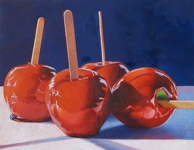
This is the finished background ... however ... I think the backgound is a beautiful color but is too vibrant and is coming forward to compete with the apples and not sitting back as it should be.
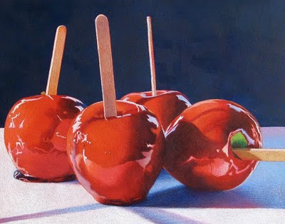
So in order to compensate, I add a layer of Cool Gray 90% to the entire background. I do this by slightly dampening the background working small areas at a time, laying down a layer of the Cool Gray 90% and then gently brushing it smooth. I find that I have to hold it to the light and inspect the finish because some areas are applied heavier than others and can cause inconsistencies. You can always alternate between pencil and brush to make the color more consistent. Sometimes I also use my fingers to move the wet pencil around and remove brush strokes. Like finger painting! In this last photo, the sun was shining when I took the picture so some of the brush strokes are showing. The background of my original is also more gray than it appears in the picture. This whole process for the (11x14") background takes about an hour. I hope this helps if anyone wants to give this process a try!

Monday, February 14, 2011

American Art Collector - March Issue


I'm plugging along with more candy apple pieces so I won't post them until they are finished and framed because it's my usual process. So rather, I'm including the pages from the next issue of American Art Collector. Through the Bristol Art Gallery, I am included in the feature editorial of Florals and Botanicals on pages 100 and 104. Page 104 shows my colored pencil piece "Calla Lilies" which was inspired by a trip to Kew Gardens in London a few years ago. American Art Collector is a great magazine highlighting different artwork from all over the USA. I enjoy seeing subjects and mediums other artists choose and happy to see other colored pencil artists featured. Its nice to see colored pencil gaining recognition in galleries and art magazines.

I'm in Florida right now and entered three small colored pencil pieces that I worked on board and varnished into a community art exhibit here. I can't tell you how many favorable comments I received and how many people said, "that's colored pencil?!" I really enjoy introducing viewers to different processes and new ways of seeing art.

Monday, February 7, 2011

An Eventful Week

I was down for the count this past week with the flu, couldn't believe it because I don't think I've ever had the flu before and have never considered getting a flu shot. That might change now because I spent a miserable week of laying around in bed.

The next thing that happened was a little more exciting ... for a moment or two. I was contacted by an art gallery in New York City asking if I would be interested in being represented by them and could they send me their contract to look over. This really excited me, a gallery in NYC looking to represent me? And I didn't even have to hit the pavement with my portfolio! However, when I read over the contract I realized they are looking for the artist to pay $2950 per year for representation. It seems that most of the art exposure is through their website or advertisements, and perhaps for one collective exhibit in the gallery itself. Plus they still take 30% commission on sales. I'm not in a position to spend this kind of money but I'm wondering if anyone else is familiar with this practice or have heard whether an arrangement like this is worthwhile? I would be interested in comments.

Meanwhile, I have started another candy apple piece for my Rock/Candy exhibit with Debbi Friedman. The surface is 3/4" cradled Ampersand Gessobord with Terra Cotta Colourfix Primer, the usual surface I like for my candy apple pieces. I add a little bit of water to the Colourfix before applying it so the surface is a little less textured. I've started by laying on the first layer of color on the apples, mingling the pinks and reds.

Tuesday, February 1, 2011

CPSA Explore This! 7

Explore This! 7 went on line today. The exhibition and award winners can be viewed here. I'm fortunate to have my piece included in the exhibit.

I alway find it fun and interesting to see what mediums, surfaces and techniques other artists are using with colored pencils.

Friday, January 28, 2011

Elaina's Portrait

I have so many colors in this portrait that I'm starting to lose my sanity! I wouldn't recommend working on a portrait of someone from a photo and not being able to see that person in life. This is my niece who lives in Arizona so I am relying on photos in which to work from. The photos flatten and dull her skin tone so I am trying to bring her skin tones to life. Today I asked one of the artists in the studio to help me. First thing she said was that I had done an incredible job with the hair. I must say that I really enjoyed rendering the hair but its the face I want to bring to life. The she said I added too much brown to her skin tone and she needed more warm pinks and oranges to make her look like a child. I agreed because I had added Prismacolor Chestnut and Black Raspberry which are nice warm purple-browns but they dulled her complexion. Thank goodness Stonehenge paper erases so easily. I lifted off the brown tones and gave all of her skin tone a wash of Prismacolor Pale Vermillion which warmed everything up. So upward and onward I go with the portrait hoping that one of these days I will have my skin colors down to a science like my candy apple colors!

Tuesday, January 25, 2011

Salmagundi Club Award

In a previous blog entry, I noted that two of my colored pencil works had been accepted into the Special President's Exhibition; Photography and Graphics, which is a juried member exhibit. And I was even more excited when I received a call from the Salmagundi Club telling me that I had won The President's Award, First Award for this piece, Cherries on China.

Cherries on China also previously won second prize at an exhibit in Rhode Island, however, it was rejected from the CPSA national exhibit when I submitted it two years ago. This is a reminder to us as artists that art is subjective and we shouldn't despair if a piece is not accepted into an exhibit or given an award. I am always disappointed when I'm not accepted into an exhibit I really want to be a part of but I try not to be discouraged. There are many reasons why a particular piece isn't accepted; could be that it just didn't fit in with the other works or wasn't that judge's particular style. I've been told that my work can be too photo realistic at times also. Each piece of my artwork is a part of me, almost like another child. I have to remind myself not to take it personally if my art is rejected. On the other hand, at times like this, I am so jubilant and elated when I am accepted into an exhibit or an art organization or win an award! It's all just part of the artist's journey.

Sunday, January 23, 2011

Working on Two at Once!

I started going to a new acupuncturist late last summer and when she found out I am an artist, she told me that she could heighten my creativity and creative ideas. Well, I think its working because I've got so many ideas rattling around in my head that I just wish I had more time to put them all down on paper or board.

For the time being, I will settle on finishing these two pieces. I'm working on the surface the vase of tulips is sitting on. I started with a layer of Powder Blue, then a layer of LF285 LIght Oxide and added solvent to blend the two. While the solvent was wet I added a layer of Cool Grey 30% - working only small areas at a time. While the glass table surface was that color, it appeared too light in value for the rest of the drawing. When it dried, I added many light layers of colors, so many I can't even remember them all because I've been going back and forth with light layers. I think I can name some of them; Periwinkle Blue, Parma Violet, Violet Blue, Cool Grey 50% and 70%, Kelly Green, Dark Green, and Tuscan Red. I think it may be just about done but I've stood it in my studio and every time I walk by, I'll look at it and ponder what more needs to be done.
I'm back to Elaina and working on her skin tones. In lightest areas I've added Deco Peach and Deco Pink over the color already there. I also think that parts of her too purple-brown (such as the shadowed area on her bottom arm that will need to be fixed. I'm added Periwinkle, Blue Violet Lake and Coloursoft Grey Green (one of my favorite colored pencils!) to the shadows in her skin tones and Spanish Orange for the glow in her face, which I may decide to take out later. Portrait work, for me, is a learning experience and goes slowly but I'm a perfectionist and enjoy the journey!

Saturday, January 15, 2011

Tulips Coming to Life

I've been working on this drawing this week and having so much fun with it. As in my last post, I mentioned that I began with the flowers and leaves. I worked them in Prismacolors and Lyra Rembrandts and then added Prismacolor Verithins on top to burnish and fill in areas I wanted to appear solid. I took the original photo on my deck and did not like the background so I played with the image in Photoshop, cut out the vase and tried different backgrounds. It took me several hours of learning how to make it work in Photoshop and choosing a background, but in the end decided on this blue & gray cloudy sky.

I began the background with Periwinkle, Cool Grey 30% and white in the dark and light areas, added solvent and then added several other Cool Greys, Slate Grey, Blue Violet Lake, Imperial Violet, Powder Blue and more white. I blended with the brush and then with my fingers. When I finished the background, I found there was too much of a disparity between the solid paint-like appearance of the sky and the textured pencil application of the flowers. I didn't want to add solvent to the flowers because the solvent sort of mushes the colors together and the petals will lose the transparency of the layers of color showing through each other. So I decided to lightly burnish just about all of the petals and leaves with a colorless blender so that the texture of the board wouldn't show through and they would stand out from the background. It worked and next I am onto the bottom area.

Wednesday, January 12, 2011

Oh happy snow day!

Our New England weather has been cold and snowy and I haven't been to the studio to work on Elaina and so I started a new colored pencil piece over the weekend at home. I have some photos of beautiful red and yellow tulips in a glass vase in which I took on a gray day and have been thinking about them for a while. My idea and inspiration is to portray the vase of tulips as vibrant and bright against a quiet blue/gray background of a rainy day. The surface in which I'm working on 18x24" Rtistx board. This photo (above) isn't great, I took it inside in natural light and the brightness of snow out the window is graying everything in the front, however the tulips are still fairly bright enough to get the idea of my start.

The galleries are asking for my colored pencil work not to be framed under glass. The lighting from above reflects on the glass and the piece is difficult to see. So I have to rethink my surfaces. I Chose Rtistx for this piece because it can be varnished but also has less texture than the other boards I work on. I need a softer surface for the delicate petals and leaves, yet still a board that can withstand being varnished afterward.

After reading Paula Pertile's blog entry on colored pencil swatches for the various brands, I decided to give my Lyra Rembrandt pencils a workout on this piece. The Prismas and Coloursofts are softer and crumble a bit and flake off as I layer them. I'm still using them along with the Rembrandts which aren't as crumbly and can be applied a little more evenly. Paula is correct, they do go on like 'buttah'! The Rtistx is also wonderful for layering lights on top of darks and will take many layers of color. The white surface makes the color even more vibrant. I don't like to burnish much on my work, I like the texture of the surface and characteristics of the pencil to show through. If I do decide I need to cover some of the texture and solidify areas of the colored pencil, I will add solvent.
Here is the ad with my artwork that will appear in February issue of American Art Collector magazine. I also found out today that this piece "Red Reflections" was juried into CPSA's Explore This 7 Online Exhibition that will be on the website starting February 1. This is my 4th acceptance into the Explore This exhibitions. I'm also very excited because one of my c.p. students, Cheryl Borbone, had her piece "Cherry Martini" accepted into Explore This 7. While she worked on this piece independently, I am happy to have helped her develop her colored pencil skills over the last few years she has taken classes with me.

Sunday, January 9, 2011

Ann Kullberg's new Colored Pencil magazine

Ann Kullberg has published a new colored pencil magazine, titled Colored Pencil, now in printed version and Ann has sent me a copy to share with my students. Just like her previous on-line From My Perspective magazine, this one is chocked full of great information, ideas and artwork. This issue features the work of Sally Ford, the journeys of Gemma Gyling and information about how to render wavy hair and working with Photoshop Elements. I am very fortunate to have my colored pencil drawing of sailboats featured on the "Showcase" page. I included the image to the left under the magazine cover.

Thursday, January 6, 2011

Portrait of Elaina


After working on the portrait of my niece, Samantha, I decided to try my luck with a portrait of another niece, Elaina. Elaina is 3 years old in this photo and she lives in Arizona so her skin is always a bit tan. Her olive complexion is unlike Samantha's creamy skin so I find myself using all different pencils. As you can probably tell, I was really intrigued with her hair and began at the top. I think I used every brown plus some warm yellows and purples. For her skin, I began by putting a layer of Prismacolor 939 Peach on her skin. Then Mineral Orange, Rosy Beige, Clay Rose, Blush Pink, Burnt Ocher, Henna, Luminance Manganese Violet, Chestnut, Periwinkle and I'm far from being finished. The biggest challenge I'm finding is to capture her olive skin tones without making her skin look like wood. I am cautiously layering skin tone colors!

Wednesday, January 5, 2011

Working on Pastelbord

Here is the piece finished. All of the white in the background and between the stripes is the white pastelbord surface. The most difficult part of doing this drawing was the pencil dust flaking all over the area of the pastelbord that I wanted to keep white. As we know, working on a sanded surface creates lots of pencil dust. I solved the problem by dabbing with a kneaded eraser and removing all (or most) of the unwanted color in the white areas. Its really helpful to photograph the piece and look at it on the computer because you can see flaws or areas that could be changed. I just noticed the sticks like faint in value/color compared to the rest of the piece.

Friday, December 31, 2010

Candy Apples & Salmagundi Club Exhibition

I'm burning the midnight oil tonight, even the dog is looking at me as if to say "can we go to bed now?" I had a tiring day with helping my elderly dad and needed to unwind when I got home. Mostly frustrating with my dad because he doesn't want assistance to help him walk and my heart skipped a beat each he slipped on ice today and refused my hand. So here I am unwinding, trying to portray luscious red apples on Pastelbord. This is a portion of my drawing that would fit on my scanner bed. The scanner has darkened the top white area so its not quite accurate. Yesterday I was having trouble achieving the smooth, shiny texture of the apples. Today I added solvent to the colored pencil and them more colored pencil on top of the solvent. I was very pleased with the ease in which the solvent dissolves the first layer of pencil without streaks and in some areas I didn't even need to add any more pencil. I still don't know what I'm going to do about all the red flecks all over my white Pastelbord but I have to finish the drawing before I have to worry about that.

Below are my two colored pencil pieces "Golden Glow" and "Cherries on China" which have been accepted into Special President's Exhibitions; Photography and Graphics Exhibition at the Salmagundi Club. The exhibit runs January 10 - February 11, 2011 and I am honored to have two pieces of my work selected for the exhibition by the president herself, Claudia Seymour.

Happy New Year everyone and thank you for following or visiting my blog! I really appreciate the support & encouragement!


Monday, December 27, 2010

Candy Apples on Pastelboard

I'm spending some time working on some new candy apple pieces because my others have sold, which is a good thing. More money for art supplies : ) This piece is for Bristol Art Gallery and will be used in the gallery's advertisement in American Art Collector magazine. For the surface, I am trying Ampersand Pastelbord for the first time. I chose white pastelbord because much of the background is going to stay white. Here are my observations; the pastelbord takes many layers but Prismacolor pencil flakes easily. My white background has red flecks all over it so I may have to add white acrylic paint at the end. The surface is rough and I'm having a bit of trouble getting very smooth pencil to portray the shiny red candy. So I will need to add either harder type of pencils on top layer or use solvent with the Prismacolors so they go on like paint.

Thursday, December 23, 2010

Candy Apples on Richeson Board

This is an interesting surface to work on. It eats the pencils like crazy and they flake off a little but I found I could really get some intense color with this surface. I could also layer light over dark and the dark would still show through underneath. Some of the areas are one color and others are several colors layered so I had the option. I also was able to use mineral spirits successfully on this board to dissolve the pencil for the background and foreground and achieve even layers of the white and grays.